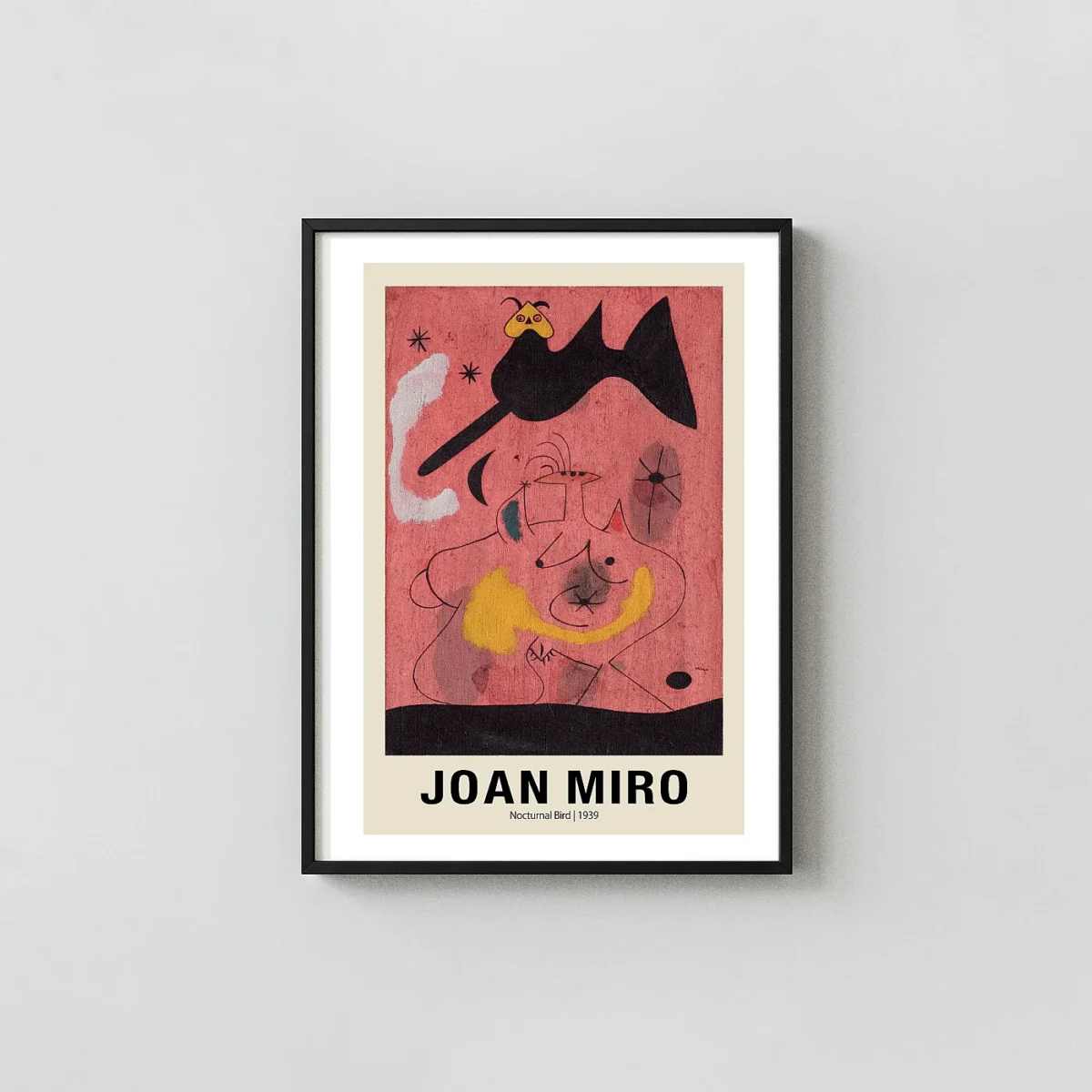


Joan Miro Print – Woman and Dog in Front of the Moon 1935 Exhibition Art
This Joan Miro Print reproduces the 1935 surrealist composition with vivid biomorphic yellow and red forms. Each 1930s surrealist art reproduction uses museum-grade matte paper for an authentic finish.
The Artwork
About This Print
This Joan Miro Print offers a faithful reproduction of the 1935 surrealist work titled ‘Woman and dog in front of the Moon.’ During the mid-1930s, the artist was deeply immersed in his ‘painting-objects’ and a period of visual experimentation that challenged traditional representation. The composition features a large, dominant yellow biomorphic form representing a woman, accented with red and black geometric details that suggest eyes and limbs. To the left, a smaller, whimsical figure representing a dog stands within a white cloud-like shape, creating a high-contrast focal point against the deep teal background of the night sky.
The Aesthetic Logic of a Joan Miro Print
When displaying a Joan Miro Print, you are showcasing a mastery of negative space and primary color theory. The artist utilized bold, flat planes of color to create a sense of depth that ignores standard perspective. The yellow figure occupies the right third of the frame, its neck stretching upward toward a white crescent that denotes the moon. This 1930s surrealist art style is characterized by its dreamlike quality and the use of ‘automatic drawing’ techniques, where shapes are allowed to evolve organically rather than through rigid planning. The organic curves of the figures contrast with the sharp, precise lines of the whiskers and pupils, highlighting the tension between order and chaos.
Technical Specifications and Museum Quality Wall Art Standards
Every Joan Miro Print we produce follows strict archival protocols to ensure the longevity of the colors. We utilize 200 GSM museum-grade matte paper, which provides a heavy, premium feel without the distracting glare of gloss finishes. The inks are fade-resistant archival pigments, ensuring that the saturated teal and fiery red tones remains stable over decades of display. This abstract Spanish painter had a specific eye for color balance; our professional large-format printers are calibrated to hit those exact hex codes, providing a colorful biomorphic poster that feels close to the original canvas. The print arrives unframed, allowing you to choose a mounting option that best fits your specific gallery wall decor needs.
Integrating a Joan Miro Print into Modern Interior Design
The versatility of a Joan Miro Print makes it a favorite for diverse interior environments. In a minimalist mid-century modern living room, the primary colors provide a necessary pop against neutral walls. In an office setting, the intellectual weight of an abstract Spanish painter adds a layer of sophistication and historical context. The teal background acts as a grounding element, while the yellow shapes draw the eye, making this vintage exhibition gallery print a natural conversation starter. For those building a collection of 20th-century art, this 1935 piece serves as a bridge between pure abstraction and early surrealist thought.
Preservation and Art History Context
Owning a Joan Miro Print is an exercise in appreciating the ‘assassination of painting’ philosophy Miro championed. By breaking down figures into their most basic, symbolic components, he forced the viewer to interact with the artwork on a subconscious level. This piece was created just before the Spanish Civil War, reflecting a period of intense personal and political transition. The high-resolution 300 DPI clarity of our digital masters captures every subtle brushstroke and textural nuance of the original gouache and oil application. Securing your own Joan Miro Print preserves this moment of art history for your personal collection.
Paper: 200 GSM museum-grade matte finish.
Inks: Fade-resistant archival, professional large-format.
Framing: Ships unframed, standard frame-ready.
Digital download: 300 DPI PDF/JPG at $3.90.
This is fan-inspired artwork and an original artistic interpretation. It is not affiliated with, endorsed by, or officially licensed by any studio, production company, label, artist, photographer, or rights holder.
What You're Getting
Premium Quality, Every Print
Not all posters are created equal. Here's exactly what makes a MerchFuse print different.
Paper Quality
200 GSM Matte Stock
Genuine heavyweight fine art matte paper — noticeably thicker than standard poster stock. Resists curling and feels substantial on the wall.
Ink & Longevity
75-Year Archival Inks
Fade-resistant pigment inks rated for 75+ years of indoor display — the same technology used in professional photography studios and fine art galleries.
Packaging
Rigid Tube Shipping
Every order hand-rolled in tissue paper inside a reinforced protective tube with end-cap cushioning — arrives perfectly flat, crease-free, mint condition, guaranteed.
Before You Order
Find Your Perfect Print Size
All sizes match standard off-the-shelf frames — IKEA, Target, and Amazon frames fit straight away.
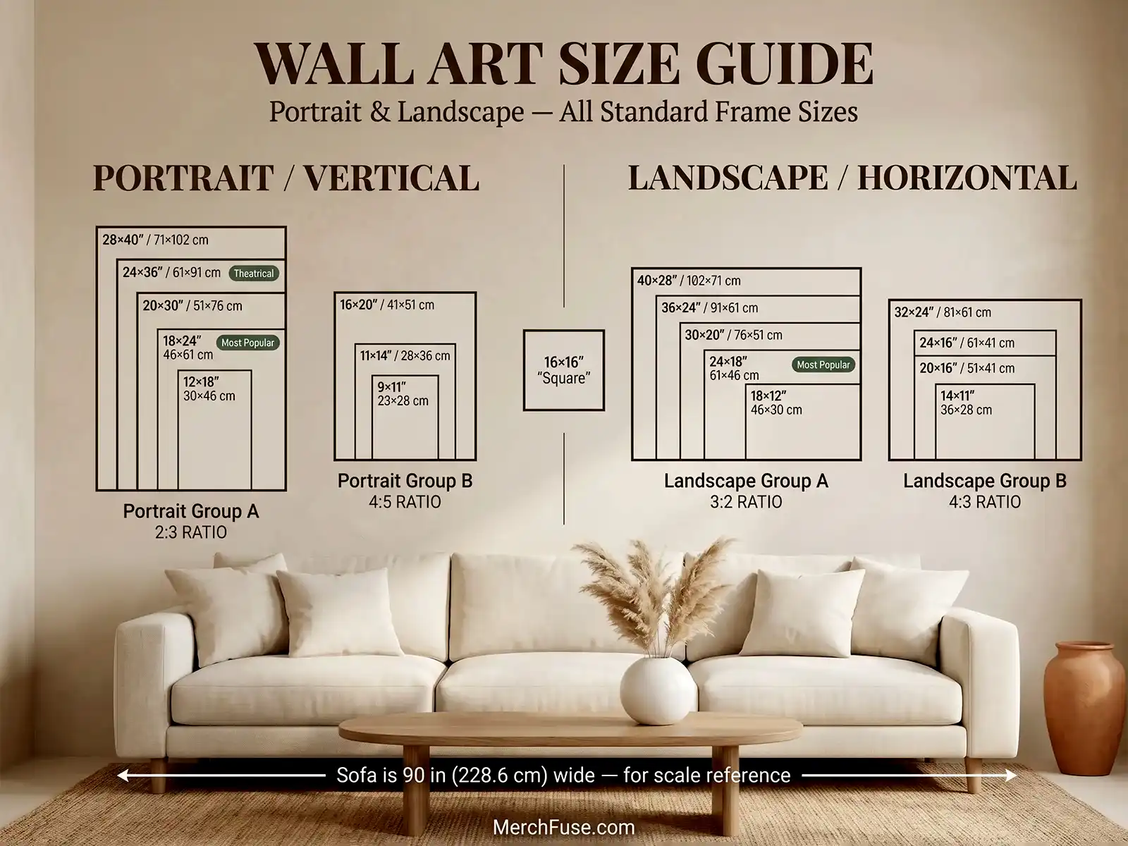
All sizes shown to scale — portrait & landscape orientations
After It Arrives
How to Frame & Display Your Print
Four simple steps, tube to wall — no tools, no specialist knowledge.
-
Unroll & Let It Relax
Remove from the tube and lay face-down on a clean flat surface for 20–30 minutes. The 200 GSM matte stock self-relaxes — any shipping curl releases without heat or moisture.
-
Pick a Standard Frame
Every size matches a standard off-the-shelf frame — IKEA HOVSTA, Target Threshold, Amazon Basics. An 18×24" drops in directly. No trimming, no custom framing.
-
Glass Is Optional
Our matte finish eliminates glare, so hanging without glass often shows more detail — particularly deep blacks and shadow gradients. If you prefer glass, use UV-protective acrylic.
-
Avoid Direct UV Sunlight
Archival pigment inks are rated for 75+ years indoors. Choose a wall with indirect or diffused natural light for the longest possible display life.
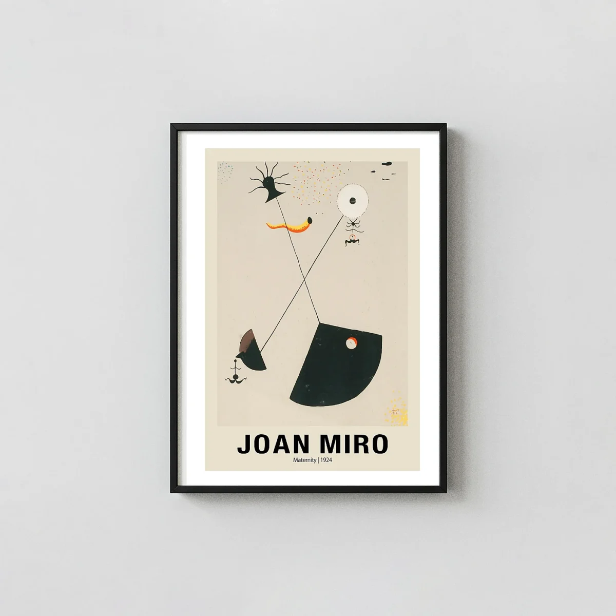
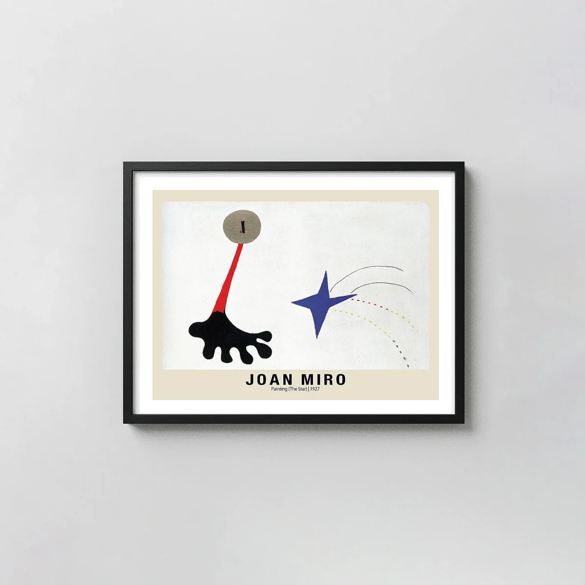
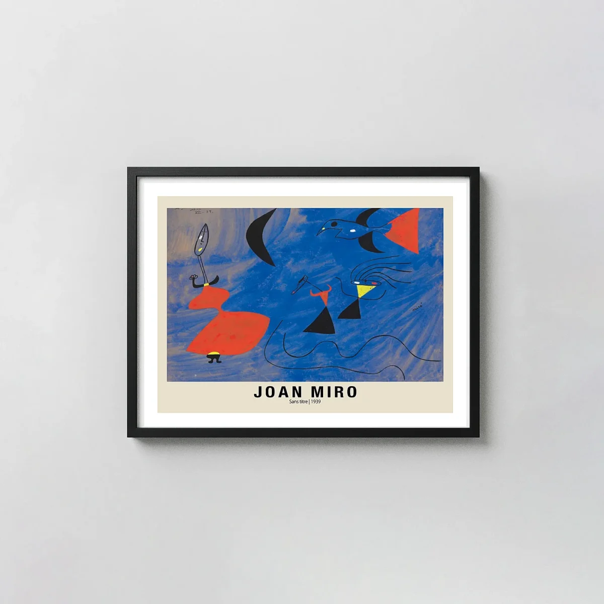
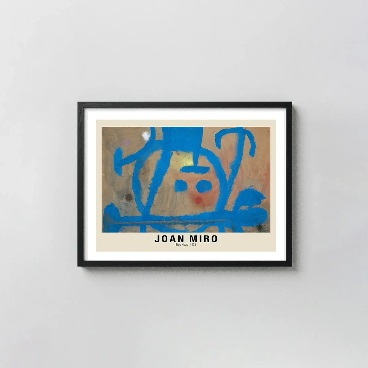
YOU MIGHT ALSO LIKE