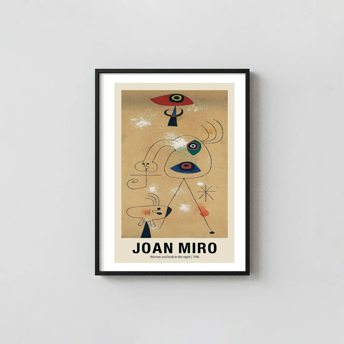


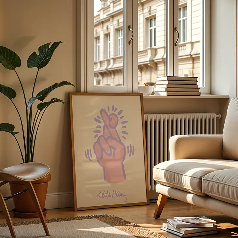
Authentic Joan Miro Print – Women and Birds at Sunrise 1946 Wall Art
This Joan Miro Print captures the vivid surrealist composition of the 1946 original with archival precision. Each mid-century modern poster is produced on 200 GSM museum-grade matte paper for a glare-free finish.
The Artwork
About This Print
This Joan Miro Print serves as a faithful reproduction of the 1946 oil painting titled Women and Birds at Sunrise. Created during a significant period of the artist’s professional development, this work reflects a sophisticated engagement with surrealist automatism and geometric abstraction. The composition utilizes a pale azure background that suggests the early morning light of the Mediterranean coast. Against this airy field, a series of thick black lines and delicate filaments create a network of interconnected forms. These shapes represent stylized figures and avian symbols, which are foundational elements of the artist’s personal iconographic dictionary. Choosing a Joan Miro Print allows collectors to bring the rhythmic complexity of 20th-century Spanish abstraction into a contemporary living space.
A Deep Analysis of the Joan Miro Print
The visual structure of this piece relies on a deliberate balance between heavy, grounded shapes and ethereal, floating lines. The central figure is defined by a series of ovoid forms and sharp angles, rendered in a striking combination of cadmium red and deep blue. A large yellow oval with a concentric red and black eye serves as a primary focal point, drawing the gaze toward the middle of the composition. This Joan Miro Print emphasizes the contrast between these saturated pigments and the atmospheric quality of the light blue background. To the right, a large, translucent triangle containing another eye-like motif suggests the presence of a bird in flight, blurred by the shifting light of dawn. The arrangement feels both spontaneous and mathematically calculated.
Color Theory and Iconographic Symbolism
The use of color in this 1946 work is symbolic of the natural world and the human psyche. Red circles represent the sun or the life force, while the blue and yellow accents provide a rhythmic counterpoint to the dominant black ink. The black lines vary in thickness, ranging from bold, structural boundaries to thin whiskers that sprout from the edges of the characters. This specific Joan Miro Print emphasizes the raw, graphic nature of the original brushstrokes, preserving the texture of the charcoal and oil application from the era. Each element is placed to ensure that no single side of the image feels heavier than the other, resulting in a sense of suspended animation that is characteristic of post-war surrealism.
Museum-Quality Physical Specifications
- Paper Quality: Printed on 200 GSM museum-grade matte paper for a premium, non-reflective finish.
- Ink Technology: Utilizes fade-resistant archival inks that preserve color depth for decades.
- High-Resolution Detail: Captures every subtle variation in the original 1946 brushwork.
- Standard Sizing: Produced in standard frame-ready dimensions for easy professional or DIY framing.
- Durability: The heavy paper weight prevents curling and ensures the print remains flat behind glass.
Integration with Interior Design
Our Joan Miro Print uses archival inks to ensure that the vivid reds and deep blacks remain sharp regardless of the lighting conditions in your room. The mid-century modern aesthetic of the piece makes it a versatile addition to various decor styles, from minimalist industrial lofts to more traditional gallery spaces. Because the primary colors are set against a neutral light blue, the print acts as a bridge between different furniture tones and architectural features. It functions exceptionally well as a central feature in a study or as part of a larger collection of abstract art. Owning a Joan Miro Print connects the viewer to the legacy of the Spanish avant-garde, providing a window into the mind of one of the most influential artists of the modern era.
This is fan-inspired artwork and an original artistic interpretation. It is not affiliated with, endorsed by, or officially licensed by any studio, production company, label, artist, photographer, or rights holder.
What You're Getting
Premium Quality, Every Print
Not all posters are created equal. Here's exactly what makes a MerchFuse print different.
Paper Quality
200 GSM Matte Stock
Genuine heavyweight fine art matte paper — noticeably thicker than standard poster stock. Resists curling and feels substantial on the wall.
Ink & Longevity
75-Year Archival Inks
Fade-resistant pigment inks rated for 75+ years of indoor display — the same technology used in professional photography studios and fine art galleries.
Packaging
Rigid Tube Shipping
Every order hand-rolled in tissue paper inside a reinforced protective tube with end-cap cushioning — arrives perfectly flat, crease-free, mint condition, guaranteed.
Before You Order
Find Your Perfect Print Size
All sizes match standard off-the-shelf frames — IKEA, Target, and Amazon frames fit straight away.
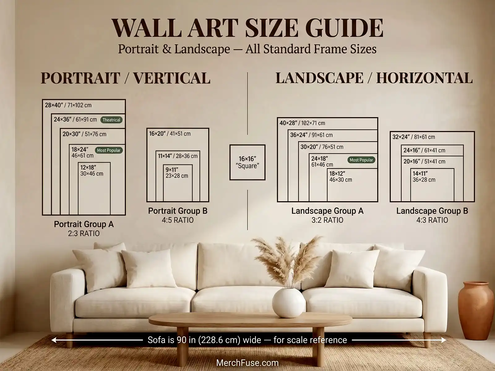
All sizes shown to scale — portrait & landscape orientations
After It Arrives
How to Frame & Display Your Print
Four simple steps, tube to wall — no tools, no specialist knowledge.
-
Unroll & Let It Relax
Remove from the tube and lay face-down on a clean flat surface for 20–30 minutes. The 200 GSM matte stock self-relaxes — any shipping curl releases without heat or moisture.
-
Pick a Standard Frame
Every size matches a standard off-the-shelf frame — IKEA HOVSTA, Target Threshold, Amazon Basics. An 18×24" drops in directly. No trimming, no custom framing.
-
Glass Is Optional
Our matte finish eliminates glare, so hanging without glass often shows more detail — particularly deep blacks and shadow gradients. If you prefer glass, use UV-protective acrylic.
-
Avoid Direct UV Sunlight
Archival pigment inks are rated for 75+ years indoors. Choose a wall with indirect or diffused natural light for the longest possible display life.
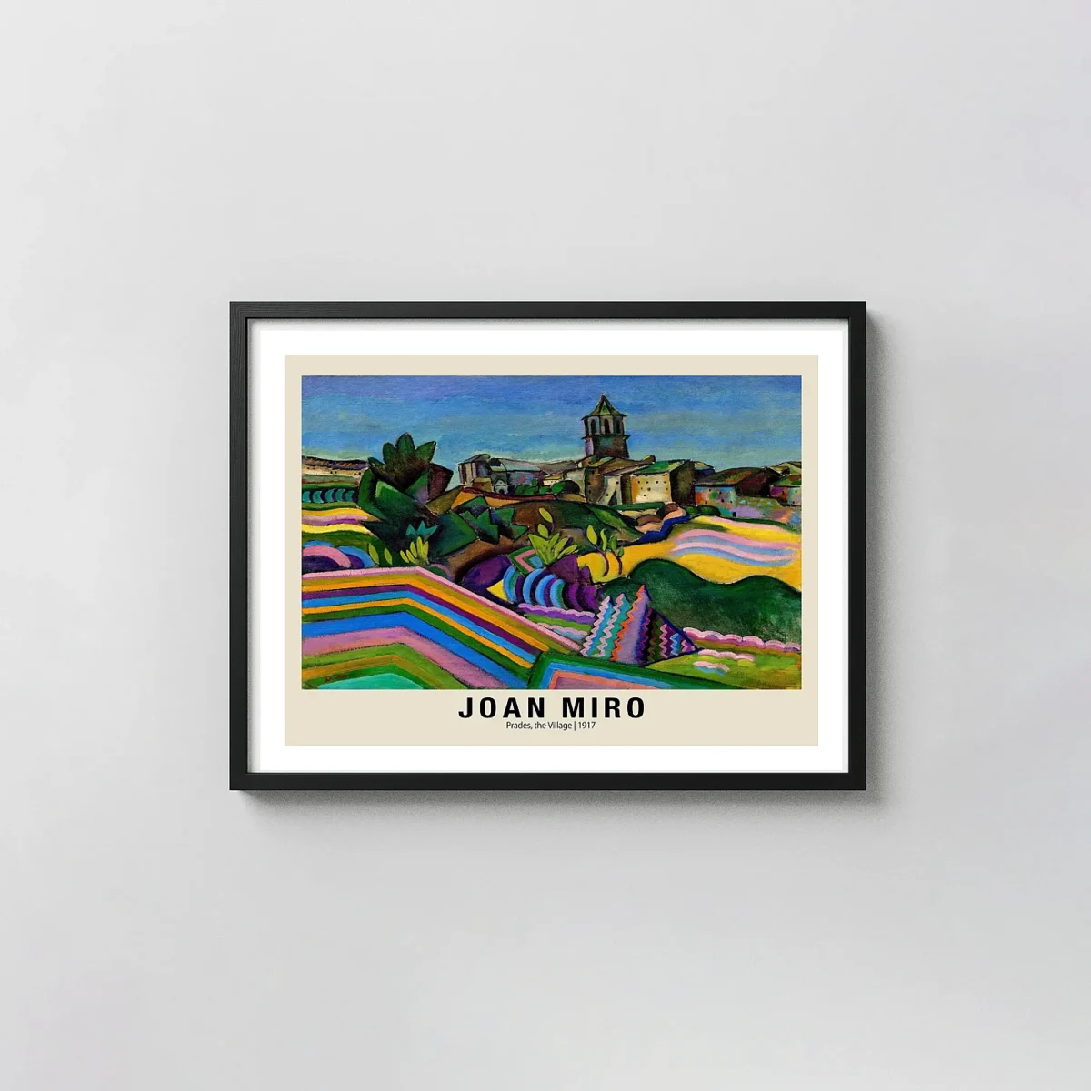
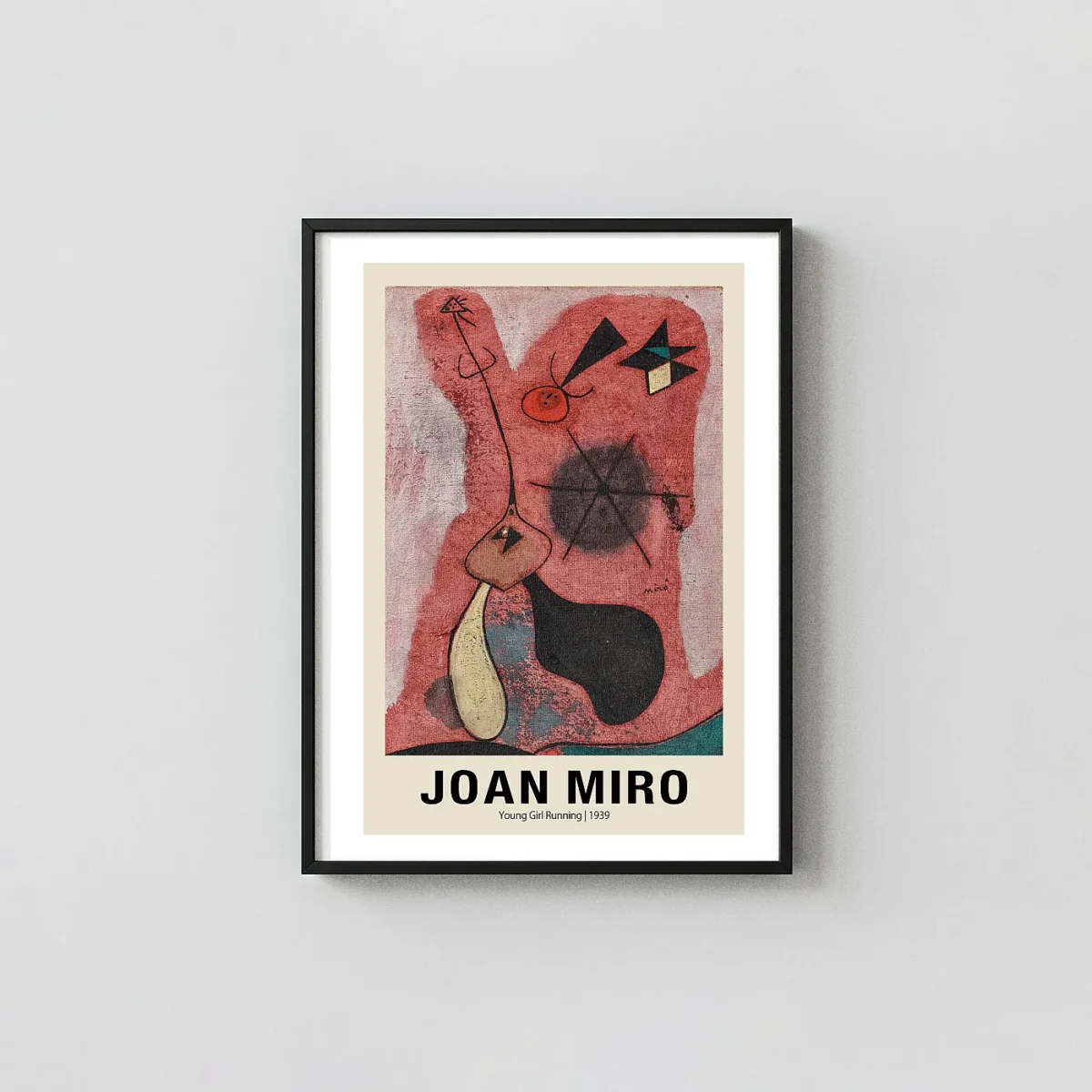
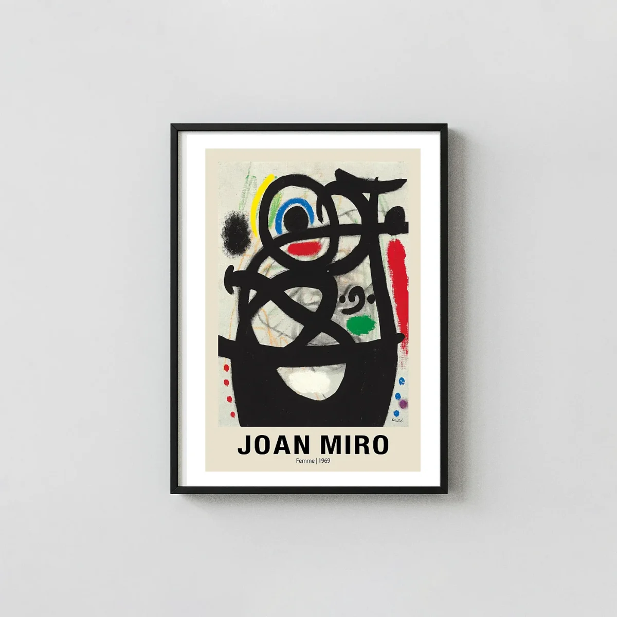
YOU MIGHT ALSO LIKE