

Classic Rothko No 10 1958 – Abstract Expressionist Color Field Art Print
Rothko No 10 1958 displays deep earth tones through its iconic stacked rectangular forms. This abstract art poster is printed on 200 GSM matte paper for a glare-free finish.
The Artwork
About This Print
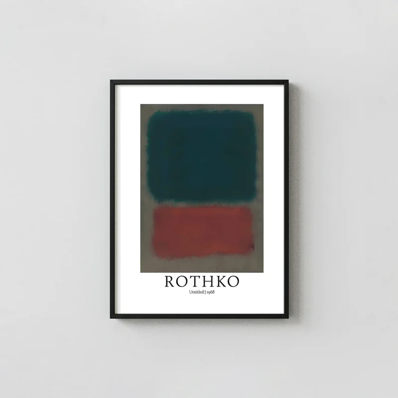
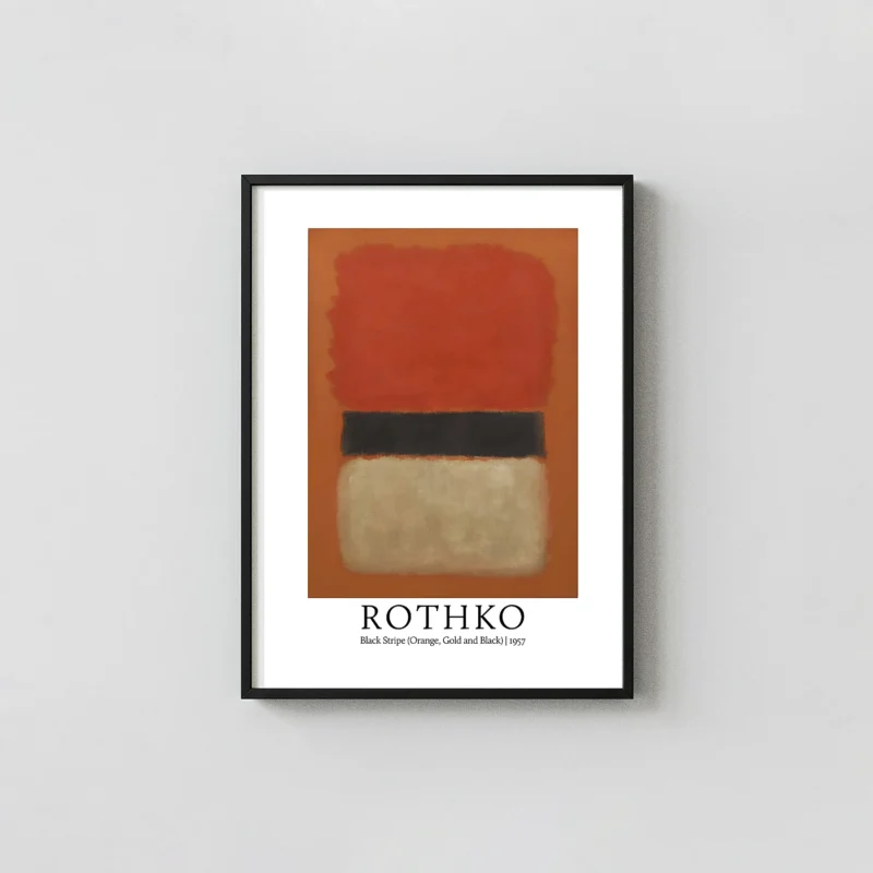
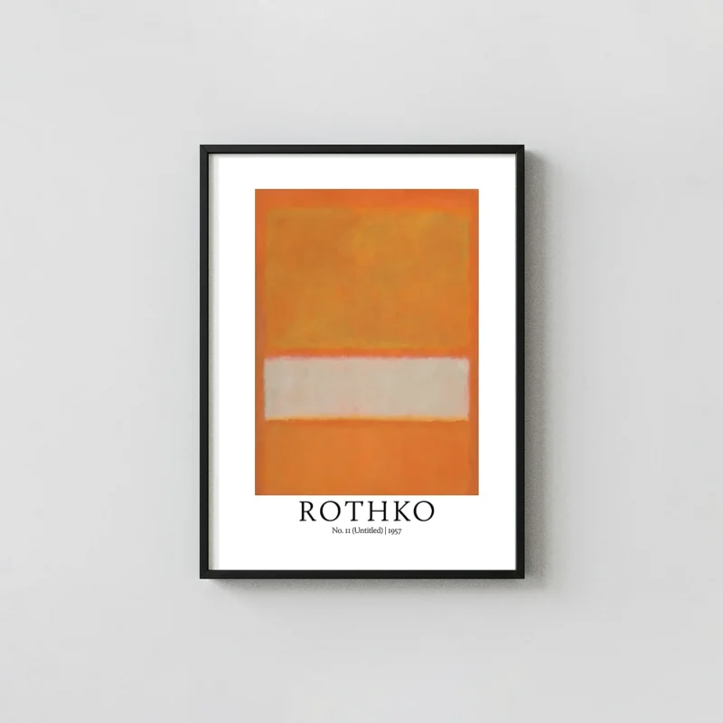
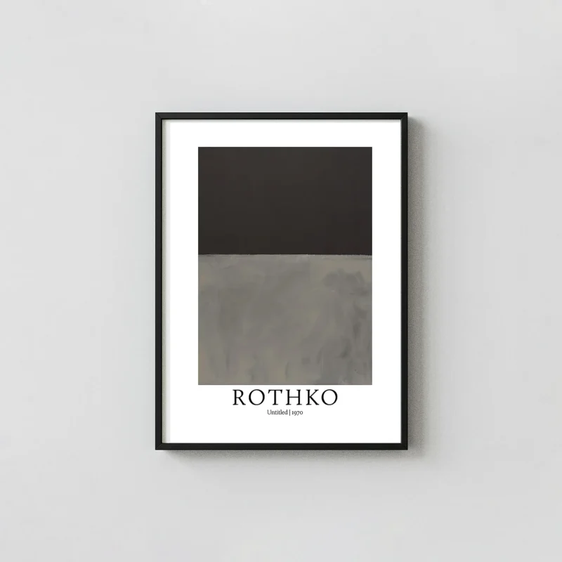
Rothko No 10 1958 is a defining representation of the Abstract Expressionist movement’s focus on color and form. Produced during a pivotal period in the artist’s career, this specific composition illustrates the transition toward the darker, more somber palettes that characterized his later work. The imagery consists of two primary rectangular fields that appear to hover within a dark, nebulous perimeter. The upper section is rendered in a saturated, earthy orange-red, while the lower section presents a desaturated, shadowy brown. These forms are not rigid; their edges are feathered and blurred, allowing the colors to bleed into the surrounding black tones, creating a sense of depth and atmospheric vibration.
The Visual Language of Rothko No 10 1958
In analyzing the structure of Rothko No 10 1958, one observes the meticulous layering of pigments. Each color field print in this style relies on the interaction of light and thin washes of paint to achieve its glow. The dark border functions as a window, drawing the viewer’s eye into the center where the warm tones reside. This abstract art poster captures the nuances of the original brushwork, from the visible strokes at the margins to the smooth, meditative centers of the internal shapes. The balance between the warm sienna and the cool, dark umber creates a visual tension that is central to the mid-century aesthetic.
For collectors seeking modern wall art that offers both historical significance and visual intensity, the Rothko No 10 1958 reproduction is an ideal choice. The work avoids literal representation, instead focusing on the emotional weight conveyed through pure hue and scale. This approach was revolutionary in 1958 and remains a cornerstone of contemporary interior design. Whether displayed in a brightly lit living area or a dimly lit study, the shifts in tone within the print react to the environment, much like the original canvases intended.
Technical Specifications and Material Quality
Our commitment to quality ensures that every archival art print meets museum standards. We use 200 GSM museum-grade matte paper, which provides a heavy, premium feel and prevents unwanted reflections from indoor lighting. The use of professional large-format printers and archival-quality inks means the deep browns and vibrant oranges of the Rothko No 10 1958 will remain vivid for decades without fading. This level of fidelity is essential for capturing the subtle gradients and textures that define color field painting.
- Paper Weight: 200 GSM museum-grade matte finish.
- Ink Type: Fade-resistant archival inks for long-term color stability.
- Print Resolution: High-definition 300 DPI for sharp, clear details.
- Framing: Ships unframed in protective packaging, ready for standard frames.
Integrating the Rothko No 10 1958 into your gallery wall decor provides a sophisticated focal point. Its earthy palette complements a wide range of furniture styles, from natural wood textures to industrial metal accents. As a museum quality gallery print, it serves as a bridge between high-art history and accessible home decoration. The large-format nature of the design allows it to anchor a room without the need for additional ornamentation, maintaining a clean and minimalist aesthetic.
The Rothko No 10 1958 print is more than just a decorative item; it is an exploration of human perception and the physical presence of color. By removing the distractions of subject matter, the print invites the viewer to experience the relationship between the dark void and the inner light of the rectangles. This reproduction honors the legacy of the 1950s New York art scene, bringing a piece of the gallery experience into your personal space with exceptional clarity and depth.
This is fan-inspired artwork and an original artistic interpretation. It is not affiliated with, endorsed by, or officially licensed by any studio, production company, label, artist, photographer, or rights holder.
What You're Getting
Premium Quality, Every Print
Not all posters are created equal. Here's exactly what makes a MerchFuse print different.
Paper Quality
200 GSM Matte Stock
Genuine heavyweight fine art matte paper — noticeably thicker than standard poster stock. Resists curling and feels substantial on the wall.
Ink & Longevity
75-Year Archival Inks
Fade-resistant pigment inks rated for 75+ years of indoor display — the same technology used in professional photography studios and fine art galleries.
Packaging
Rigid Tube Shipping
Every order hand-rolled in tissue paper inside a reinforced protective tube with end-cap cushioning — arrives perfectly flat, crease-free, mint condition, guaranteed.
Before You Order
Find Your Perfect Print Size
All sizes match standard off-the-shelf frames — IKEA, Target, and Amazon frames fit straight away.
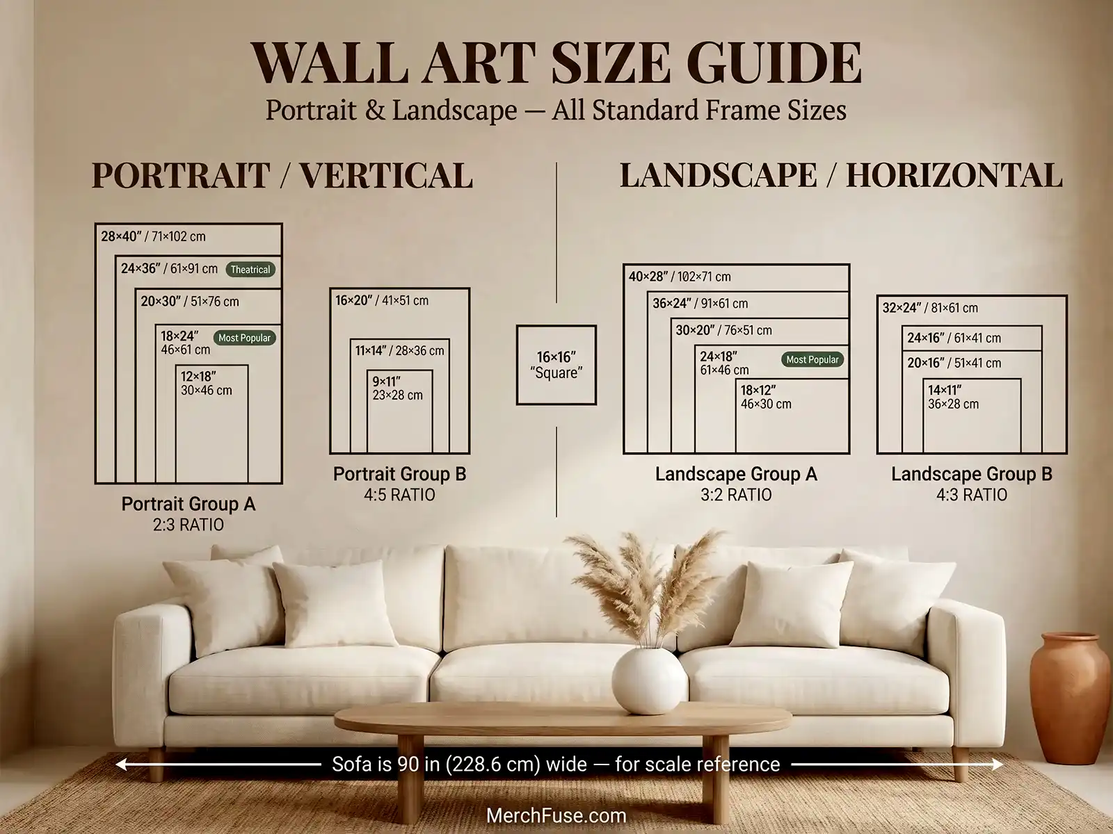
All sizes shown to scale — portrait & landscape orientations
After It Arrives
How to Frame & Display Your Print
Four simple steps, tube to wall — no tools, no specialist knowledge.
-
Unroll & Let It Relax
Remove from the tube and lay face-down on a clean flat surface for 20–30 minutes. The 200 GSM matte stock self-relaxes — any shipping curl releases without heat or moisture.
-
Pick a Standard Frame
Every size matches a standard off-the-shelf frame — IKEA HOVSTA, Target Threshold, Amazon Basics. An 18×24" drops in directly. No trimming, no custom framing.
-
Glass Is Optional
Our matte finish eliminates glare, so hanging without glass often shows more detail — particularly deep blacks and shadow gradients. If you prefer glass, use UV-protective acrylic.
-
Avoid Direct UV Sunlight
Archival pigment inks are rated for 75+ years indoors. Choose a wall with indirect or diffused natural light for the longest possible display life.
YOU MIGHT ALSO LIKE