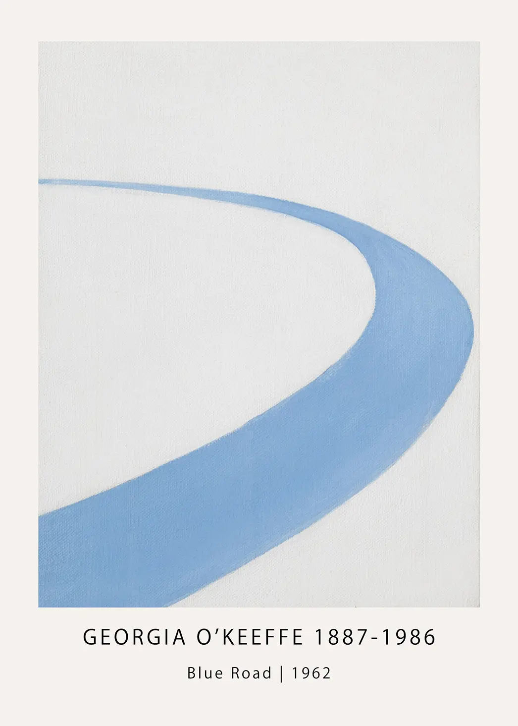

Classic Mark Rothko No 1 1962 – Abstract Expressionism Wall Art Print
Mark Rothko No 1 1962 features bold rectangular blocks of orange and crimson red on a soft cream background. This color field painting is reproduced on museum-grade matte paper for a professional finish.
What You Will Receive
- Made to order, museum-grade art print. Frame not included unless stated.
- Printed on 200 GSM premium matte paper for crisp detail and zero glare.
- Archival giclée inks that resist fading for decades.
- Multiple size options. Use the selector above.
- Protective packaging: rigid mailer or sturdy tube.
Print Quality
Every print is produced using state-of-the-art giclée technology on heavyweight 200 GSM matte paper. The non-reflective surface eliminates glare while the archival pigment inks deliver rich, accurate colours designed to last a lifetime.
Size Guide
For walls above furniture, choose a print roughly two thirds to three quarters the width of the piece below it. Smaller sizes up to 11×14 inches suit gallery walls. Larger formats of 18×24 inches and above create striking focal points.
Verified Customer Reviews
Shipping
Every order is printed on demand. Processing takes 3 to 5 business days, then ships free worldwide with tracking.
| Region | Processing | Delivery | Total |
|---|---|---|---|
| USA | 3–5 days | 2–6 days | 5–11 days |
| Canada | 3–5 days | 5–10 days | 8–15 days |
| UK & Europe | 3–5 days | 5–10 days | 8–15 days |
| Australia & NZ | 3–5 days | 8–15 days | 11–20 days |
| Asia | 3–5 days | 7–15 days | 10–20 days |
| Rest of world | 3–5 days | 10–20 days | 13–25 days |
📦 Packaging
Prints up to 12×18 inches ship flat in rigid cardboard mailers with backing board. Larger prints are rolled in sturdy tubes with protective end caps. Every package includes moisture barriers and Handle With Care labels.
Returns and Replacements
- 30-day return window from delivery. No questions asked.
- Report damage within 48 hours with photos for a free replacement.
- Full refunds for eligible returns in original condition.
- Cancel before production starts for a complete refund.
- Return shipping covered for defective or incorrect items.
Need help? info.merchfuse@gmail.com
How to Care for Your Print
Follow these steps to keep your print looking gallery fresh for decades.
Handling
Allow rolled prints to relax flat for 30 to 60 minutes. Handle by the edges with clean, dry hands and avoid touching the printed surface.
Placement
Avoid direct sunlight, heat sources and high humidity areas. North-facing walls receive less UV. Use LED or incandescent lighting instead of fluorescent.
Framing
Use acid-free mats and UV protective glass or acrylic for maximum longevity. Leave a small gap between print and glazing for airflow.
Cleaning
Dust framed glass with a soft cloth. Spray the cloth, not the glass. For unframed prints, use a dry microfibre cloth and never apply liquids to the surface.
Climate
Keep temperature at 18–24 °C and humidity at 40–60%. Avoid attics, basements and garages where conditions swing widely.
Storage
Store flat in acid-free folders, interleaved with tissue paper, in a cool dark place. Never fold. Check stored prints annually.
⚠️ Avoid
- Prolonged direct sunlight or fluorescent lighting.
- Bathrooms, kitchens and areas above heat sources.
- Tape, adhesives or liquids applied directly to the print.
- Rolling with the image facing inward as this can crack the ink layer.
- Extreme or rapid temperature and humidity changes.
📊 Expected Lifespan
- 100+ years when framed with UV protective glazing and indirect light.
- 50–75 years when framed with standard glass and indirect light.
- 25–50 years when stored correctly in darkness.
Mark Rothko No 1 1962 is a definitive example of the late-career brilliance found in the abstract expressionist movement. This specific work utilizes three primary horizontal bands of color that float within a cream-colored field, creating a sense of depth and vibration through the application of thin, translucent layers. The orange and red pigments used in this 1962 composition reflect the focus on the emotional weight of color, moving away from representation to focus entirely on human experience through visual form.
The Visual Language of Mark Rothko No 1 1962
The structure of Mark Rothko No 1 1962 follows the established multiform style that the artist pioneered in the late 1940s. In this particular piece from the early 1960s, the edges of the rectangular shapes are soft and feathered, allowing the colors to bleed into the surrounding background. This technique results in a luminous effect where the center orange block appears to hover in space. The top bar of darker crimson provides a weightier anchor, while the bottom band of red-orange offers a grounded foundation to the composition.
Color Field Theory and Application
When you display Mark Rothko No 1 1962, the visual impact relies on the quality of the print. Our reproduction captures the subtle shifts in tone and the visible brushwork that defines the original canvas. The use of saturated orange against a neutral background is intended to provoke an immediate visceral reaction. Collectors of mid-century modern decor often choose this piece for its ability to anchor a room without the need for complex narrative elements. The simplicity of the form hides a complex layering process where different washes of pigment interact to create new, secondary shades at the borders.
Museum-Grade Materials for Lasting Color
To ensure that the intense hues of Mark Rothko No 1 1962 remain vibrant for decades, we utilize a 200 GSM museum-grade matte finish paper. This heavy-weight stock prevents the paper from buckling and provides a non-reflective surface that honors the original matte texture of the oil and acrylic mixtures. Combined with fade-resistant archival inks, this print maintains its integrity even in well-lit rooms. The professional large-format printing process ensures that every detail, from the slight splatters of paint to the thinning of the wash at the edges, is rendered with absolute clarity.
The Mark Rothko No 1 1962 print serves as a focal point for minimalist or modernist interior designs. Its vertical orientation and balanced proportions make it suitable for large wall spaces in living areas, offices, or galleries. Unlike traditional representational art, this piece invites the viewer to experience the color field as an environment rather than a picture. The interaction between the warm tones suggests a solar intensity or a glowing embers effect, depending on the surrounding light conditions in your home.
Ordering a Mark Rothko No 1 1962 print allows you to bring a piece of art history into your personal collection. This work was created during a period where the artist was experimenting with larger formats and more intense color saturations before his later, darker periods. It represents a moment of high energy and visual power. Our prints are shipped unframed and arrive ready for a standard frame size of your choice, ensuring they fit directly into your existing decor style.
- Printed on 200 GSM museum-grade matte paper for a premium feel.
- Utilizes archival inks to prevent fading over time.
- High-resolution detail capturing the original brushwork and texture.
- Standard sizes available for easy framing.
- Available as a 300 DPI digital download for immediate use.
Choosing the Mark Rothko No 1 1962 for your wall art collection is an investment in a specific aesthetic history. This print is not just a decoration but a study in how color can define space and mood. Whether you are a dedicated fan of the New York School of painters or someone looking for a bold orange abstract art piece, this reproduction meets the highest standards of quality and visual fidelity.
This is fan-inspired artwork and an original artistic interpretation. It is not affiliated with, endorsed by, or officially licensed by any studio, production company, label, artist, photographer, or rights holder.
Price range: $3.90 through $74.90
Price range: $3.90 through $74.90
Price range: $3.90 through $74.90
Price range: $3.90 through $59.90