A movie poster is one of the few wall art decisions that doubles as a genuine personal statement — it says something specific about taste, memory, and what you think is worth putting on a wall. Getting that decision right means thinking beyond the film title and considering the print itself: the paper weight, the image quality, the size relative to the room, and whether the subject fits the space it will actually live in.
Most buyers focus almost entirely on the subject — which film, which scene, which era — and give almost no thought to the physical object. That’s the common failure point. A poorly printed 24×36 on thin paper, curled at the edges and washed out under a light, won’t do justice to even the most iconic image. This guide covers both dimensions: the art decision and the object decision.
What Makes a Movie Poster Worth Displaying for Years
The difference between a poster that looks right on the wall and one that looks like an afterthought comes down to three things: the quality of the source artwork, the quality of the print, and the quality of the presentation. Collectors and interior designers who work with film art regularly will tell you the same thing — the object matters as much as the image.
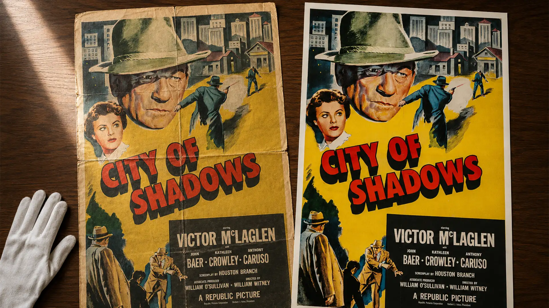
Source artwork quality refers to the resolution and fidelity of the original design. Original theatrical release posters were hand-illustrated or photographically composed at high resolution. Good reproduction prints source from the best available archive files — you should see clean edges, accurate colour reproduction, and genuine tonal depth. If the poster looks soft, slightly blurry, or has colour that looks off compared to reference images online, the source file was inadequate.
Print quality is what the paper and ink actually deliver. The industry standard for fine art reproduction is giclée printing — a process that uses archival pigment-based inks on heavyweight paper, producing prints with colour accuracy and longevity that standard commercial printing cannot match. Paper weight matters too: 200 GSM is the minimum for a print that will hang flat, resist humidity, and feel substantial in the frame. Anything lighter tends to curl at the edges, especially in rooms with temperature variation.
How to Choose the Right Movie Poster Size for Your Wall
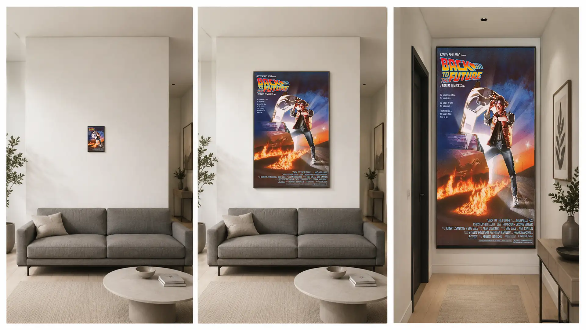
Size selection is the decision most buyers get wrong — usually by choosing something too small for the space. The standard rule of thumb is that wall art should fill roughly 60–75% of the wall width you’re allocating to it. A single poster above a sofa should ideally span two-thirds of the sofa’s width. A print on a narrow corridor wall should leave breathing room on both sides without disappearing into the plaster.
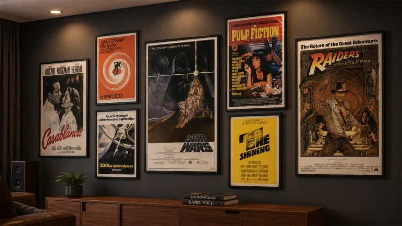
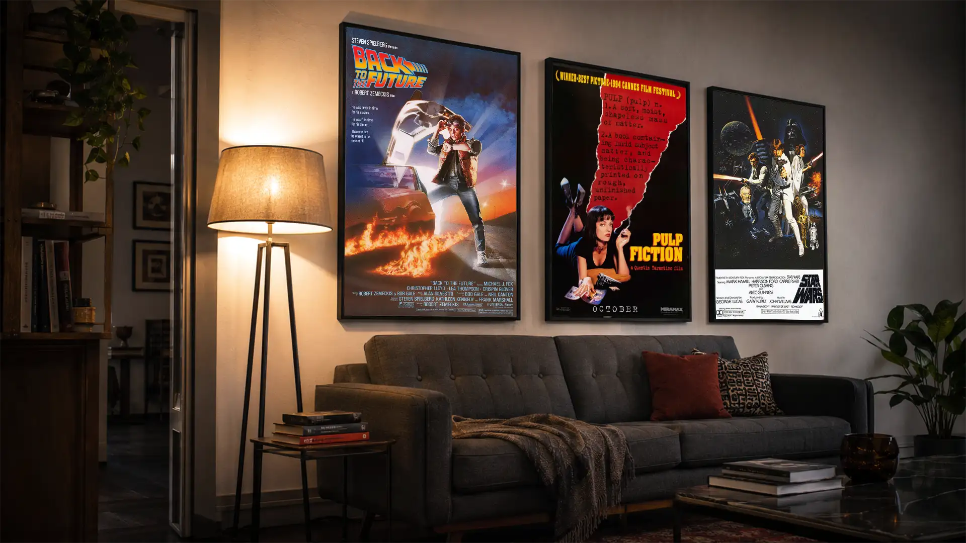
The most practical starting point is to measure the wall space first, then work backward to the poster size. For living room feature walls and home theaters, 24×36 inches is the most versatile choice — it’s the industry standard format, frames are available everywhere, and it creates a genuine focal point without overwhelming a medium-sized room. For gallery walls combining multiple prints, mixing 12×18 and 18×24 prints at different heights creates visual rhythm far more effectively than repeating the same size.
International buyers should note that A1 (594×841mm / 23.4×33.1 inches) is the closest equivalent to 24×36 in metric markets and is often a better fit for frames available in Europe, Australia, and Asia. The aspect ratios differ slightly, so if framing matters, check frame availability in your region before ordering the US size.
For a complete breakdown of every standard size with room-by-room recommendations, see our Poster Size Guide — it covers US and international formats, resolution requirements, and framing compatibility in detail.
Size by Room Type
| Room | Recommended Size | Format Notes | Watch Out For |
|---|---|---|---|
| Living room feature wall | 24×36″ or 18×24″ | Single statement piece; portrait orientation | Going too small — a 12×18 on a large wall disappears |
| Home theater / media room | 24×36″ or 27×40″ (one-sheet) | Cinema one-sheet proportions suit the space naturally | Competing with screen glow — cool-toned palettes work better |
| Hallway or narrow corridor | 12×18″ or 18×24″ | Portrait orientation; leave at least 4–6 inches of margin | Choosing 24×36 in a narrow passage — it feels claustrophobic |
| Home office or study | 18×24″ | Works at desk viewing distance; not too dominant | Strong graphic designs can be distracting in work environments |
| Gallery wall arrangement | Mix of 12×18″ and 18×24″ | Vary sizes intentionally; odd numbers of prints look more natural | All the same size creates visual monotony; use an anchor piece |
Choosing a Movie Poster Style That Suits Your Interior
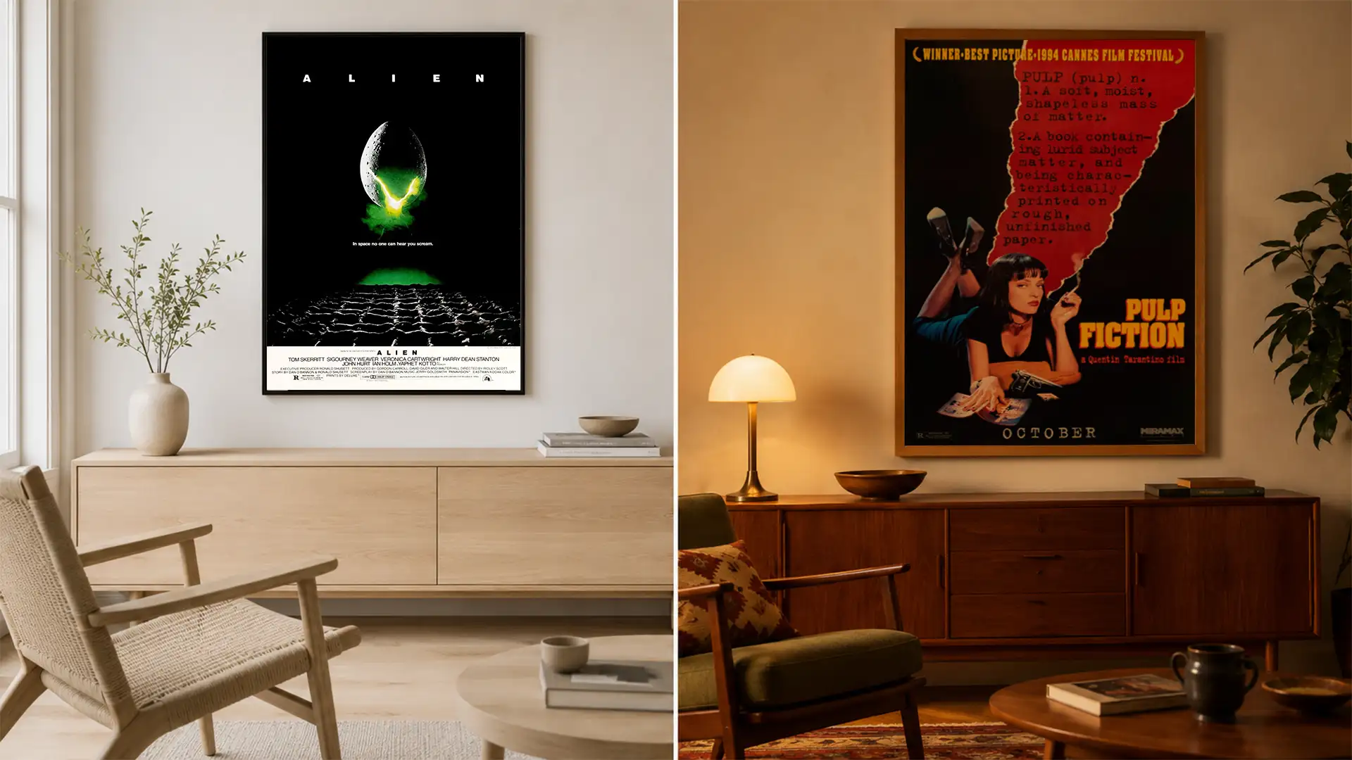
Subject matter is the obvious starting point, but style is what determines whether a poster actually works in a room. A photographic portrait-based poster (think Pulp Fiction’s Uma Thurman or Casablanca’s Bogart and Bergman) sits well in almost any warm-toned interior. A high-contrast graphic design poster (2001: A Space Odyssey’s monolith, the Alien egg against black) suits minimal and modern interiors where it can occupy a wall with almost no competition. Illustrated theatrical posters from the 1970s and 1980s — the Roger Kastel and Drew Struzan style — read like fine art and work particularly well in rooms with warm wood tones and ambient lighting.
Colour palette is the practical filter. Before choosing a poster, pull the dominant colours from the artwork and check them against the room’s existing palette. A poster with a strong blue-grey tone (like The Empire Strikes Back) will work in cool-toned rooms and look jarring in warm ochre or terracotta spaces. Warm vintage travel poster tones — reds, golds, burnt oranges — suit kitchens, dining rooms, and spaces with natural wood furniture. Black-and-white or high-contrast monochrome prints are genuinely versatile and the safest choice when a room’s palette is already complex.
Style by Interior Type
| Interior Style | Poster Style That Fits | Strong Examples | Avoid |
|---|---|---|---|
| Minimal / Scandinavian | High-contrast graphic, monochrome, negative space designs | Alien (1979), Vertigo, Her, Get Out | Busy illustrated posters with many competing elements |
| Warm / Mid-Century Modern | Illustrated theatrical, warm-palette 1970s–1980s styles | Jaws, Back to the Future, Apocalypse Now | Cold digital-era posters with predominantly blue or grey tones |
| Industrial / Dark | Noir, horror, cyberpunk — high-contrast darks with accent colour | Blade Runner, The Dark Knight, Goodfellas | Pastel or soft-palette prints — they get lost against dark walls |
| Eclectic / Art-Forward | Mondo prints, alternative poster art, graphic design-led compositions | Psycho (Saul Bass), A Clockwork Orange, Parasite | Generic promotional photography; one-note commercial poster art |
| Home Theater / Dedicated Cinema Room | Classic theatrical one-sheets, illustrated studio-era prints | Star Wars, The Godfather, Casablanca, 2001 | Overtly digital designs that look screen-generated rather than printed |
Original Posters vs Reproduction Prints: What Buyers Should Know
Original theatrical release posters — particularly pre-1980s one-sheets — are genuinely collectible objects. A well-preserved original Star Wars 1977 Style A (Tom Jung design) in C8 or better condition commands thousands of dollars at auction. First-release Casablanca window cards and lobby cards are museum-level artefacts. If you’re buying originals, authentication matters: look for paper stock consistent with the era, printing registration marks, fold lines from the standard one-sheet folding practice, and provenance documentation if the price justifies it.
For the vast majority of buyers, high-quality reproduction prints are the practical and aesthetically equivalent choice for wall display. A giclée reproduction on 200 GSM matte paper from a credible source will reproduce the original artwork at the same visual quality you’d experience looking at the real thing from a normal viewing distance — and it won’t degrade with age if stored and displayed correctly. The key distinction is intent: if you’re building a collection with investment or provenance value, original posters matter. If you want the artwork on your wall looking its best, quality reproductions are the right tool.
Mondo prints occupy the middle ground — limited-edition art prints created by respected designers and illustrators, often commissioned for specific film anniversaries or screenings. They’re not original theatrical posters, but they’re limited in edition, printed to fine art standards, and genuinely collectible in their own right. The Daniel Danger Psycho print is a strong example of this category.
Buying Movie Posters as Gifts: What Actually Works
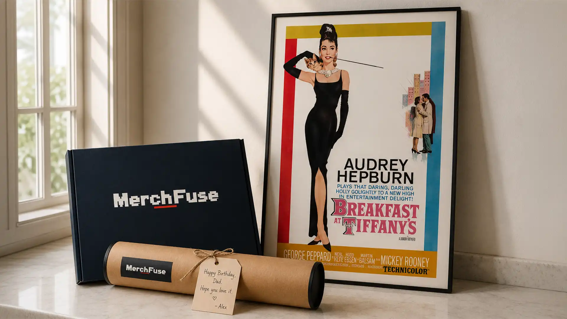
Movie posters are one of the more successful gift categories in wall art — the subject matter does most of the personal connection work. The practical challenge is knowing enough about the recipient’s space to choose something that will work on a wall rather than sit in a tube. A few questions make a significant difference: Does the person have a home theater or dedicated media room? (If yes, the whole-room palette is probably tolerant of almost any classic film subject.) Do they have a gallery wall already? (If yes, a 12×18 print in a complementary style is a more thoughtful choice than a large statement piece.) Is the film in question one they have a specific memory of rather than just generally liking? (Personal specificity always outperforms general appreciation for gifts that end up on walls.)
Print format choice matters for gifts too. A physical print in a rigid protective mailer communicates care and permanence — it’s an object. A high-resolution digital download at $3.90 is a practical choice when you genuinely don’t know the recipient’s wall dimensions, framing setup, or preferred size, as it allows them to print locally at exactly the size they need.
Films and Subject Matter: Choosing Posters With Staying Power
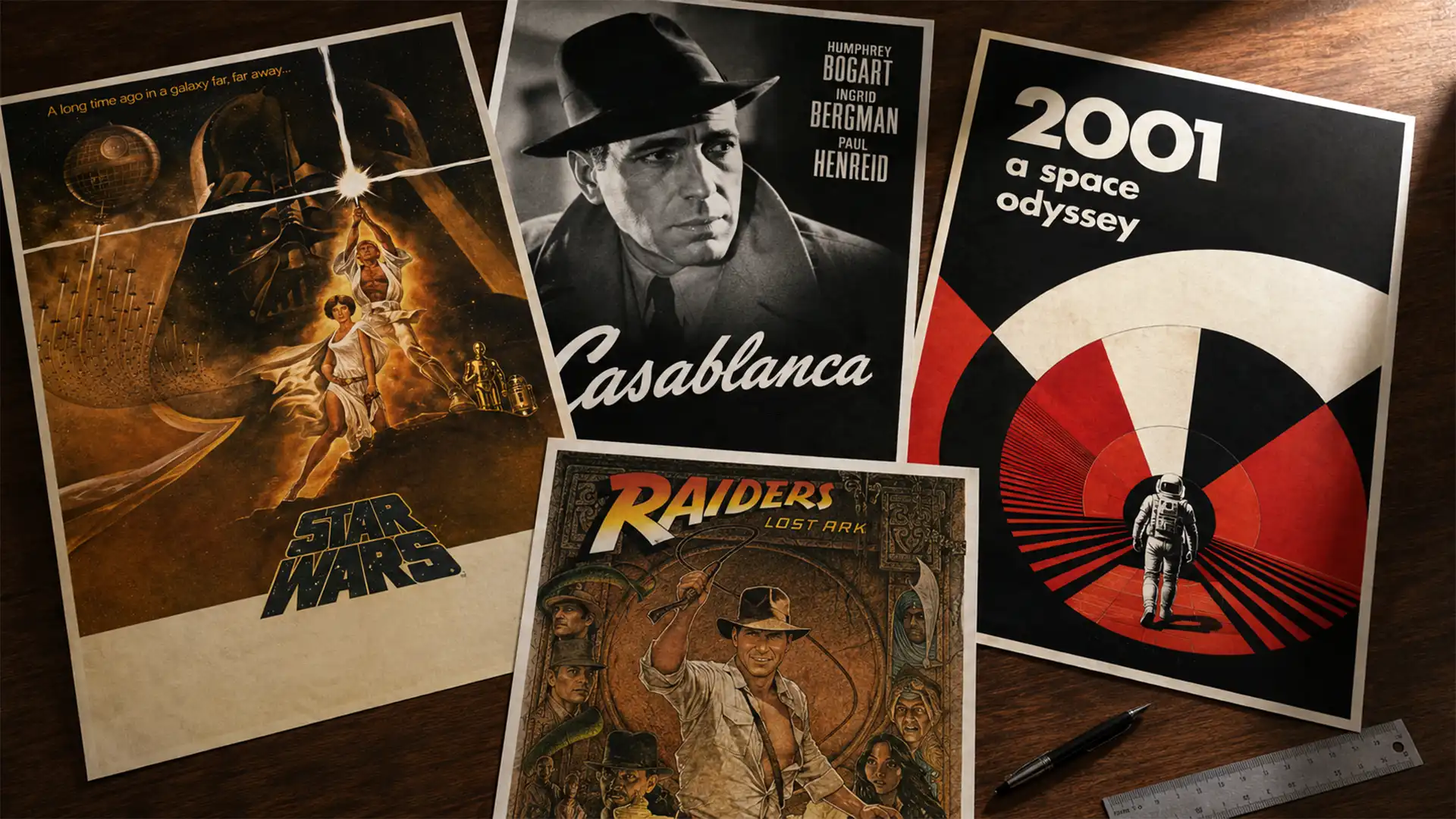
Novelty prints — posters tied to a recent release you’re enthusiastic about right now — can feel dated within a few years if the film doesn’t hold up on revisiting. Films with proven cultural longevity (the Classic Hollywood era, the canonical New Hollywood films of the 1970s–80s, the Kubrick catalogue, the Studio Ghibli library) are safer long-term investments for wall art. You won’t regret a Godfather print or a 2001: A Space Odyssey print on your wall in ten years the way you might regret a rushed streaming-era promotional poster.
That said, personal resonance genuinely matters — a film that shaped you at a specific moment will always have more emotional weight on your wall than something chosen on critical consensus alone. The practical filter is: will this image still interest you in five years? If the answer is confidently yes, that’s the one.
For guidance on which posters have become genuine cultural artefacts, our 50 Best Movie Posters of All Time covers the canonical list with individual design analysis for each entry — useful reading before making any significant poster purchase.
Featured Prints: Posters That Suit Specific Rooms and Buyers
The following selection covers different buyer intents — from home theater focal points to collector-grade limited editions. Each is chosen for a specific reason, not just catalogue presence.
For the Home Theater or Media Room
These prints work specifically well in cinema-dedicated spaces where the subject and palette reinforce the room’s purpose.
The Empire Strikes Back (1980) — Roger Kastel Style B
This is one of the most compositionally sophisticated theatrical posters ever produced. Roger Kastel’s Style B design makes Darth Vader the entire frame — AT-AT walkers and Hoth battle scenes composite directly into his cape and armor, with the hero characters anchoring the lower thirds. The blue-grey-white palette reads as deliberately cool and cinematic, which suits home theater walls specifically well — it doesn’t compete with screen glow, and the icy Hoth tones complement charcoal, navy, or dark wall colours. It’s the stronger choice over the 1977 original if your space is darker and more atmospheric. Printed on 200 GSM matte paper in seven sizes from 9×11″ to 24×36″.
Star Wars A New Hope (1977) — Original Theatrical Poster Version 1
Tom Jung’s original Star Wars composition is operatic in a way that almost no other poster achieves — the triangular arrangement driving the eye upward through Luke, Leia, and the twin suns toward Vader looming in shadow is a masterclass in narrative hierarchy. Where the Empire poster is cold and foreboding, this is warm and heroic. The two work well as a pair for a wider wall or as an anchor piece in a trilogy gallery arrangement. The warm ochre and gold palette fits rooms with wood tones and warmer ambient lighting far better than the Empire poster does. Available in sizes from 9×11″ to 28×40″.
For the Collector or Design-Forward Buyer
These prints appeal to buyers who care about graphic design and poster art as a discipline, not just as film decoration.
Daniel Danger Mondo Poster — Alfred Hitchcock’s Psycho (Bates House)
This is not a promotional movie poster — it’s a piece of commissioned art in the Mondo tradition, designed by Daniel Danger specifically for the Psycho subject. Where standard theatrical posters represent marketing, Mondo prints represent an artist’s response to the film. The Bates house is a subject that rewards a more illustrative, atmospheric treatment than the original Saul Bass theatrical design, and Danger delivers exactly that — intricate, slightly unsettling linework with the kind of detail that rewards close viewing. This print belongs in a study, gallery wall, or anywhere the viewer will spend time looking at it rather than simply passing it. Categorised under Horror and Thriller Posters.
Pulp Fiction — Banksy Parody Print (Vincent & Jules / Banana)
This print layers two canonical cultural references — Tarantino’s Pulp Fiction and Banksy’s banana stencil aesthetic — into a design that works specifically well in eclectic interiors where straight film photography would feel too literal. The subversive, slightly irreverent energy fits spaces that already have an art-forward sensibility: studios, creative offices, apartment living rooms with a mix of art and pop culture. It’s a stronger choice for buyers who want the Pulp Fiction reference without the retro pulp-novel aesthetic of the original Uma Thurman design. Available in multiple sizes.
How to Frame a Movie Poster: What Actually Matters
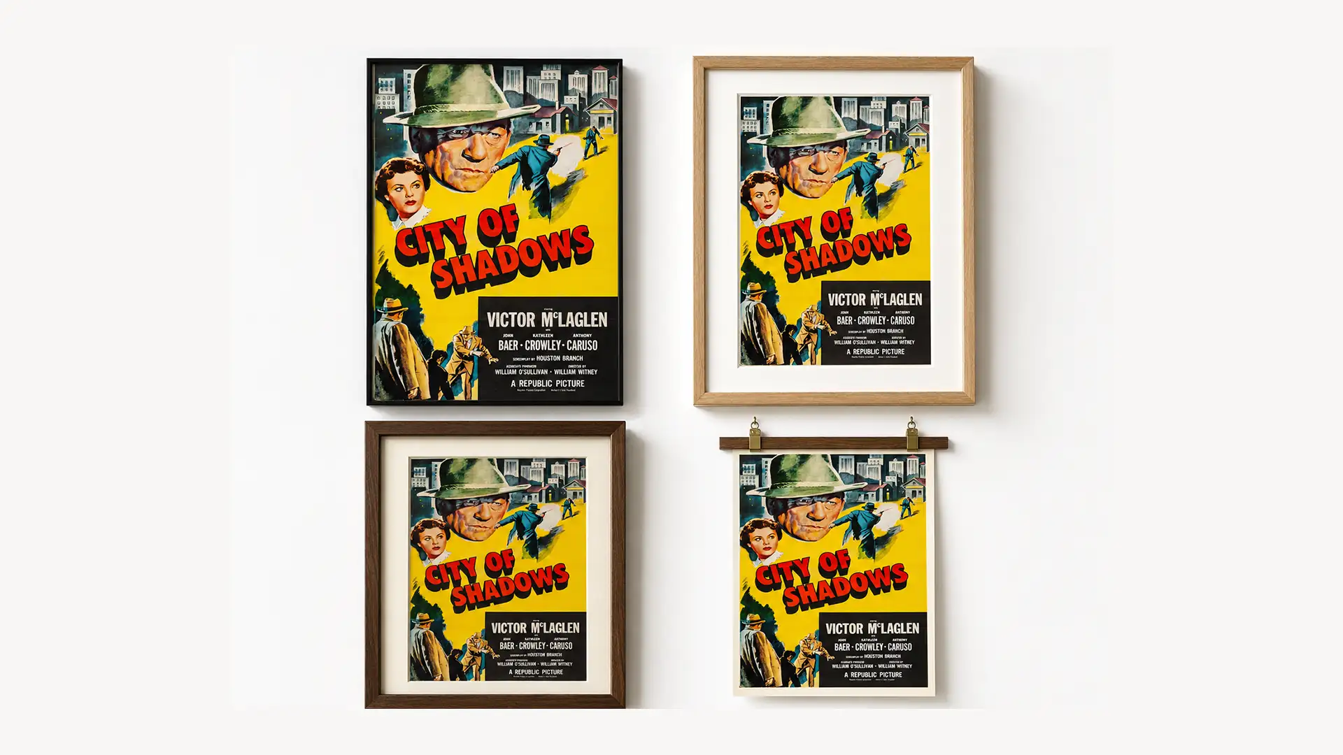
The frame is the first thing people notice before they register the image, and the wrong frame can undermine an otherwise excellent print. Wood frames — natural, walnut, or black — are the most poster-friendly choices because they don’t fight with the artwork. Thin black metal frames suit graphic design-led posters (high-contrast, minimal, typographic). Heavy ornate gold frames are almost never the right choice for a movie poster unless you’re specifically framing a Golden Age Hollywood print in a period-appropriate room.
Glass vs no glass is a practical question. Matte-finish prints on quality paper often look better without glass — the surface shows more textural detail, and there’s no reflectivity to manage. If you choose glass, UV-protective acrylic is the better choice over standard glass: it blocks 97–99% of UV radiation versus roughly 45% for standard float glass, which meaningfully extends the print’s display life. The difference is particularly relevant for prints in rooms with significant natural light.
Matting adds visual breathing room between the print edge and the frame and is especially effective for smaller prints in larger frames — a 12×18 print in an 18×24 frame with a white mat often reads more deliberate and gallery-quality than the same print in a frame that fits exactly. Avoid coloured mats unless you’re specifically matching a dominant tone in the poster itself; white or off-white is reliable in almost every context.
Common Mistakes to Avoid When Buying Movie Posters
Mistake 1: Ordering before measuring the wall. The most common regret in poster buying. A print that arrives too small for a feature wall or too large for a hallway is an expensive disappointment. Measure the exact wall space — width and height — before placing an order, and use the 60–75% rule for the print’s width relative to the furniture or wall section beneath it.
Mistake 2: Ignoring the colour palette. A poster’s dominant colours will interact with everything else on the wall and in the room. A poster that looks striking in a product image on a white background may fight with a warm-toned room or disappear against a dark wall. Pull the poster’s dominant three or four colours before ordering and check them against the room’s existing palette.
Mistake 3: Choosing based on subject alone without checking print quality. The film title you love is necessary but not sufficient. Thin paper, low-resolution source files, and cheap ink produce prints that look flat and lifeless on the wall. Check paper weight (200 GSM minimum), printing process (giclée or equivalent), and whether the source artwork is a high-resolution archive file before committing.
Mistake 4: Buying a non-standard size without checking frame availability first. Standard frames — widely available and affordable — come in specific sizes: 11×17, 12×18, 18×24, 24×36 in the US market. If you order a 20×28 or a 16×22, you’re committing to a custom frame job that can cost more than the print. Stick to standard sizes unless you have a specific reason to deviate.
Mistake 5: Treating a gift poster like a personal purchase. When buying a poster as a gift, size selection matters more than when buying for yourself — you don’t know the recipient’s wall dimensions or framing setup. Either choose a smaller format (12×18 is nearly always manageable) or opt for a digital download that lets the recipient print at their preferred size.
Mistake 6: Hanging in a high-humidity room without UV glass. Kitchens, bathrooms, and rooms above heat sources are poor environments for unprotected prints. If a poster must go in a challenging environment, UV-protective glass or acrylic significantly extends its lifespan. Matte-finish prints are more humidity-resistant than glossy finishes, which are prone to surface sticking in warm damp conditions.
Frequently Asked Questions
What is the standard size for a movie poster?
The standard US theatrical poster is 27×40 inches — the cinema “one-sheet” format. For home display, 24×36 inches is the most common choice because it’s widely available, frames are easy to source, and the size creates a genuine focal point on most residential walls. Internationally, A1 (23.4×33.1 inches / 594×841mm) is the closest metric equivalent and is often the better choice for buyers in Europe, Australia, or Asia where frames are produced to metric dimensions.
How do I know if a movie poster print is good quality?
Three things to check: paper weight (200 GSM is the minimum for a print that hangs flat and resists curling), printing process (giclée with archival pigment inks is the standard for fine art quality), and source resolution (the print should show clean edges, accurate colour, and tonal depth at normal viewing distance — soft or slightly blurry areas indicate a low-resolution source file). Avoid anything described as “standard poster stock” or “satin finish” without further specification.
Are reproduction movie posters worth buying, or should I get an original?
For wall display purposes, a high-quality giclée reproduction is the right choice for most buyers — it will look as good as or better than an original on the wall, it won’t degrade with age if cared for correctly, and it costs a fraction of what genuine originals command. Original theatrical posters matter if you’re building a provenance-based collection with investment intent, but for a home theater or living room wall, a quality reproduction is both practical and aesthetically equivalent at viewing distance.
What movie poster styles work best in a home theater?
Classic theatrical one-sheets from the 1970s–1990s work particularly well — the illustrated painterly style of artists like Roger Kastel and Drew Struzan (Star Wars, Jaws, Back to the Future, Indiana Jones) has a warmth and detail that suits ambient lighting well. For darker, more modern home theaters with controlled lighting, high-contrast graphic designs — Alien, The Dark Knight, Blade Runner — complement the space without competing with screen glow. Avoid posters with predominantly white or pale backgrounds in very dark rooms; they become distracting focal points when the screen is on.
How should I hang a movie poster without damaging the wall?
For temporary or renter-friendly display, command strips rated for the print’s weight work well for framed prints under 3kg. For permanent display, a single picture hook rated appropriately for the combined weight of print and frame is more reliable. Always hang from a wall stud where possible for heavier frames, particularly at 24×36 and above. Avoid poster mounting tape applied directly to the print — it damages the paper surface and leaves residue that can’t be removed cleanly.
What is a Mondo print, and is it worth the premium?
Mondo prints are limited-edition art prints created by commissioned illustrators and designers, typically produced for specific film anniversaries, screenings, or cultural events. They’re not original theatrical posters — they’re contemporary artistic responses to films, produced to fine art standards, often in editions of 100–500. They’re worth the premium if you care about both the film and the artist’s interpretation. They tend to appreciate in value more reliably than mass-market reproductions, particularly for well-regarded artists and beloved films.
How do I build a gallery wall with movie posters?
Start with a single anchor piece — typically your largest print (18×24 or 24×36) — and build outward from it. Mix sizes rather than repeating the same format, and use an odd number of prints (3, 5, or 7) for a more naturally balanced arrangement. Before committing to hanging, lay the arrangement on the floor to check spacing and proportions. A consistent frame style (e.g., all thin black metal, or all natural wood) creates cohesion even when the poster subjects vary widely. Leave 2–3 inches of space between prints — too tight looks cluttered, too wide looks disconnected.
Does framing affect how long a movie poster lasts?
Significantly. UV-protective glass or acrylic extends a print’s display life by blocking the ultraviolet radiation that degrades pigment inks over time — the difference between 50 years of stable colour versus visible fading within a decade in a sun-facing room. Acid-free mats prevent the yellowing and edge-staining that standard cardboard mats cause over time. For prints you genuinely value, the extra cost of UV glazing and acid-free materials is a straightforward decision.
Final Recommendation
The most reliable approach to buying a movie poster you’ll still be glad you chose in five years: measure the wall first, identify two or three films with genuine personal meaning rather than current enthusiasm, then filter by whether the poster’s dominant colour palette works in the room. Choose 24×36 as your default size unless the space clearly calls for something smaller. Prioritise 200 GSM paper weight and giclée printing. For home theaters, illustrated theatrical prints from the 1970s–1990s are almost always the right call — they were designed to work in dark rooms at a distance, and they continue to look right in that context decades later.
For a practical starting point, browse our Movie Posters collection and compare prints by era, style, and subject before committing to a final choice — filtering by genre and decade makes it significantly easier to find prints that will work together if you’re planning a gallery wall or a themed display.