
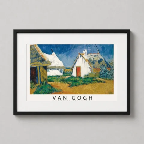
Product description
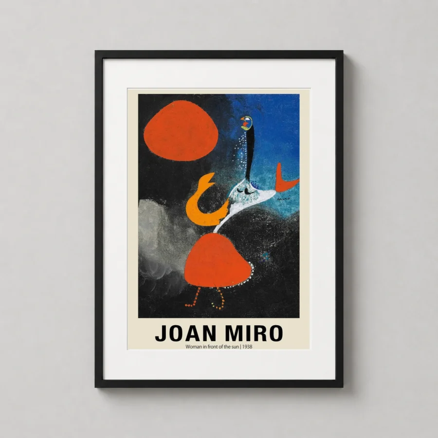
A celestial tension vibrates between the deep midnight sky and the searing heat of a crimson orb. This miro woman sun wall art captures the surrealist master’s 1938 exploration of the female form through a language of symbols and primitive shapes. The composition balances a textured red circle against a chaotic yet controlled background of cerulean blue and shadowy black, where stippled textures and fine lines create a sense of cosmic depth.
This piece reflects a pivotal era in European modernism, where reality was traded for a visceral, subconscious expression. It evokes a feeling of primal energy and cosmic wonder, inviting the viewer to look beyond literal representation and find meaning in the interplay of gravity and weightlessness. The juxtaposition of the grounded red figure and the airy blue void creates a psychological landscape that feels both ancient and futuristic.
This bold print serves as a sophisticated focal point in a minimalist living room, where its primary color palette can anchor a neutral space. It is equally compelling in a home office or creative studio, providing a spark of abstract inspiration for those who appreciate the avant-garde. The contrast of light and dark makes it an excellent choice for a gallery wall dominated by modern graphic works.
Ideal for a student of art history or a collector of Spanish surrealism, this print appeals to those who find beauty in the unconventional. It makes a thoughtful gift for an interior designer looking for a piece with historical weight, or for any homeowner who wants their decor to start conversations rather than blend into the background.
What You’re Getting
Premium Quality, Every Print
MerchFuse prints are designed for collectors and home styling: crisp artwork, archival-feel paper, careful quality checks and secure packaging.
Paper Quality
200 GSM matte stock
Heavyweight fine-art-style matte paper with a smooth, low-glare finish that feels substantial and displays beautifully under frames.
Ink & Longevity
Archival print clarity
Produced with professional print processes for rich color, clean edges and long-lasting indoor display quality.
Packaging
Protected for transit
Each order is packed flat or rolled depending on size, using protective mailers or tubes so the print arrives safely.
Before You Order
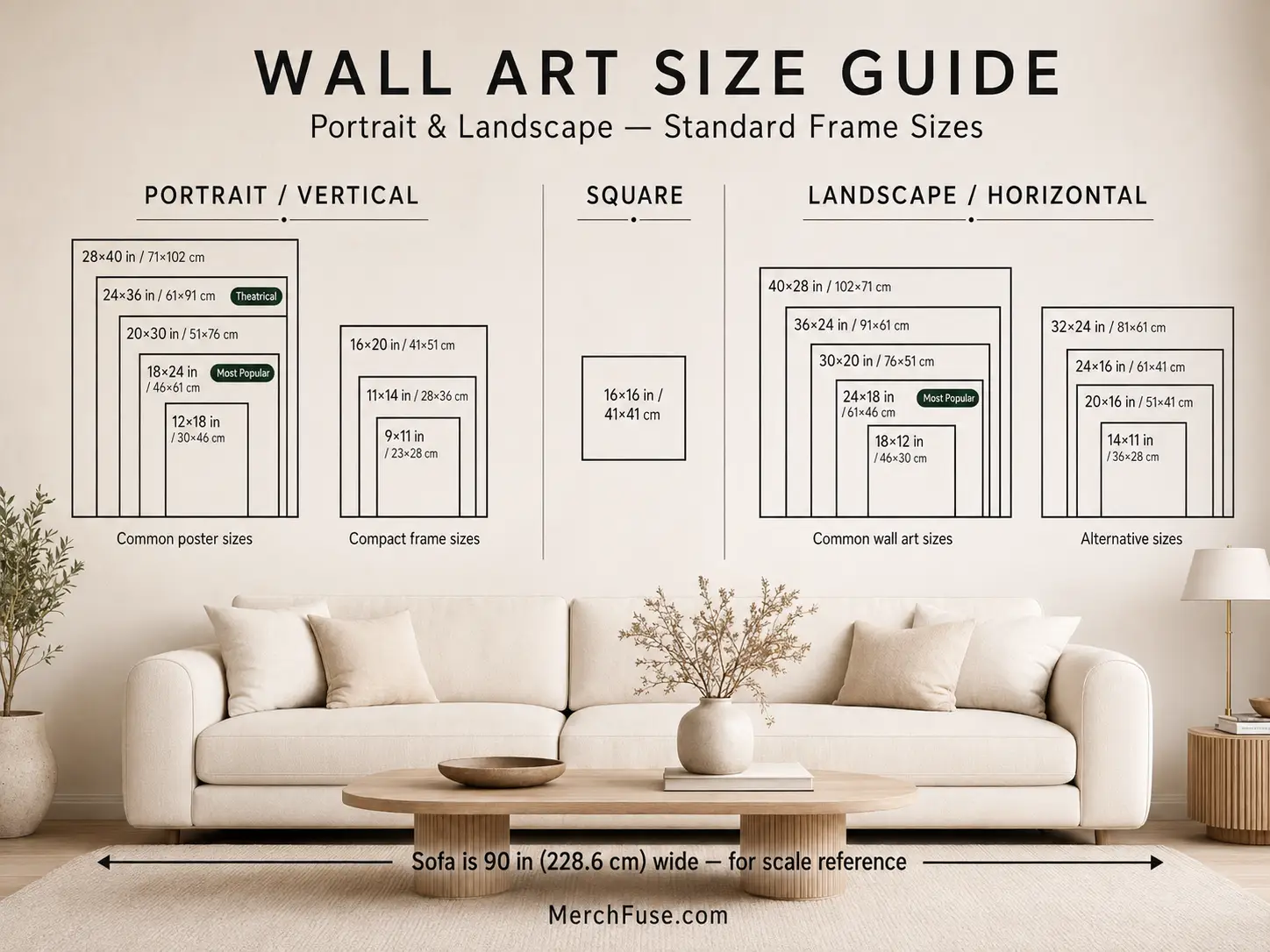
Find Your Perfect Print Size
Choose from frame-ready poster sizes that work with standard off-the-shelf frames and modern gallery-wall layouts.
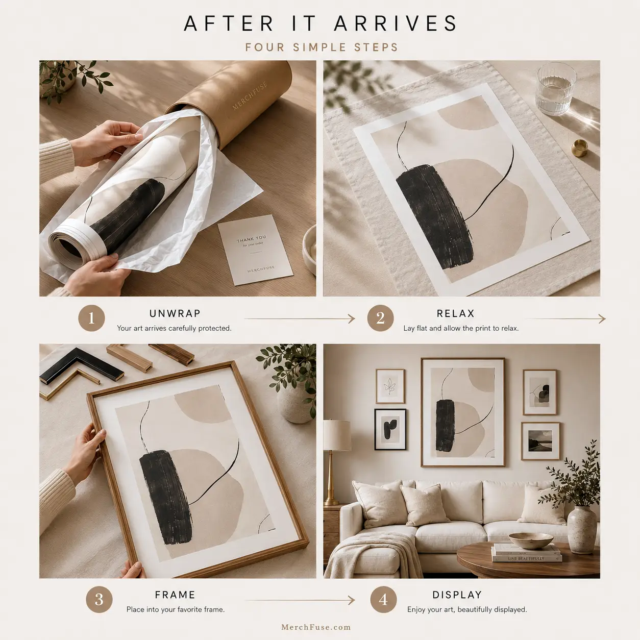
After It Arrives
How to Frame & Display Your Print
A clean tube-to-wall setup: let the print relax, choose a standard frame, then style it as a hero piece or part of a gallery wall.
- Unroll & relaxLay the print face-down on a clean flat surface for 20–30 minutes before framing.
- Pick a standard frameUse a matching off-the-shelf frame; no trimming or custom framing is needed for standard sizes.
- Hang away from moistureAvoid bathrooms, direct sunlight and damp areas for the longest-lasting display.


Reviews
Purchased this artwork? Share how it looks in your space and help the next collector choose with confidence.