Gallery Format
Exhibition Posters
Create the feeling of a curated show at home. Exhibition Posters combine artwork, typography and cultural mood for polished walls that feel intentionally collected.
-
 Abstract Art Prints
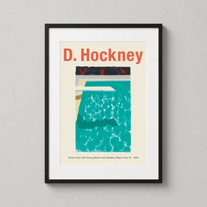
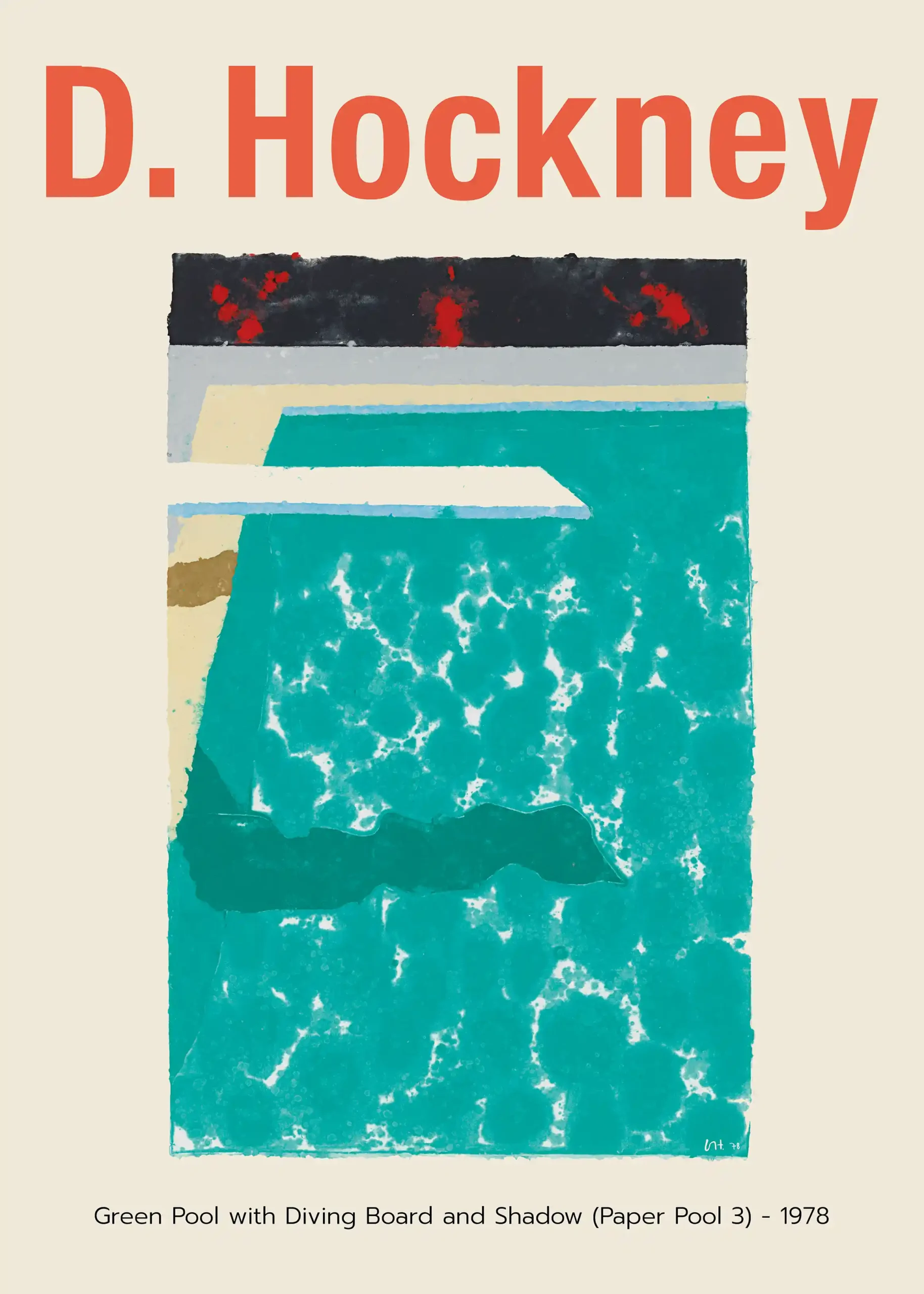
David Hockney Green Pool with Diving Board and Shadow Art Print
From $9.90Select Options This product has multiple variants. The options may be chosen on the product page -
 Art Prints
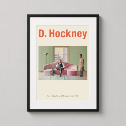
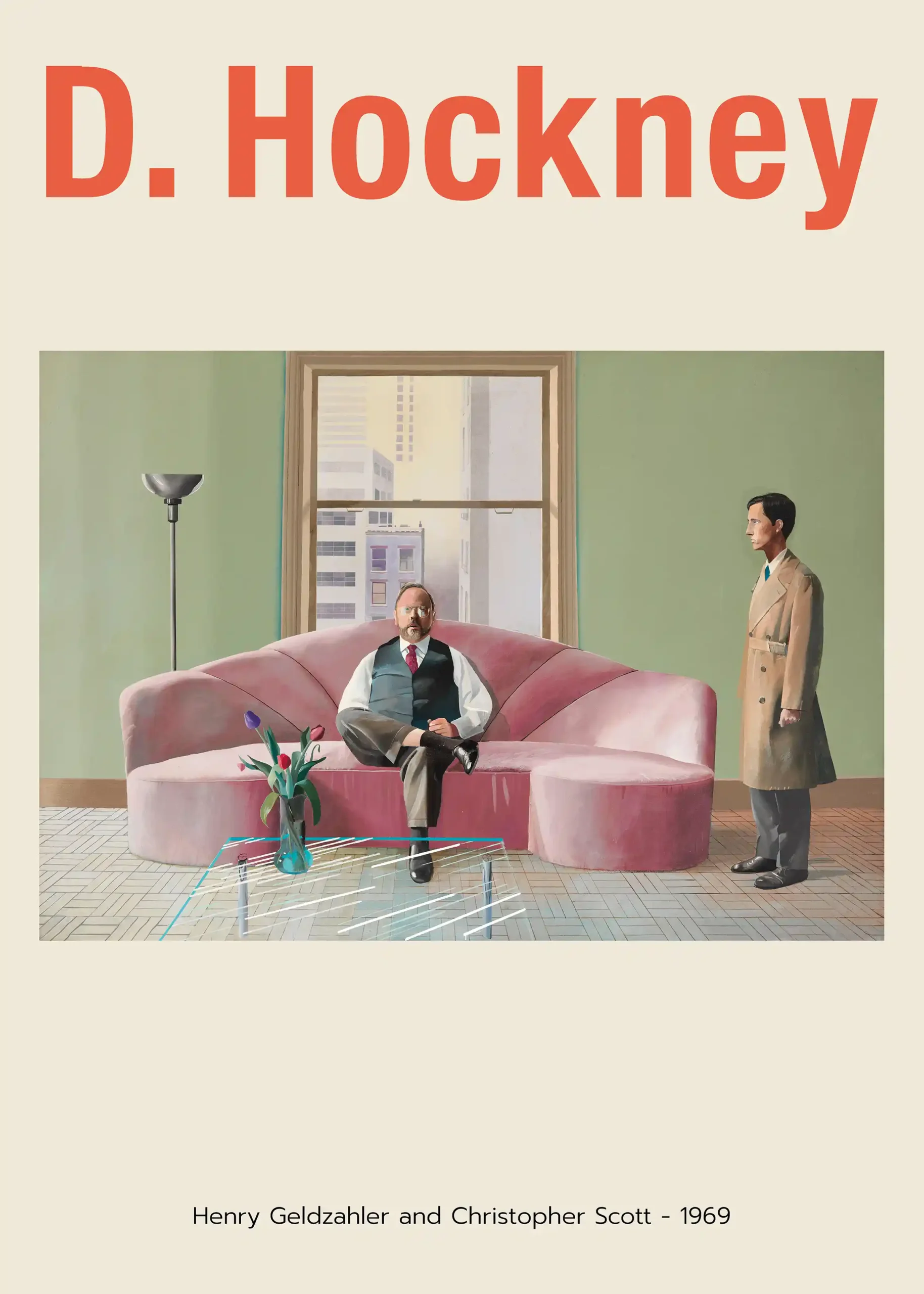
David Hockney Henry Geldzahler and Christopher Scott 1969 Art Print
From $9.90Select Options This product has multiple variants. The options may be chosen on the product page -
Art Prints
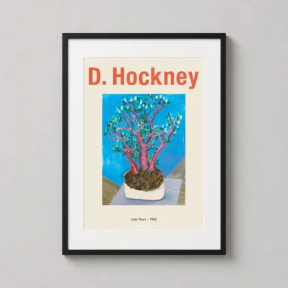
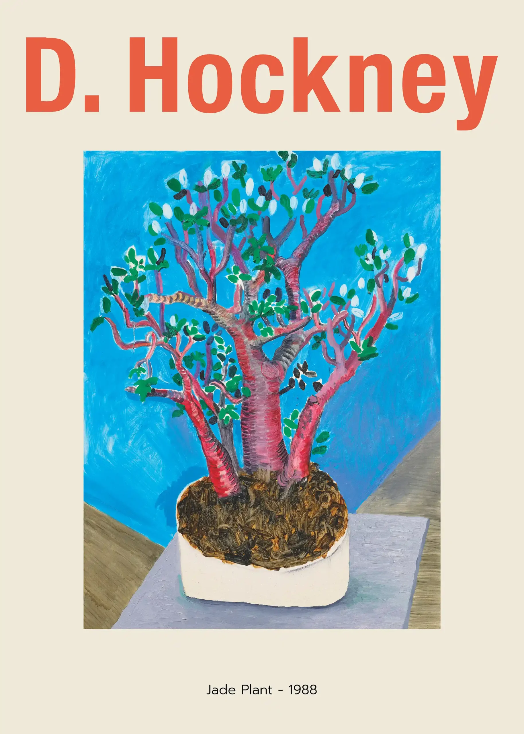
David Hockney Jade Plant 1988 Vibrant Botanical Exhibition Art Print
From $9.90Select Options This product has multiple variants. The options may be chosen on the product page -
Art Prints
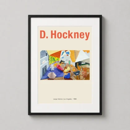
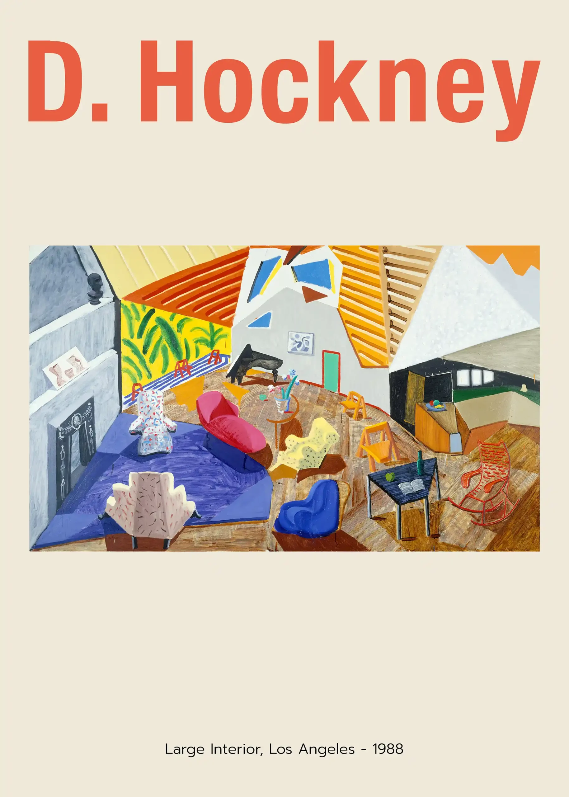
David Hockney Large Interior Los Angeles 1988 Exhibition Art Print
From $9.90Select Options This product has multiple variants. The options may be chosen on the product page -
Art Prints
David Hockney Louisiana Museum Exhibition 1976 Interior Art Print
From $9.90Select Options This product has multiple variants. The options may be chosen on the product page -
Abstract Art Prints
David Hockney Munich 1972 Olympics The Diver Art Print
From $9.90Select Options This product has multiple variants. The options may be chosen on the product page -
Art Prints
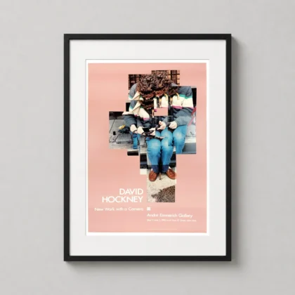
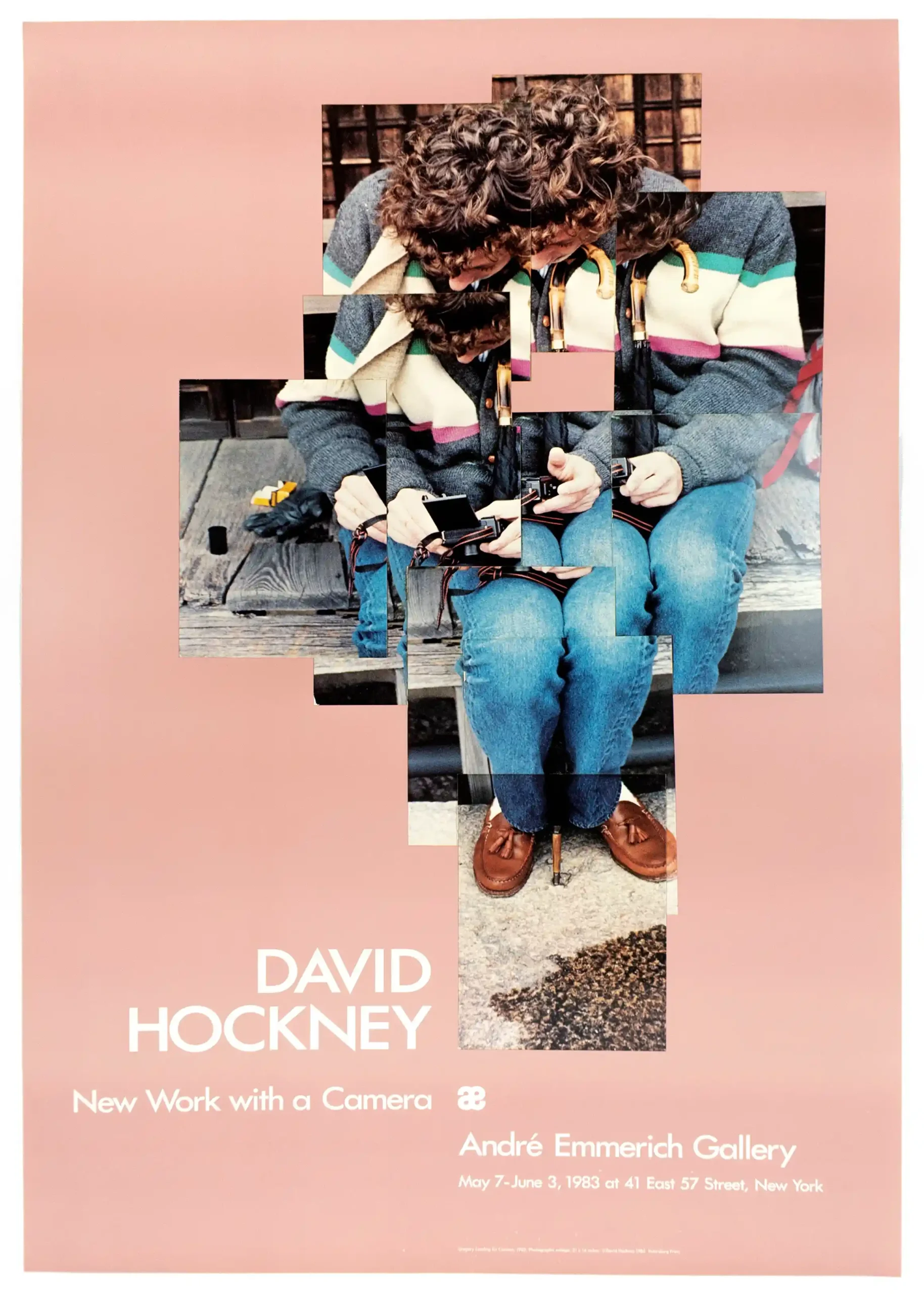
David Hockney New Work with a Camera Exhibition Art Print
From $9.90Select Options This product has multiple variants. The options may be chosen on the product page -
Art Prints
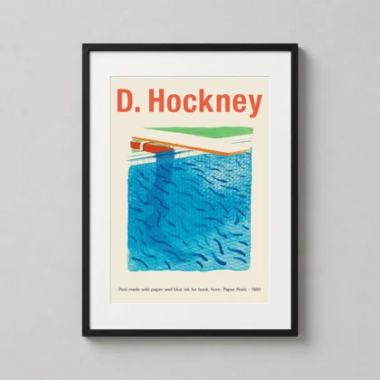
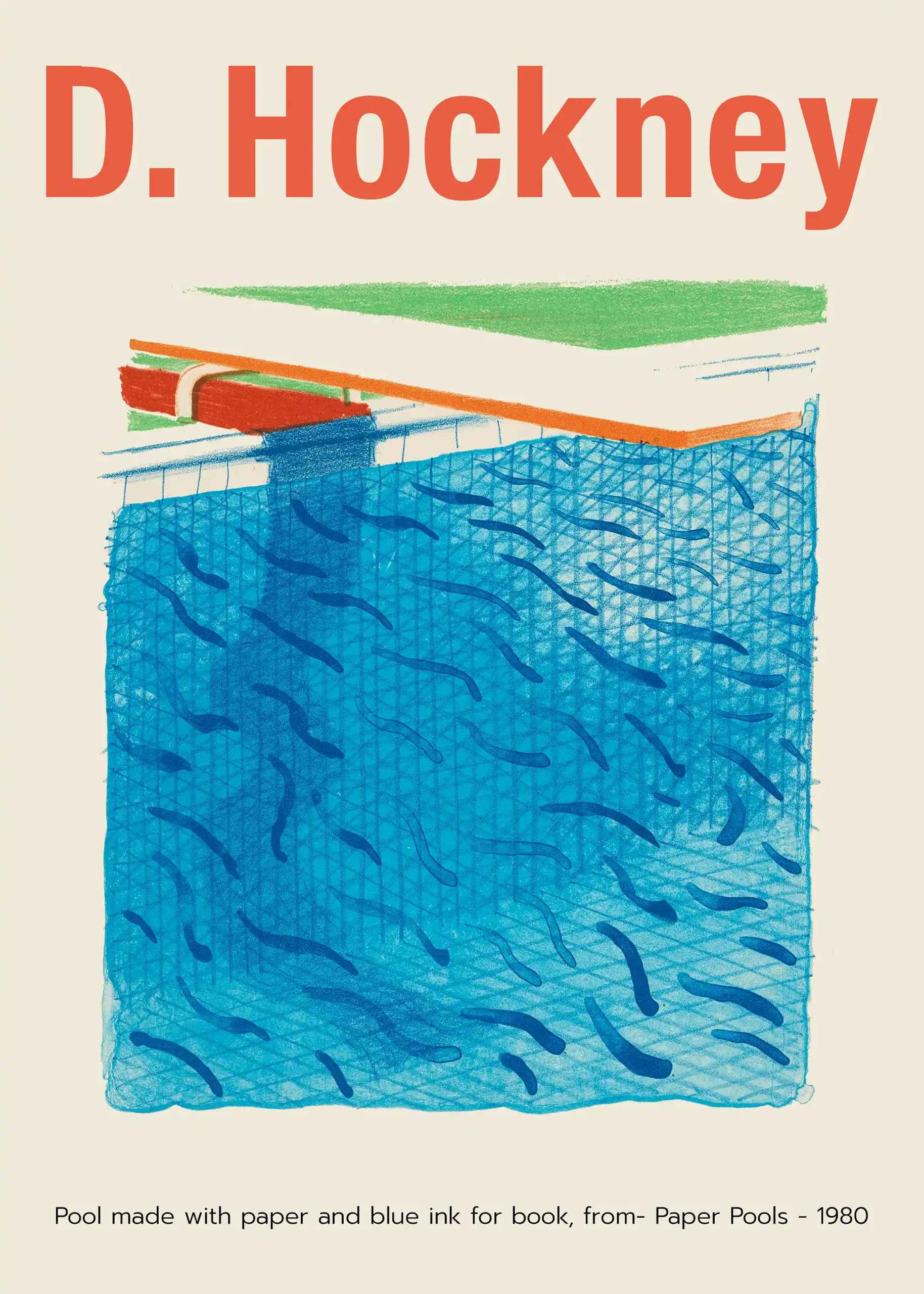
David Hockney Paper Pools 1980 Blue Swimming Pool Wall Art Print
From $9.90Select Options This product has multiple variants. The options may be chosen on the product page -
Art Prints
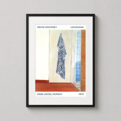
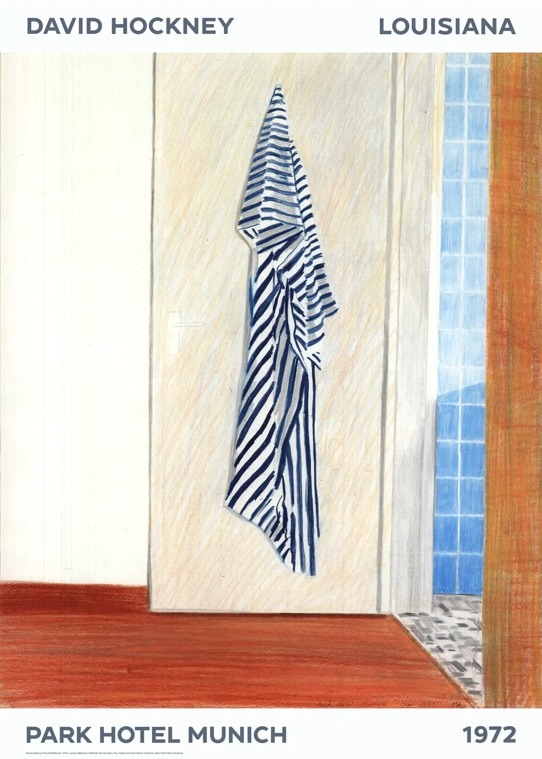
David Hockney Park Hotel Munich 1972 Striped Towel Art Print
From $9.90Select Options This product has multiple variants. The options may be chosen on the product page -
Art Prints
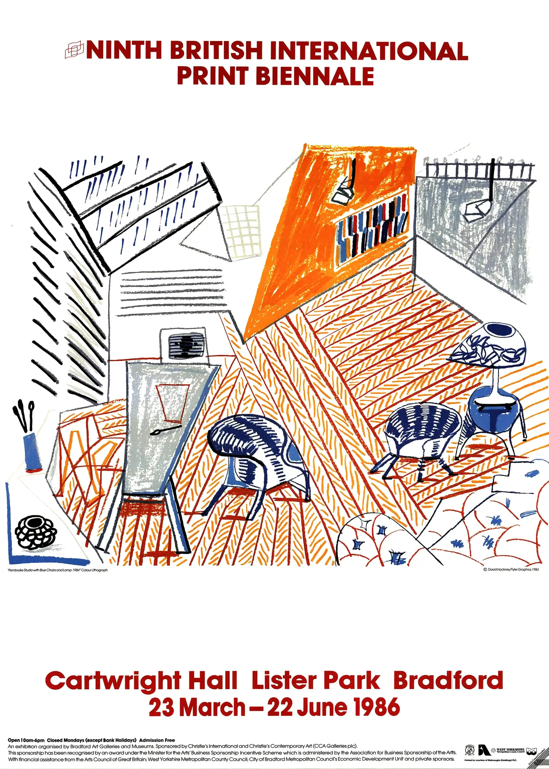
David Hockney Pembroke Studio Blue Chairs and Lamp Art Print
From $9.90Select Options This product has multiple variants. The options may be chosen on the product page -
Art Prints
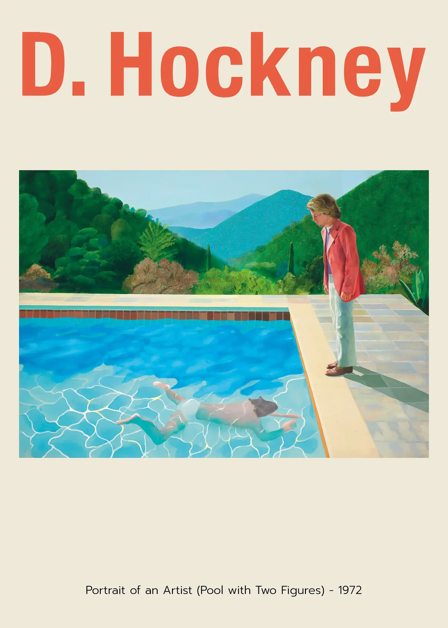
David Hockney Portrait of an Artist, Pool with Two Figures Art Print
From $9.90Select Options This product has multiple variants. The options may be chosen on the product page -
Art Prints
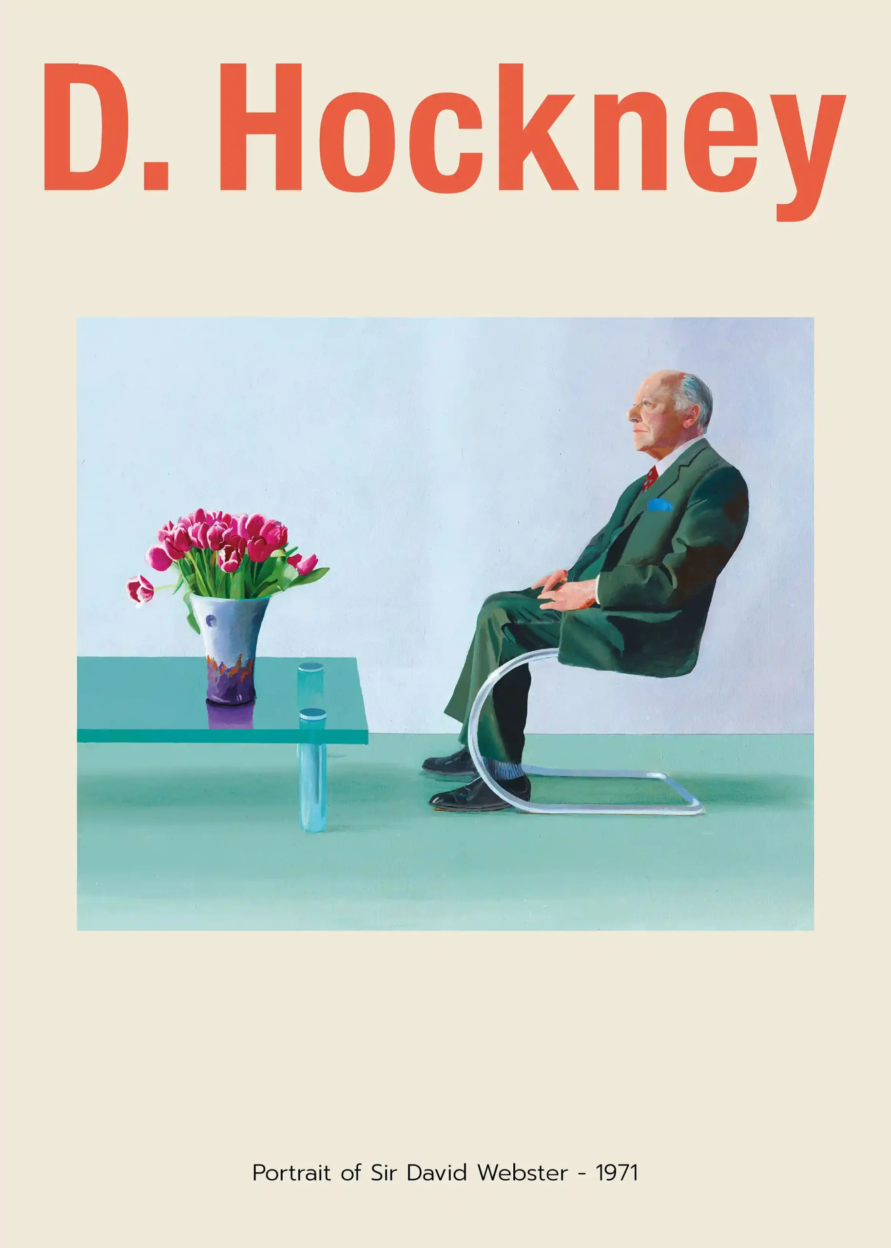
David Hockney Portrait of Sir David Webster 1971 Art Print
From $9.90Select Options This product has multiple variants. The options may be chosen on the product page -
Art Prints
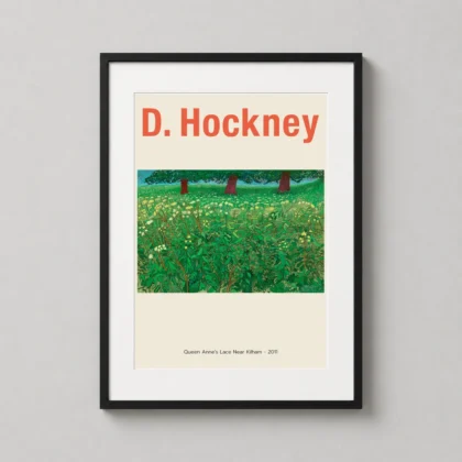
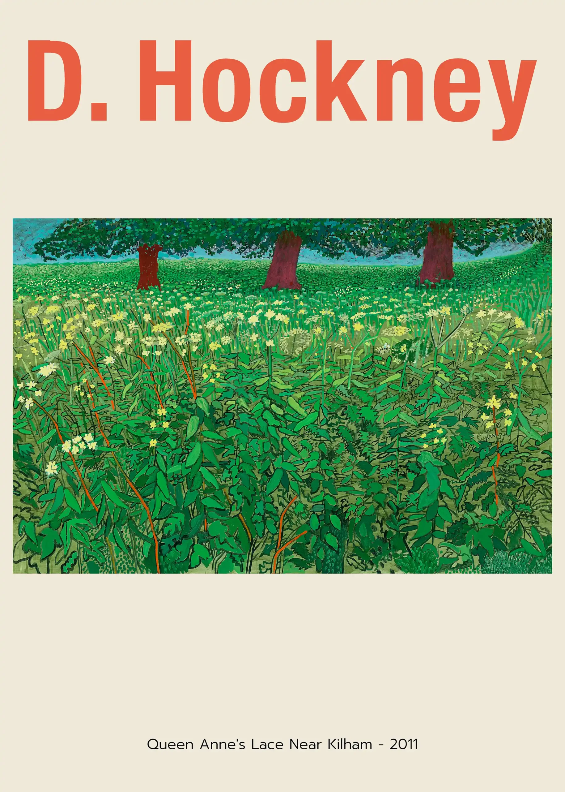
David Hockney Queen Anne's Lace Near Kilham 2011 Landscape Art Print
From $9.90Select Options This product has multiple variants. The options may be chosen on the product page -
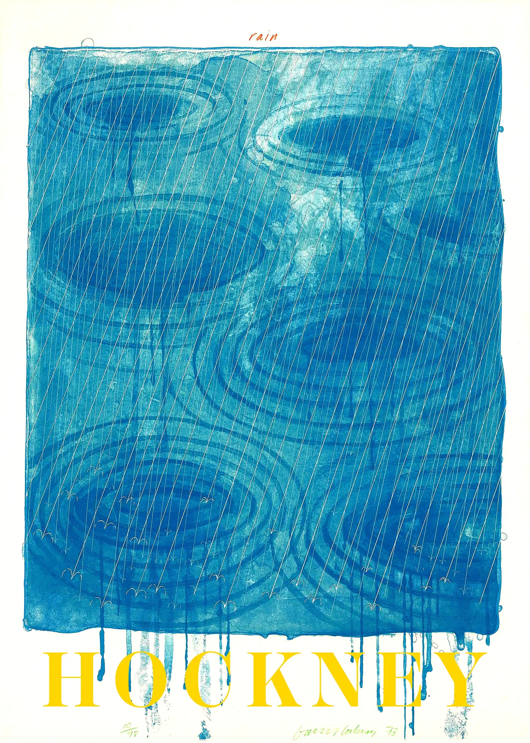
Abstract Art Prints
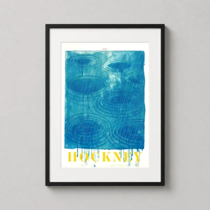
David Hockney Rain 1973, Abstract Blue Water Ripples Art Print
From $9.90Select Options This product has multiple variants. The options may be chosen on the product page -
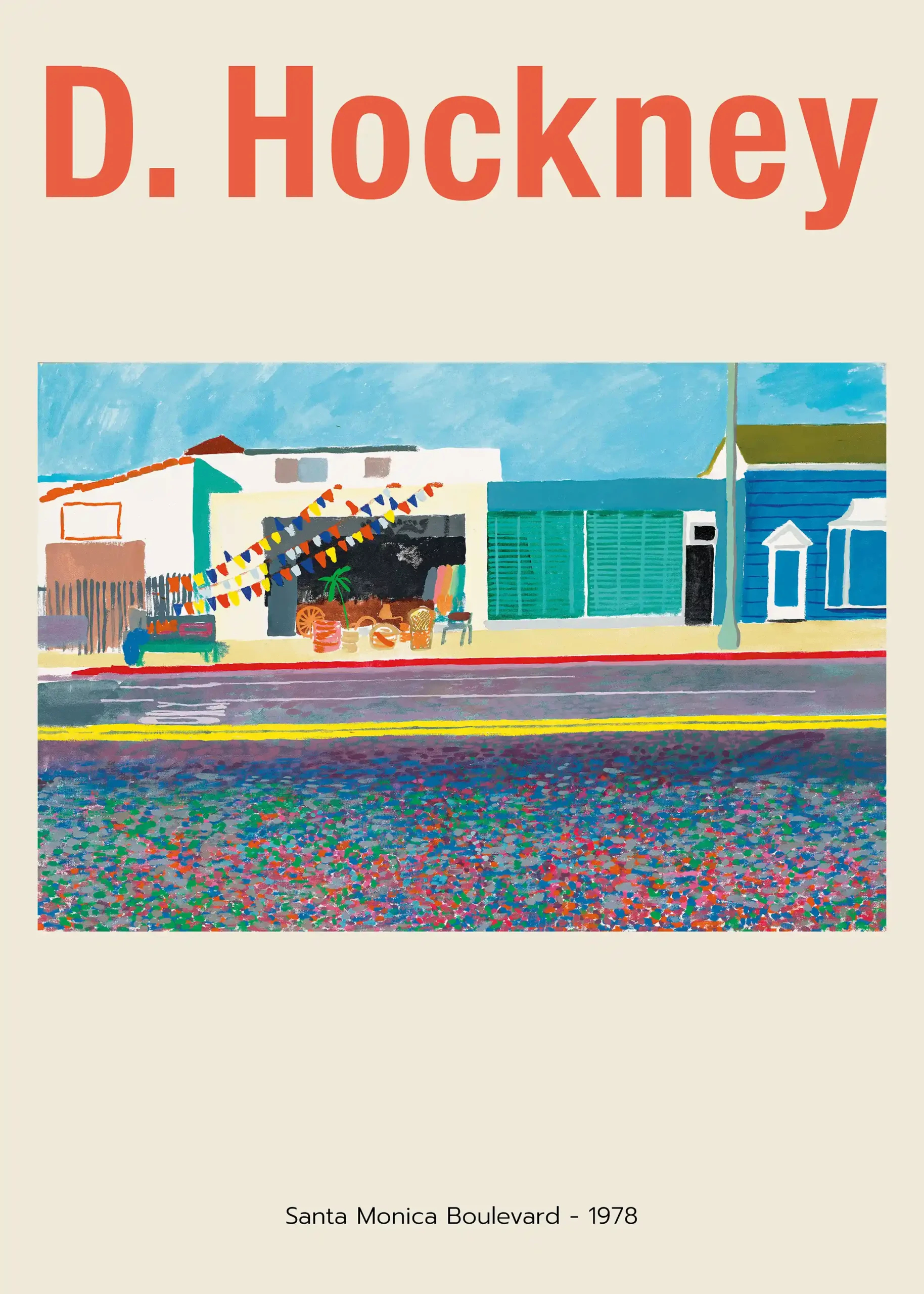
Art Prints
David Hockney Santa Monica Boulevard 1978 Pop Art Print
From $9.90Select Options This product has multiple variants. The options may be chosen on the product page -
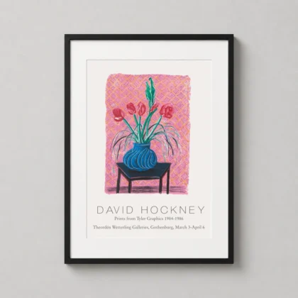
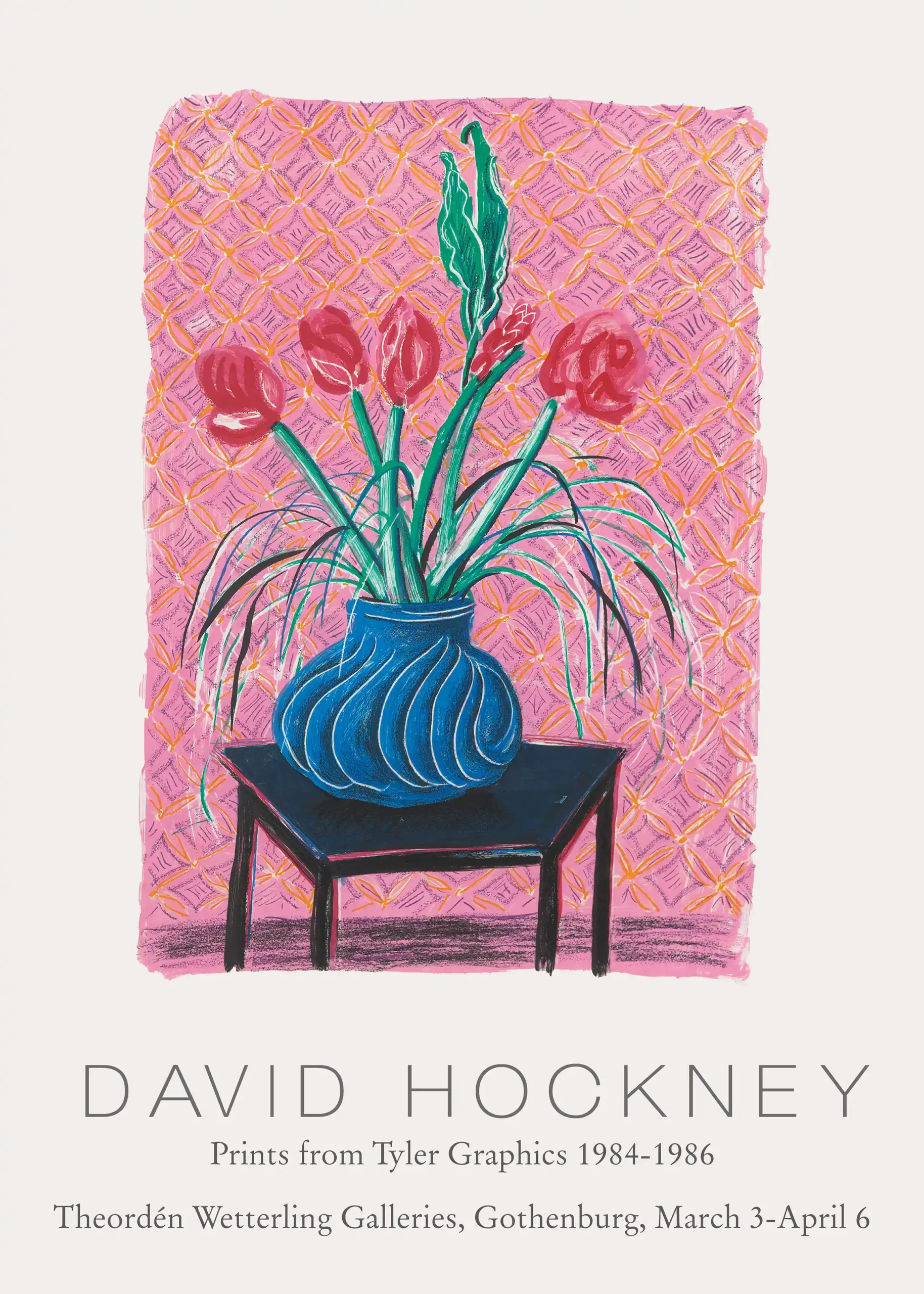
Art Prints
David Hockney Still Life Blue Vase Exhibition Poster Art Print
From $9.90Select Options This product has multiple variants. The options may be chosen on the product page -
Art Prints
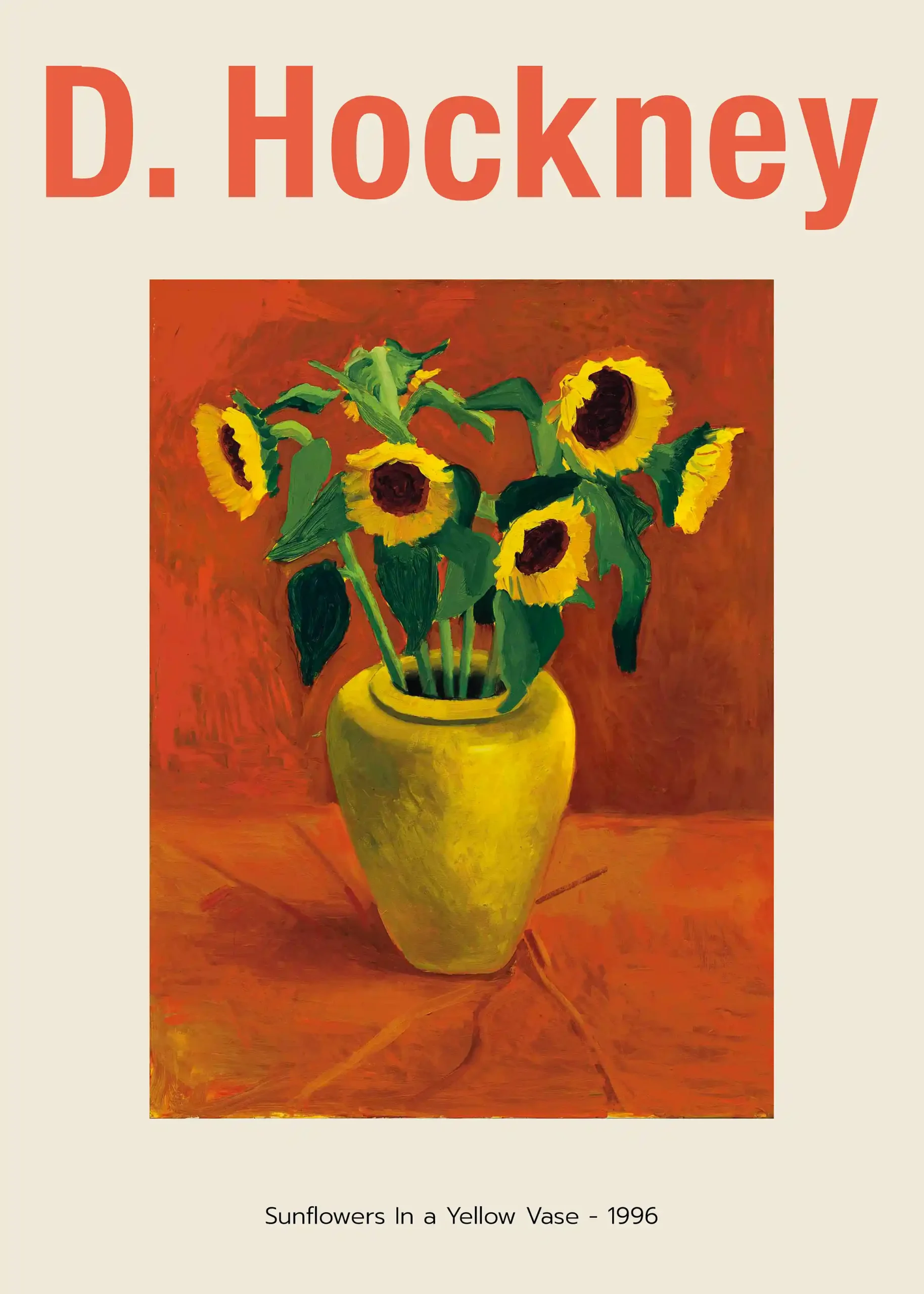
David Hockney Sunflowers In a Yellow Vase 1996 Exhibition Art Print
From $9.90Select Options This product has multiple variants. The options may be chosen on the product page -
Art Prints
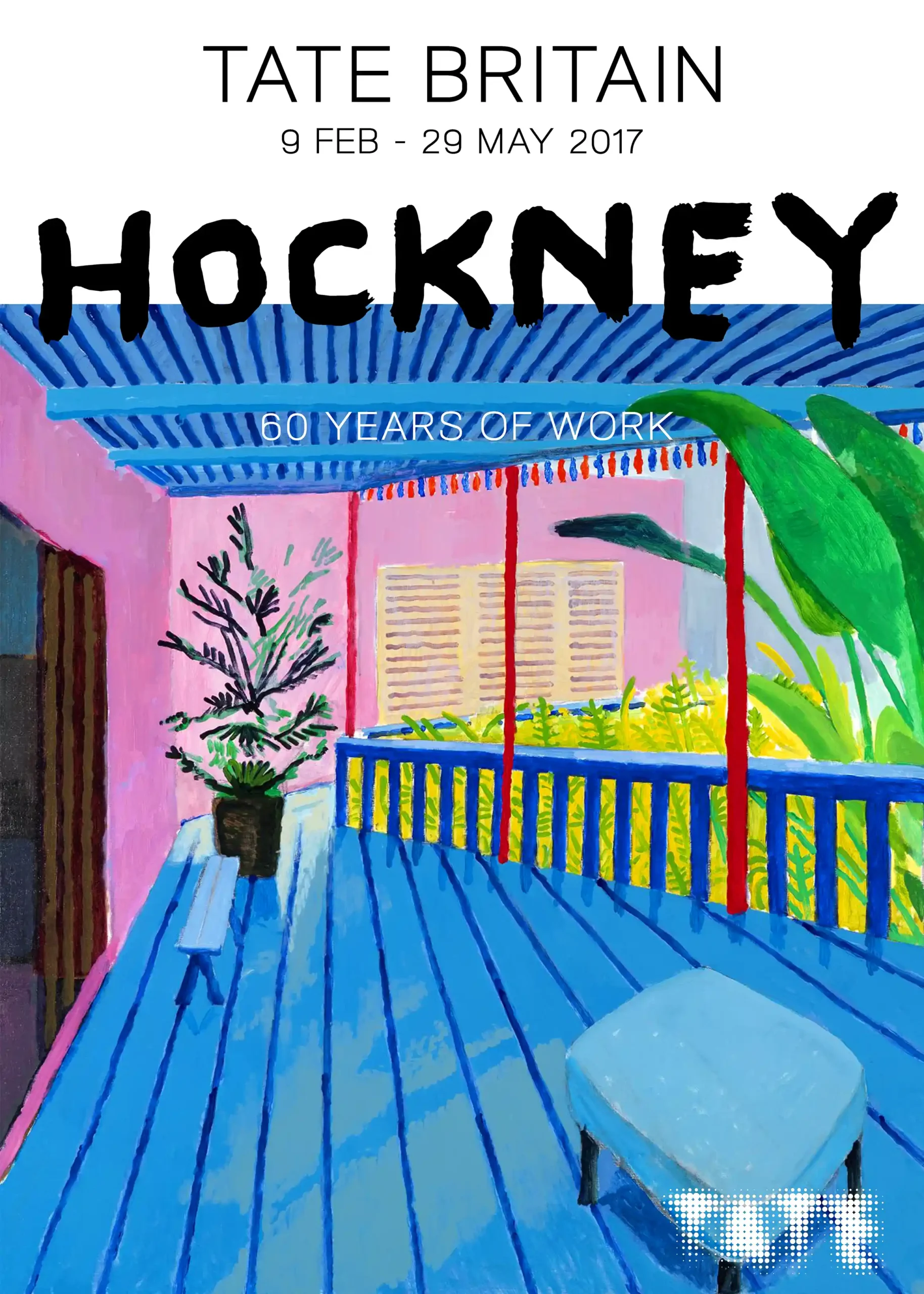
David Hockney Tate Britain 60 Years of Work Exhibition Wall Art Print
From $9.90Select Options This product has multiple variants. The options may be chosen on the product page -
Art Prints
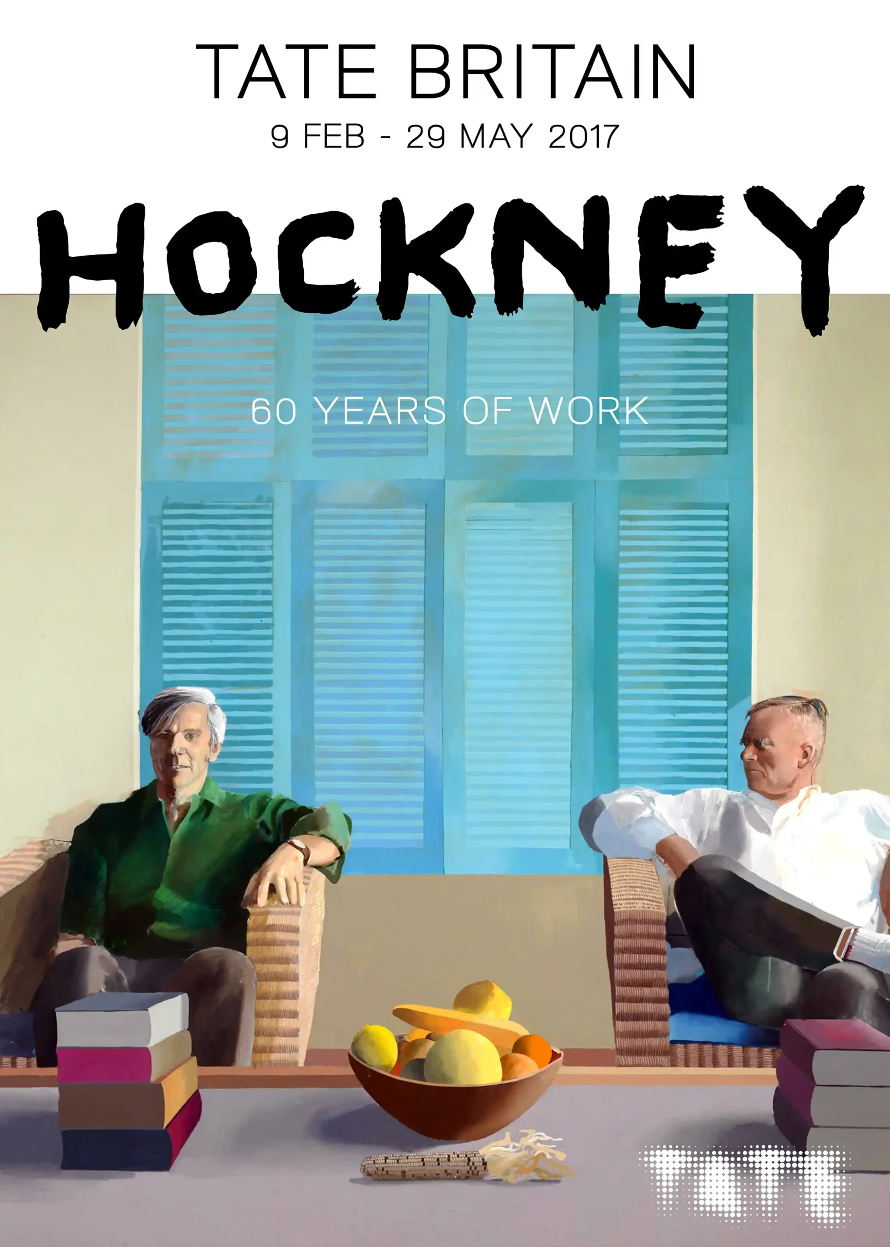
David Hockney Tate Britain 60 Years of Work Retrospective Art Print
From $9.90Select Options This product has multiple variants. The options may be chosen on the product page -
Animal Prints
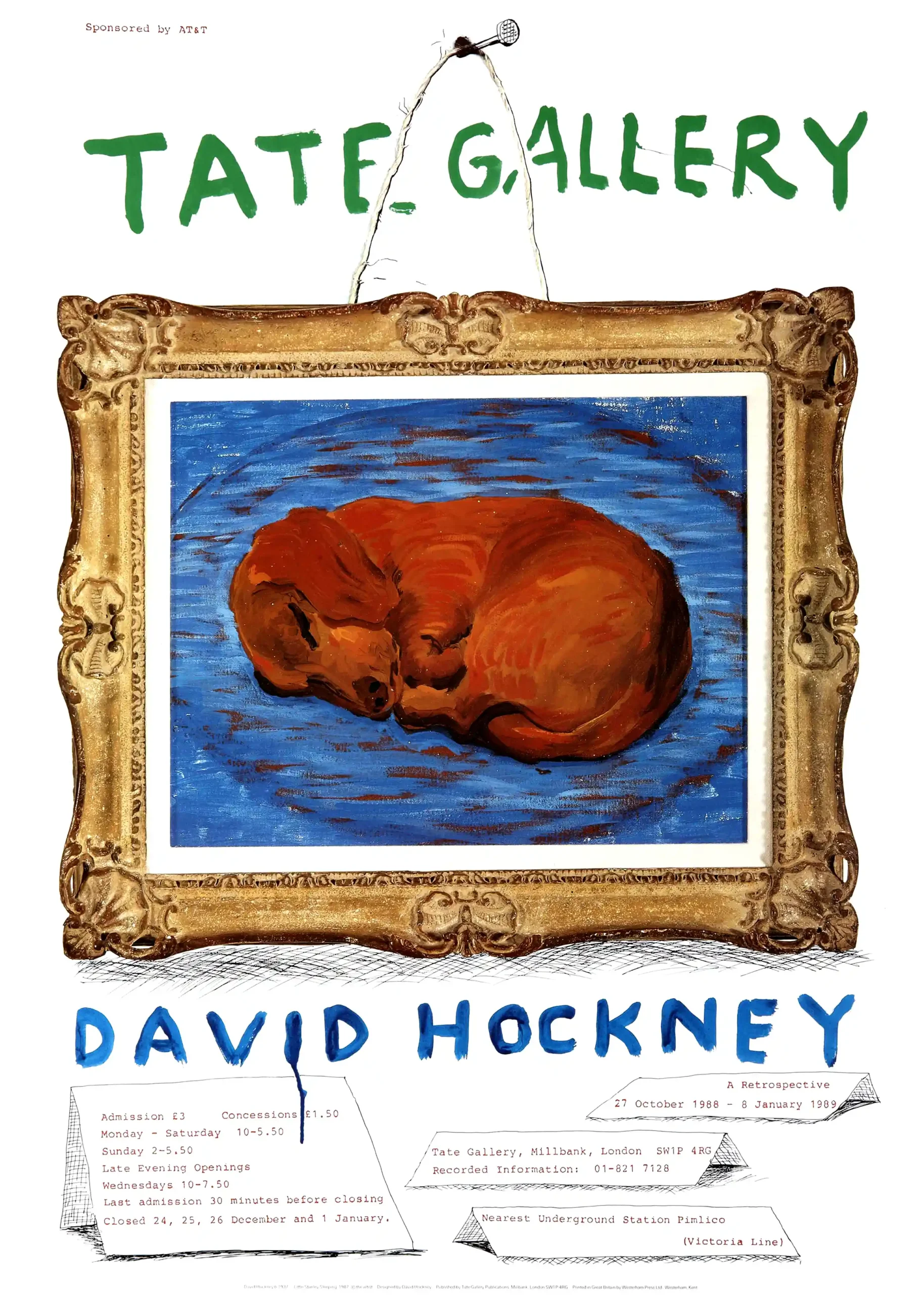
David Hockney Tate Gallery Little Stanley Sleeping Art Print
From $9.90Select Options This product has multiple variants. The options may be chosen on the product page -
Art Prints
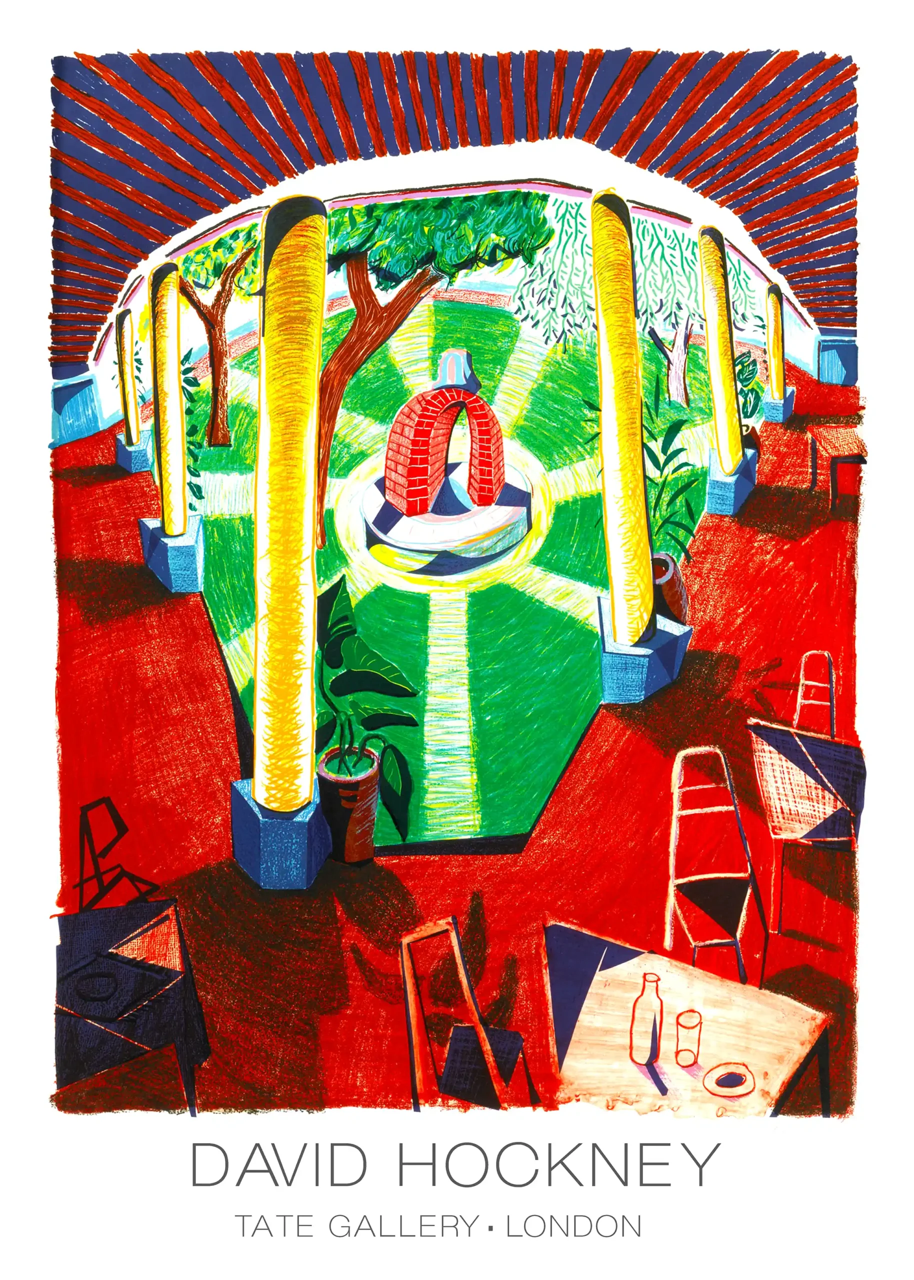
David Hockney Tate Gallery London Exhibition Art Print
From $9.90Select Options This product has multiple variants. The options may be chosen on the product page -
Art Prints
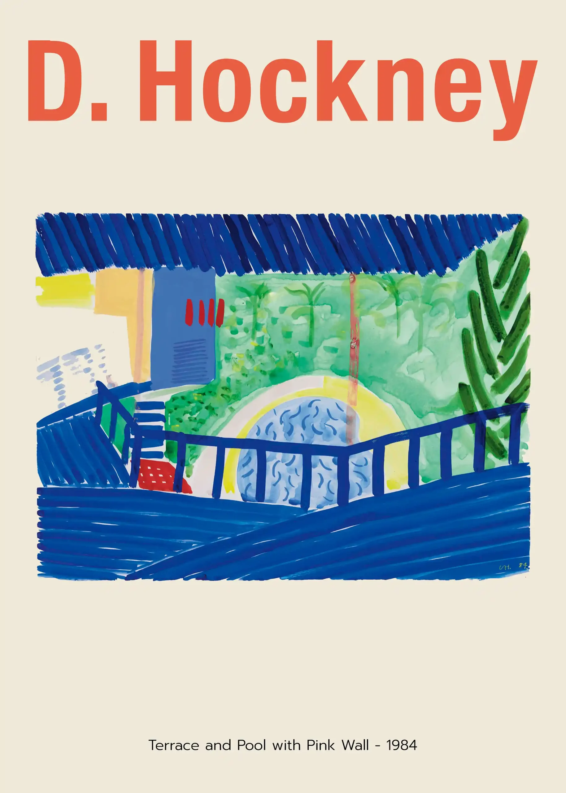
David Hockney Terrace and Pool with Pink Wall 1984 Art Print
From $9.90Select Options This product has multiple variants. The options may be chosen on the product page -
Art Prints
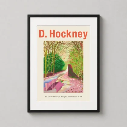
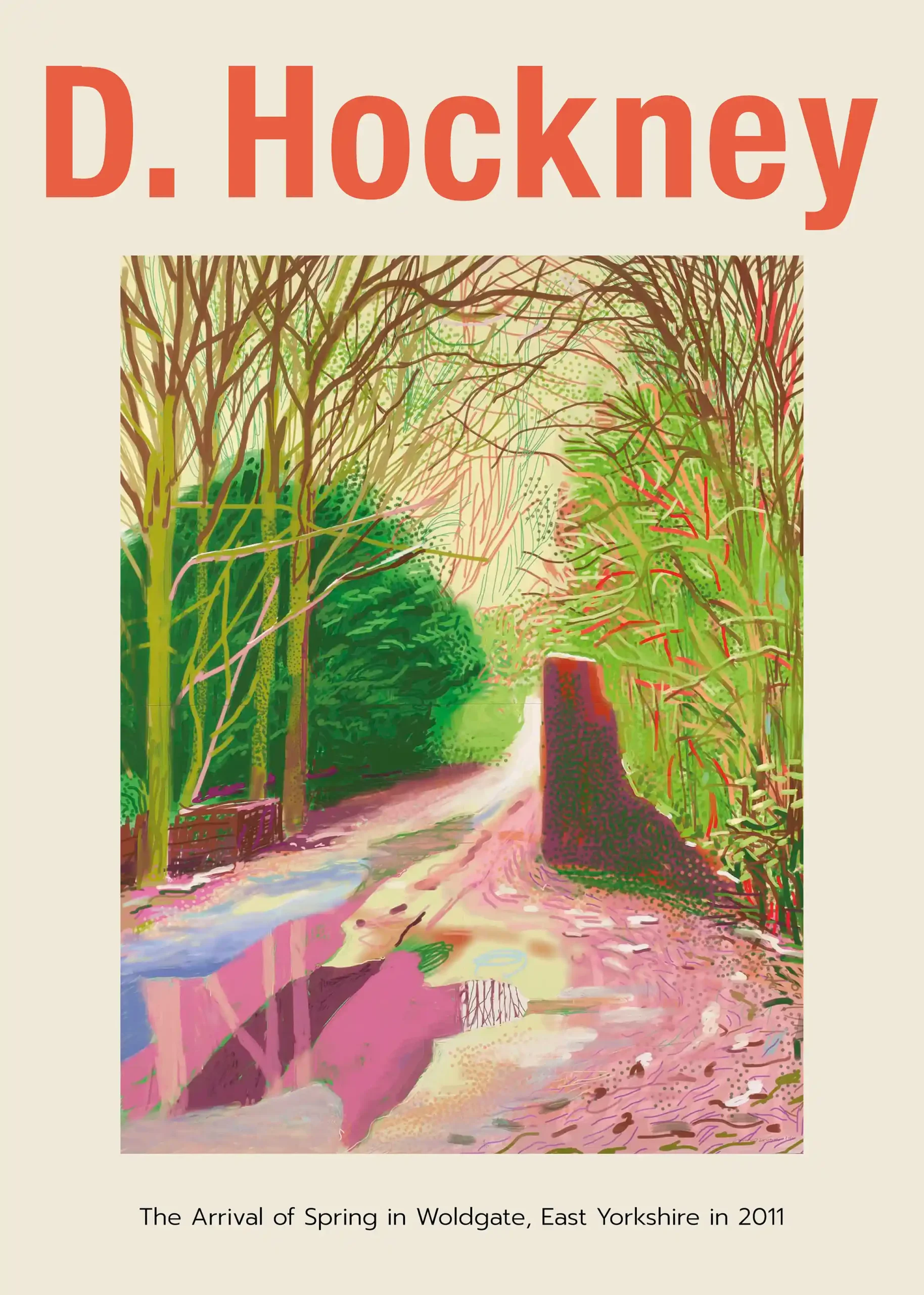
David Hockney The Arrival of Spring in Woldgate East Yorkshire Art Print
From $9.90Select Options This product has multiple variants. The options may be chosen on the product page -
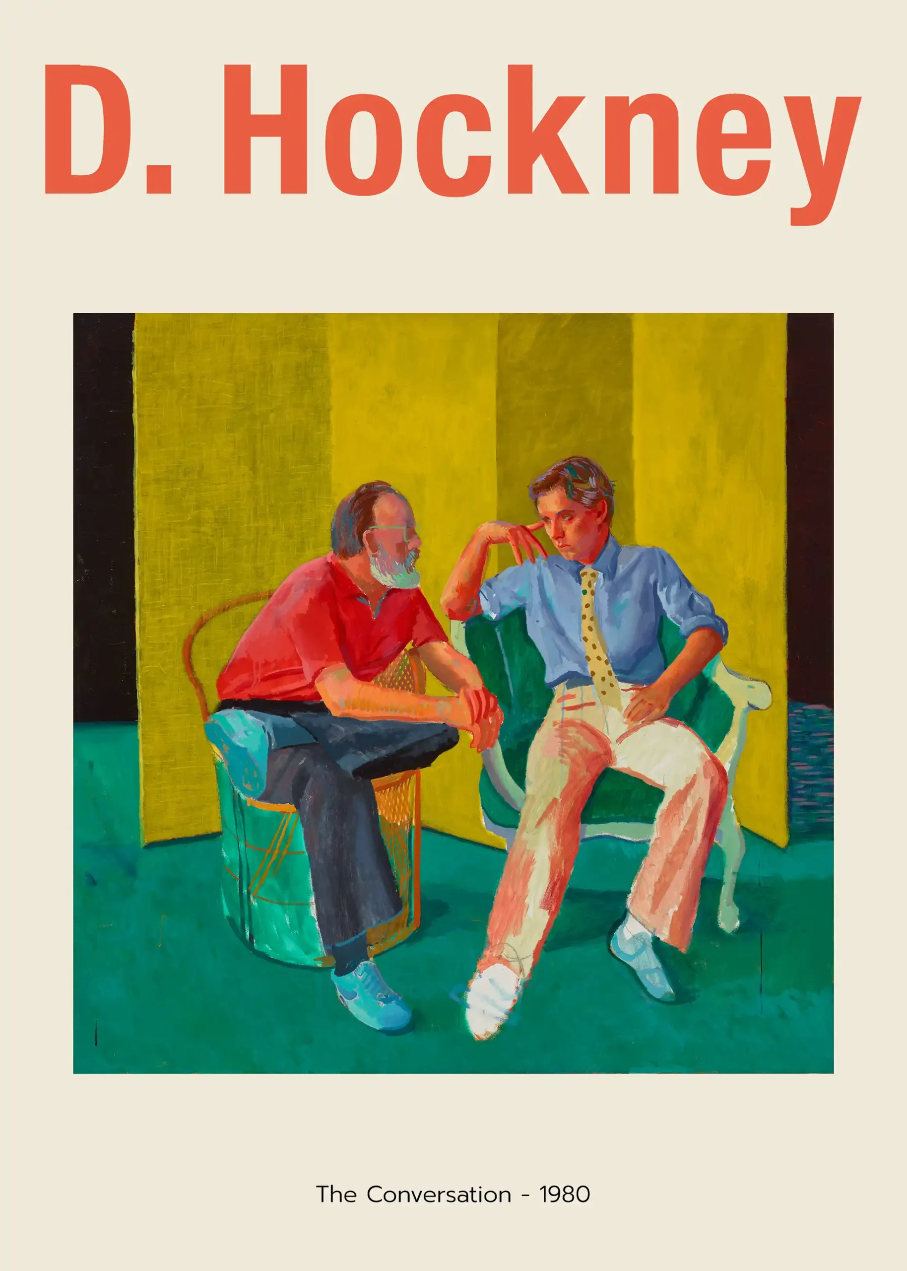
Art Prints
David Hockney The Conversation 1980 Exhibition Art Print
From $9.90Select Options This product has multiple variants. The options may be chosen on the product page -
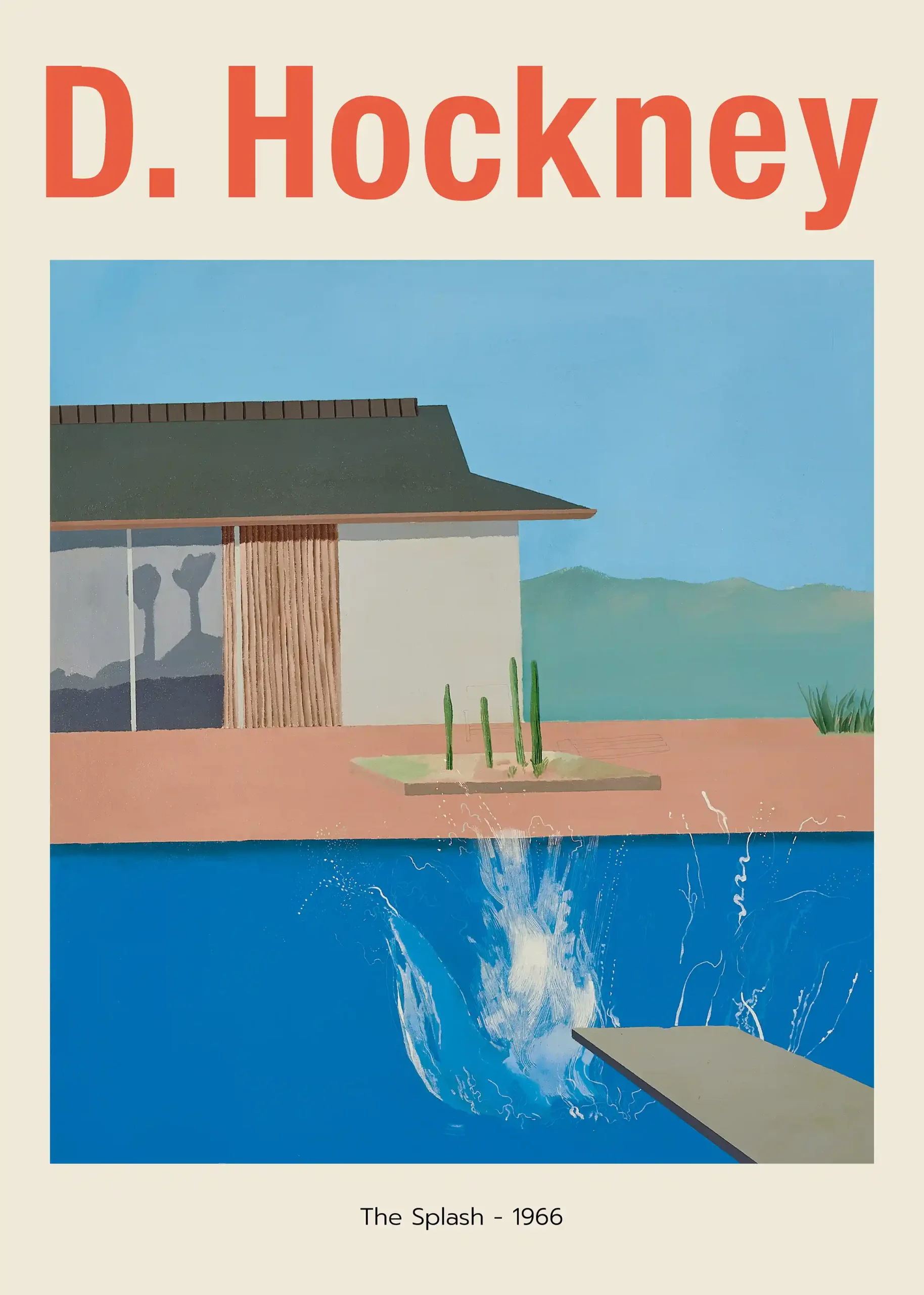
Art Prints
David Hockney The Splash 1966 Poster, Modern Poolside Art Print
From $9.90Select Options This product has multiple variants. The options may be chosen on the product page -
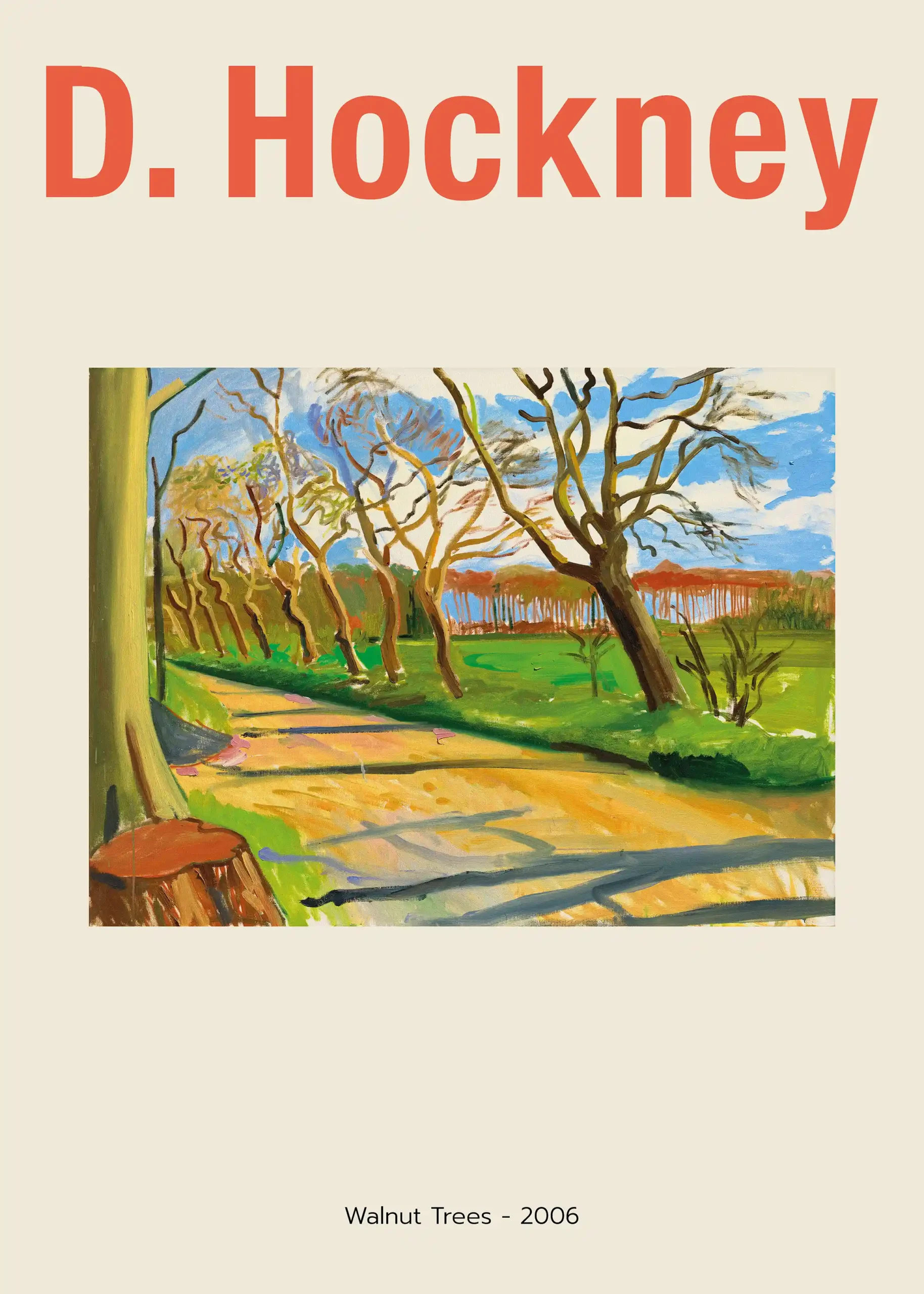
Art Prints
David Hockney Walnut Trees 2006 Landscape Exhibition Art Print
From $9.90Select Options This product has multiple variants. The options may be chosen on the product page -
Art Prints
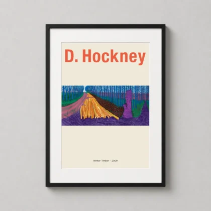
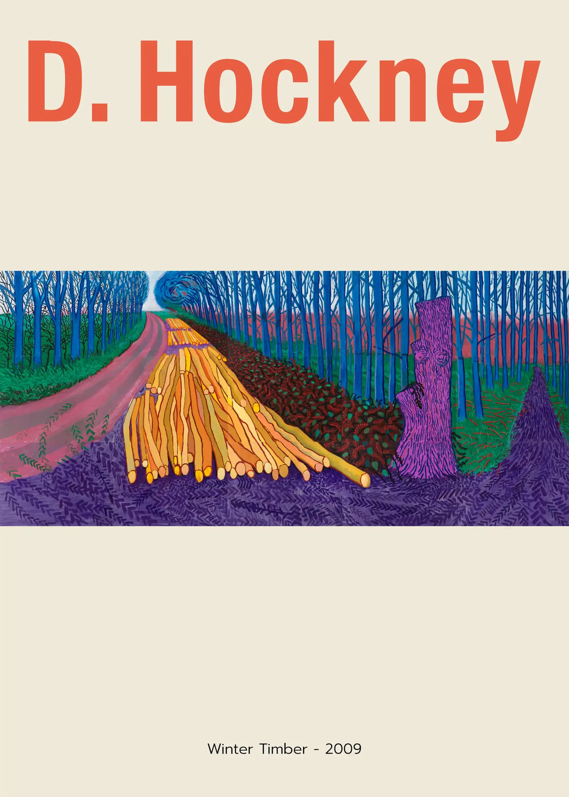
David Hockney Winter Timber 2009, Yorkshire Landscape Art Print
From $9.90Select Options This product has multiple variants. The options may be chosen on the product page -
Art Prints
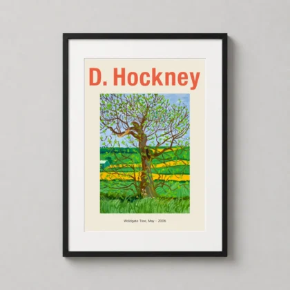
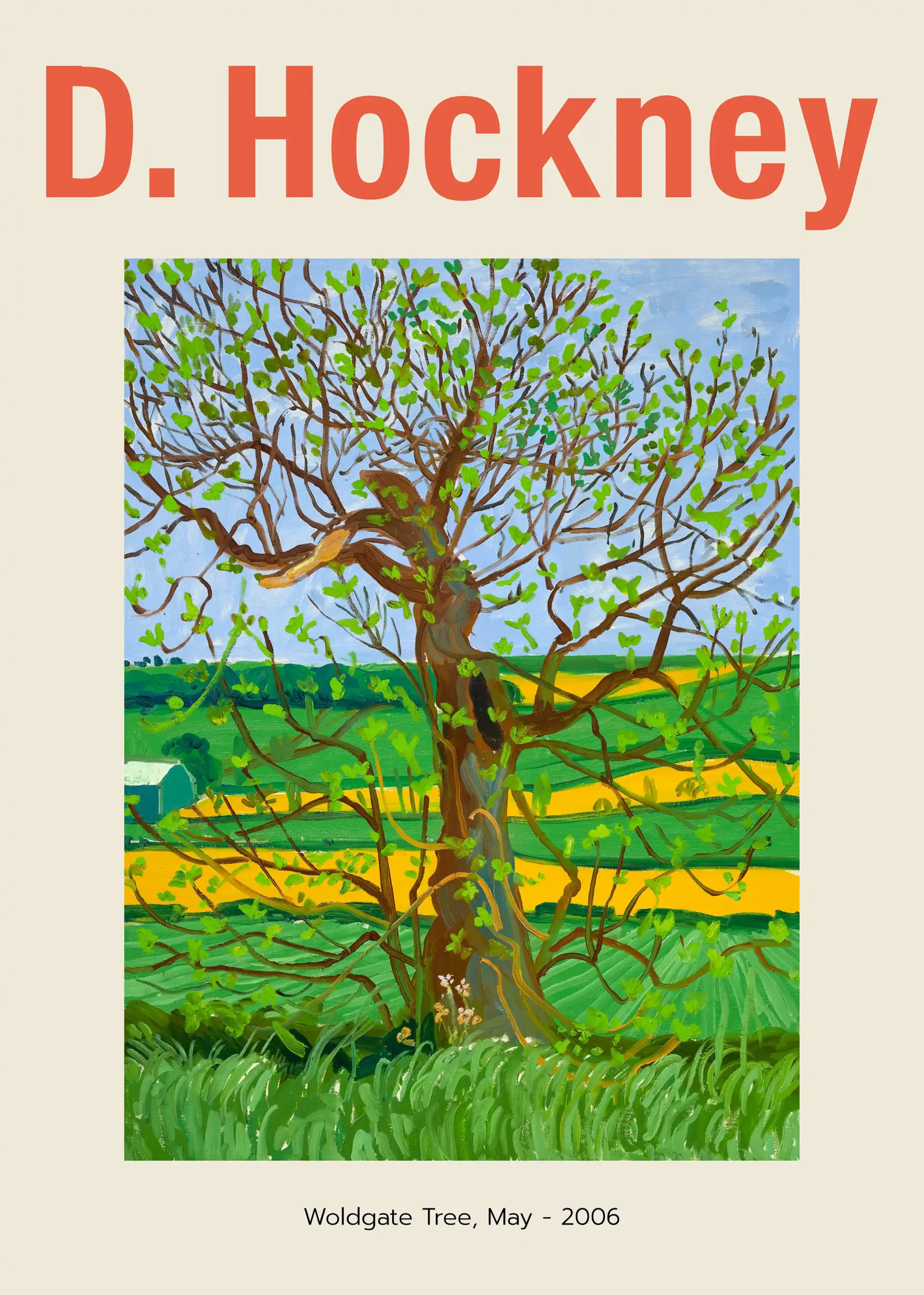
David Hockney Woldgate Tree, Modern Landscape Wall Art Print
From $9.90Select Options This product has multiple variants. The options may be chosen on the product page -
Art Prints
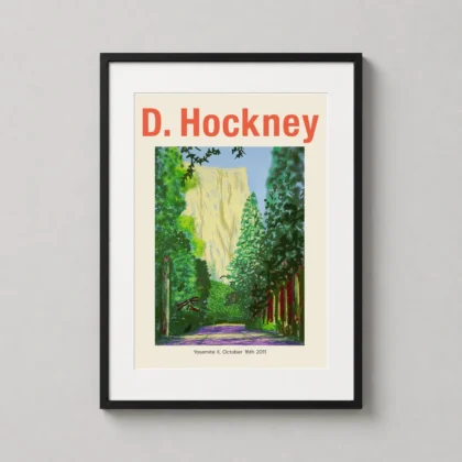
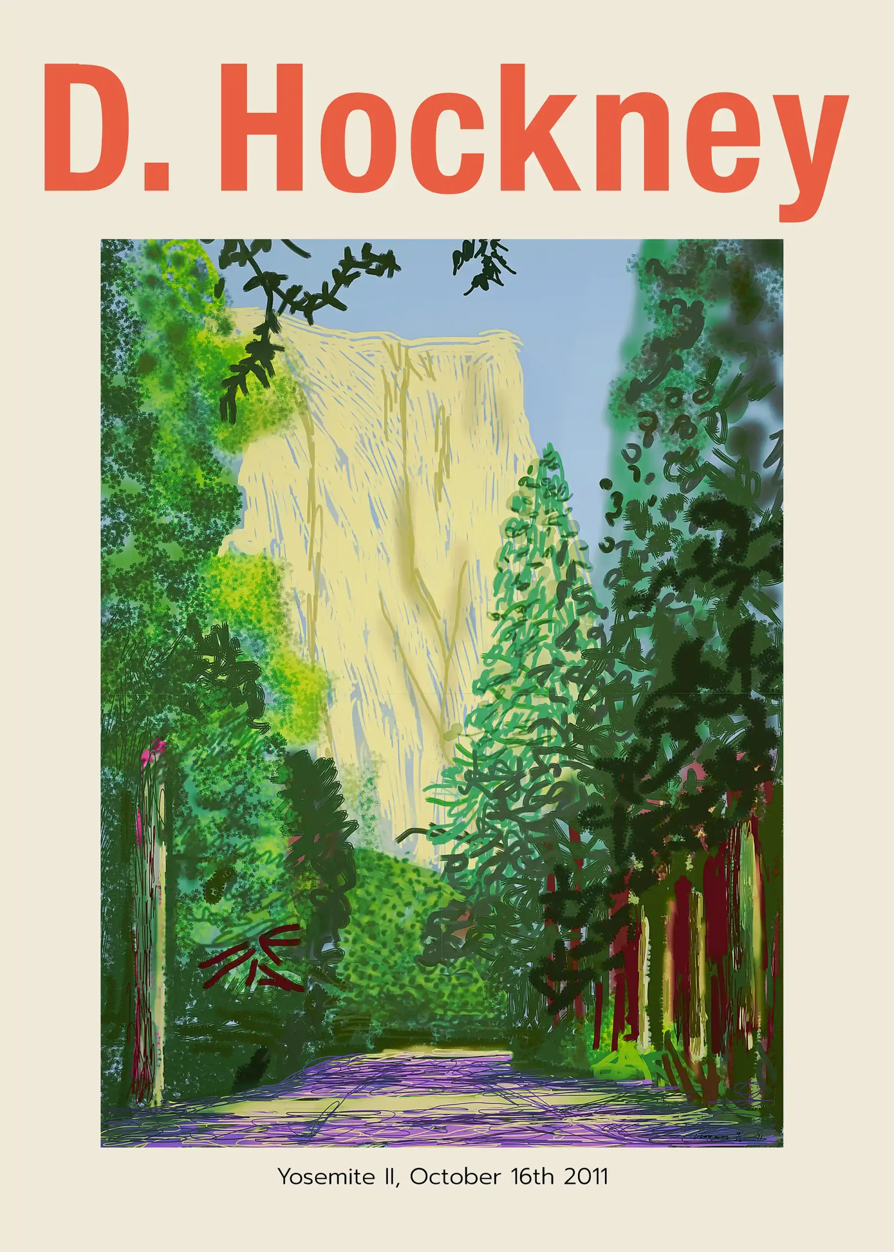
David Hockney Yosemite II, Modern Landscape Wall Art Print
From $9.90Select Options This product has multiple variants. The options may be chosen on the product page -
Art Prints
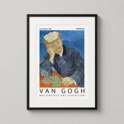
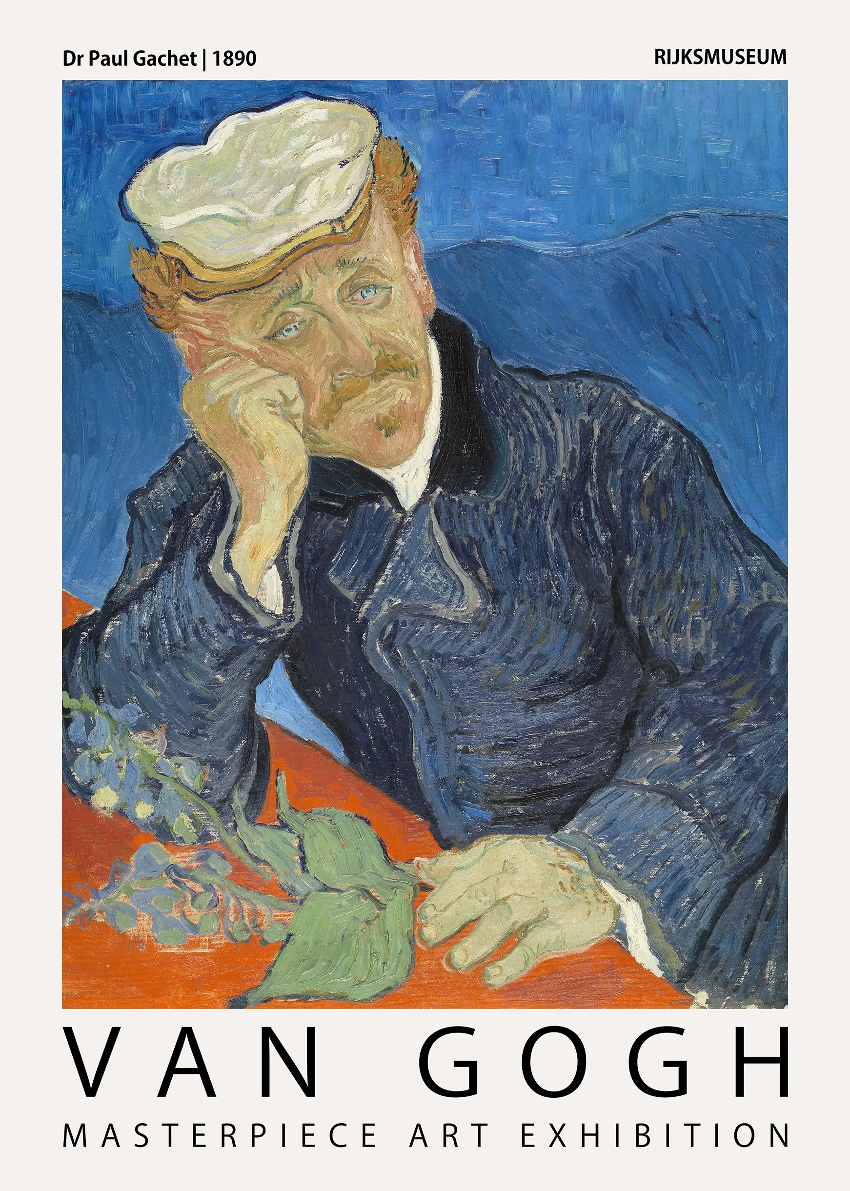
Dr Paul Gachet by Vincent Van Gogh Exhibition Art Print
From $9.90Select Options This product has multiple variants. The options may be chosen on the product page -
Abstract Art Prints
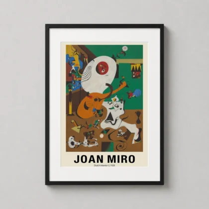
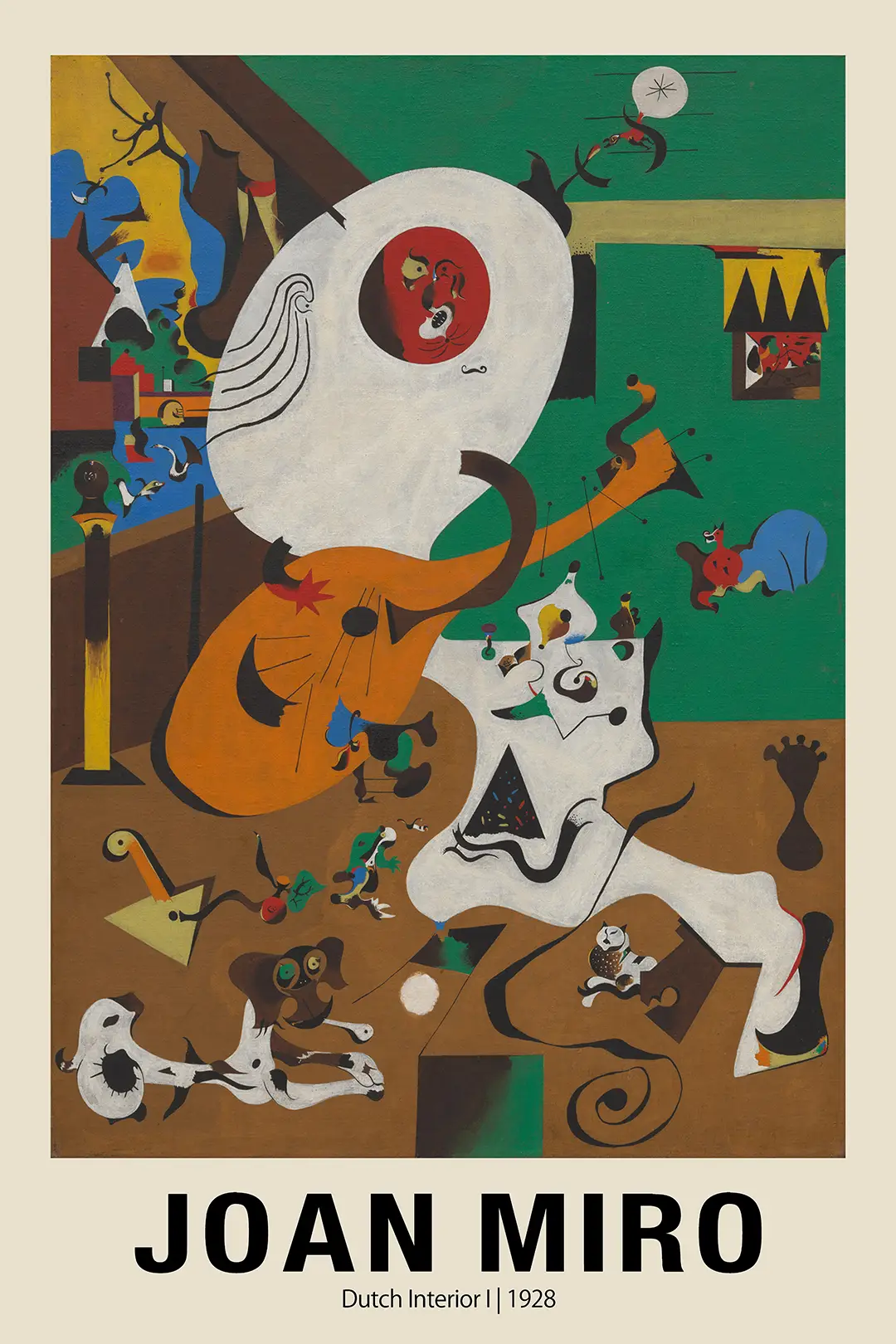
Dutch Interior I by Joan Miro, Surrealist Masterpiece Art Print
From $9.90Select Options This product has multiple variants. The options may be chosen on the product page -
Abstract Art Prints
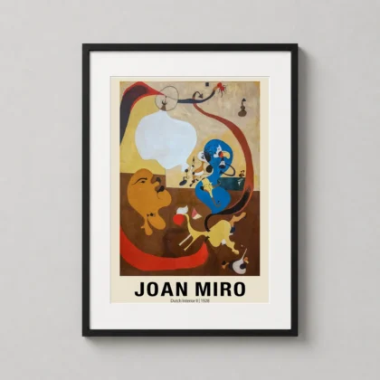
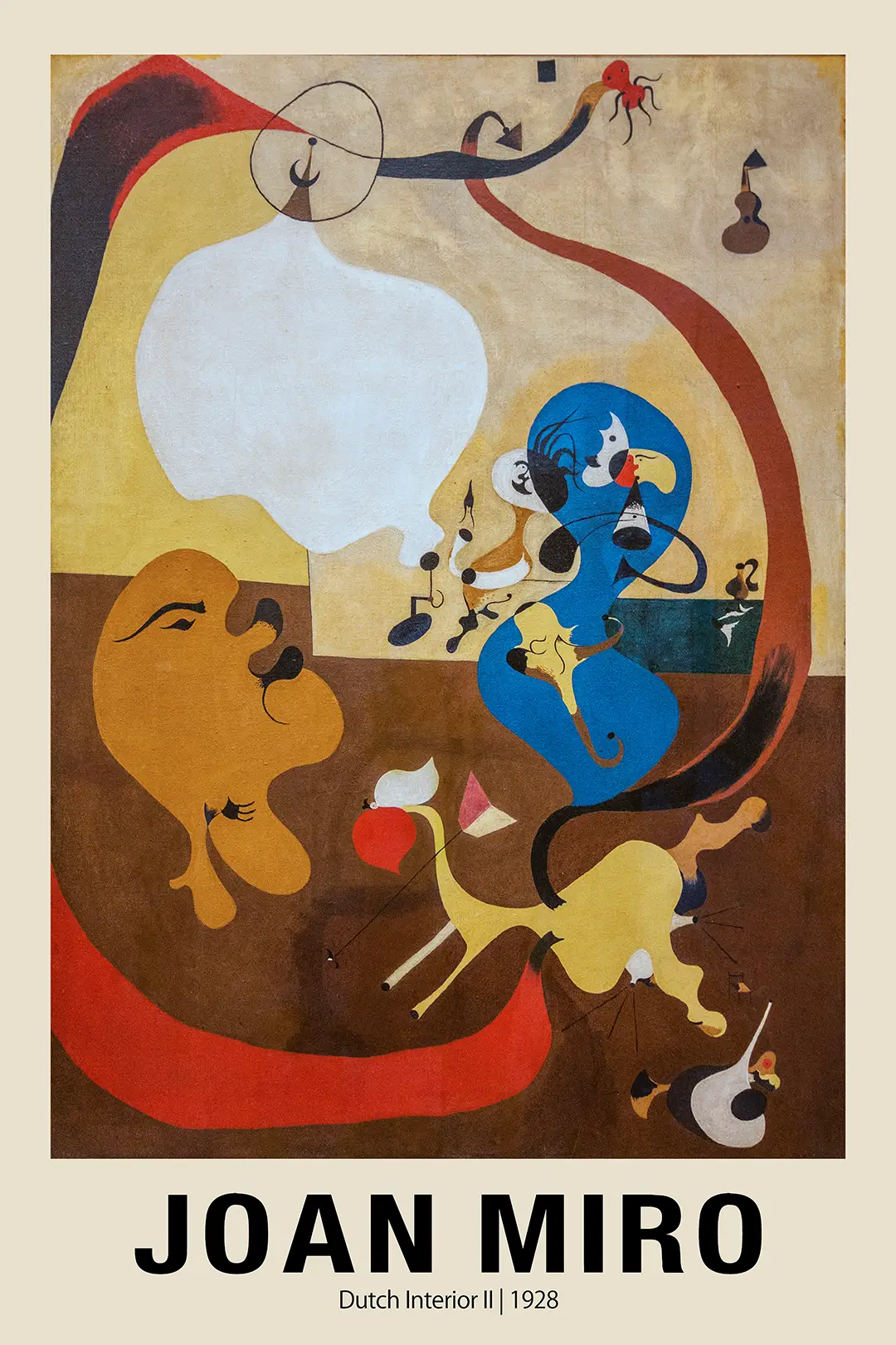
Dutch Interior II by Joan Miro Surrealist Exhibition Art Print
From $9.90Select Options This product has multiple variants. The options may be chosen on the product page -
Art Prints
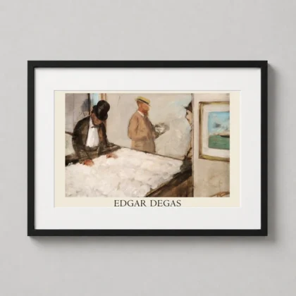
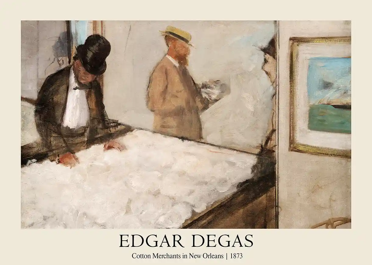
Edgar Degas Cotton Merchants in New Orleans 1873 Art Print
From $9.90Select Options This product has multiple variants. The options may be chosen on the product page -
Art Prints
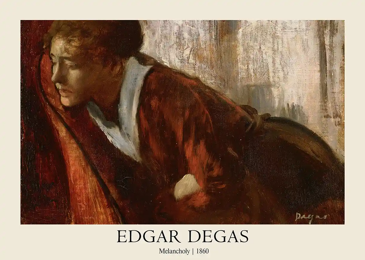
Edgar Degas Melancholy 1860 Impressionist Portrait Art Print
From $9.90Select Options This product has multiple variants. The options may be chosen on the product page -
Art Prints
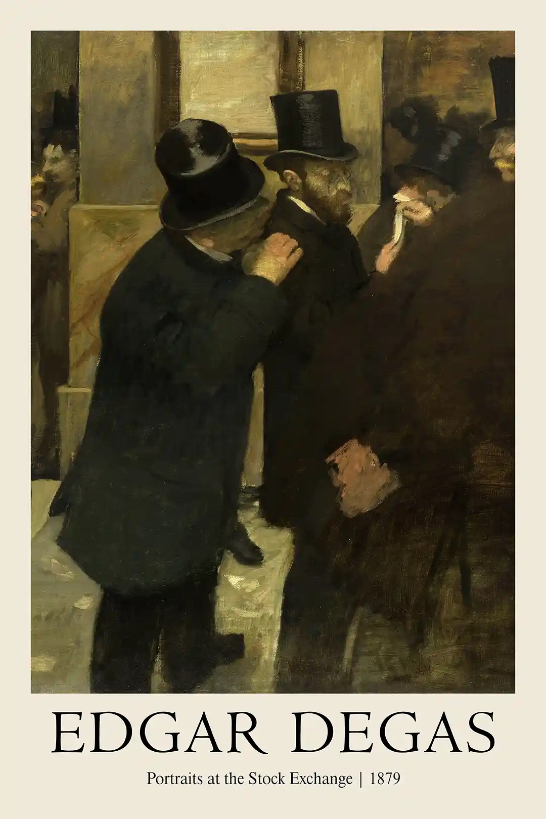
Edgar Degas Portraits at the Stock Exchange 1879 Museum Art Print
From $9.90Select Options This product has multiple variants. The options may be chosen on the product page -
Art Prints
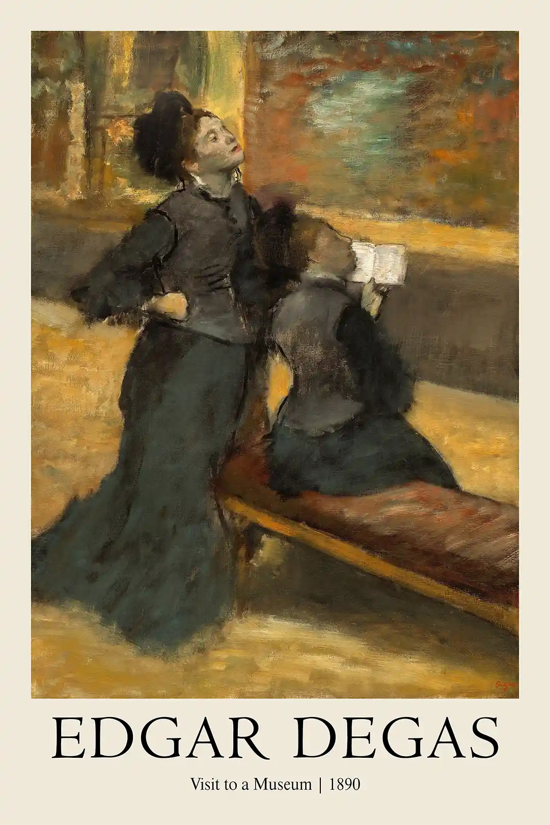
Edgar Degas Visit to a Museum 1890 Impressionist Art Print
From $9.90Select Options This product has multiple variants. The options may be chosen on the product page


How to Choose Exhibition Posters
Why this collection works on a wall
Exhibition Posters work because they bring museum typography, artist-show context and curated gallery atmosphere into a space without feeling like ordinary decoration. The collection suits living rooms, studios, offices, hallways, bedrooms and creative gallery walls, where the artwork can create a clear mood from across the room while still rewarding closer viewing. Printed as frame-ready wall art, these pieces help collectors, film fans and decorators build rooms with stronger visual identity.
How to choose your size
- Small prints are useful for shelves, compact corners, bedside walls and layered gallery arrangements.
- Medium prints suit desks, hallways, bedrooms and balanced pairings above sideboards or reading chairs.
- Large prints create a focal point for living rooms, home theatres, offices and collector walls.
How to frame it
Thin black, white, oak and walnut frames all work well. Choose the frame finish based on the poster’s typography and background rather than matching every print in the room exactly. Keep the surrounding decor simple so the print has enough breathing room. A mat border can make detailed artwork feel more gallery-led, while edge-to-edge framing gives movie and photography pieces a sharper poster-style finish.
How to care for the print
Handle the print with clean, dry hands and avoid placing it in harsh direct sunlight for long periods. Dust gently with a soft cloth, keep it away from damp areas, and consider glazing in high-traffic rooms to protect the surface over time.
Frequently asked questions
What is the Exhibition Posters collection?
This collection features wall art inspired by museum shows, artist exhibitions, gallery typography and curated cultural design. Exhibition posters are distinctive because they combine image, artist identity and editorial layout.
What paper and finish suit exhibition posters?
Museum-grade matte paper is a strong fit for exhibition posters because it keeps typography clear and artwork glare-free. The finish supports a more refined gallery feel than glossy poster stock.
What size exhibition poster should I choose?
Smaller sizes are good for layered gallery walls and office corners. Medium sizes suit hallways and bedrooms, while larger exhibition posters can act as a strong focal point above furniture.
How do I style exhibition posters at home?
Use one oversized poster for a clean gallery look, or group several by artist, colour, museum mood or period. Simple frames and enough wall spacing help the collection feel curated rather than crowded.
How are the prints packaged and shipped worldwide?
MerchFuse offers tracked worldwide shipping with protected flat-or-tube packaging depending on the print size and fulfilment route. Packaging is chosen to help the artwork arrive clean, secure and ready for framing.
What if my print arrives damaged or there is a problem?
If your order arrives damaged or there is a fulfilment issue, contact MerchFuse support with clear photos and your order details. Eligible issues are reviewed under the store policy so the right resolution can be arranged.