Product description
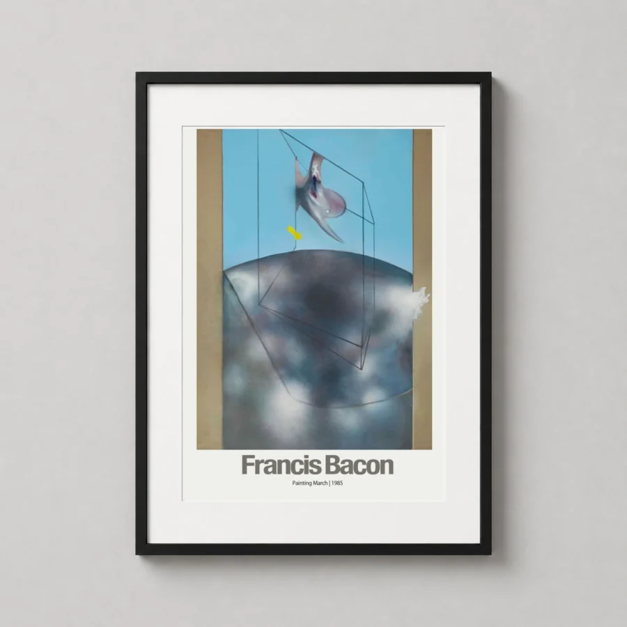
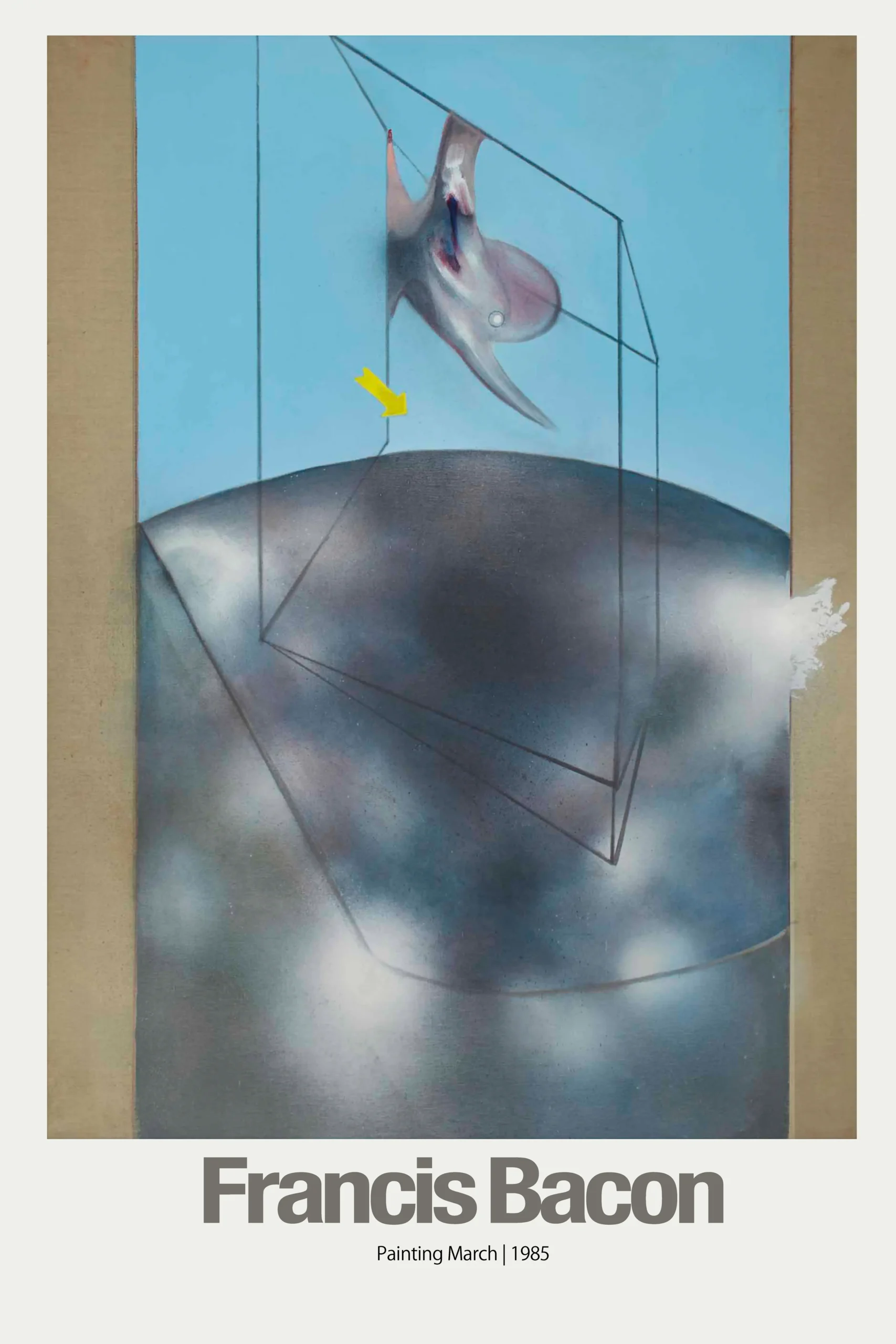
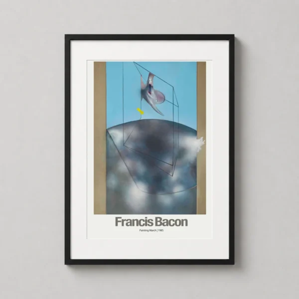
Francis Bacon Painting March 1985 has a clear identity before any styling advice is needed. Francis Bacon Painting March 1985 carries enough context through Francis Bacon to support a more deliberate room or collection.
How Francis Bacon Painting March 1985 adds subject, period and visual clarity
For Francis Bacon Painting March 1985, this display note is tied to Painting March 1985, so the advice stays product-specific rather than generic. The best placement gives Francis Bacon Painting March 1985 enough blank space for the subject to stay readable.
Francis Bacon Painting March 1985 also works well as a collection bridge. Francis Bacon Painting March 1985 keeps this point specific through the Painting March 1985 reference, which is what the shopper is actually choosing.
The exact product name matters here. In this listing, Painting March 1985 gives Francis Bacon Painting March 1985 the context behind the styling recommendation.
Because Francis Bacon already gives Francis Bacon Painting March 1985 a defined character, a room with strong color only needs simple surrounding materials. For Francis Bacon Painting March 1985, this display note is tied to Painting March 1985, so the advice stays product-specific rather than generic.
In this listing, Francis Bacon gives Francis Bacon Painting March 1985 a product-level reason for that styling choice. The Francis Bacon, 1985, Painting March 1985 reference gives Francis Bacon Painting March 1985 those cues without turning the page into a keyword list.
Paper quality for Francis Bacon Painting March 1985
A matte surface matters for Francis Bacon Painting March 1985 when Francis Bacon Abstract Art Poster is viewed near windows, lamps or screen glow. The 200 GSM paper supports Francis Bacon Painting March 1985 by giving the Francis Bacon area a cleaner, more substantial presentation.
With the right placement, Francis Bacon Painting March 1985 adds memory, subject and mood in one move. The Francis Bacon detail lets Francis Bacon Painting March 1985 add personality while still feeling easy to live with.
What You’re Getting
Premium Quality, Every Print
MerchFuse prints are designed for collectors and home styling: crisp artwork, archival-feel paper, careful quality checks and secure packaging.
Paper Quality
200 GSM matte stock
Heavyweight fine-art-style matte paper with a smooth, low-glare finish that feels substantial and displays beautifully under frames.
Ink & Longevity
Archival print clarity
Produced with professional print processes for rich color, clean edges and long-lasting indoor display quality.
Packaging
Protected for transit
Each order is packed flat or rolled depending on size, using protective mailers or tubes so the print arrives safely.
Before You Order
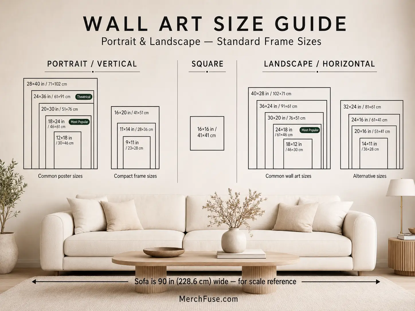
Find Your Perfect Print Size
Choose from frame-ready poster sizes that work with standard off-the-shelf frames and modern gallery-wall layouts.
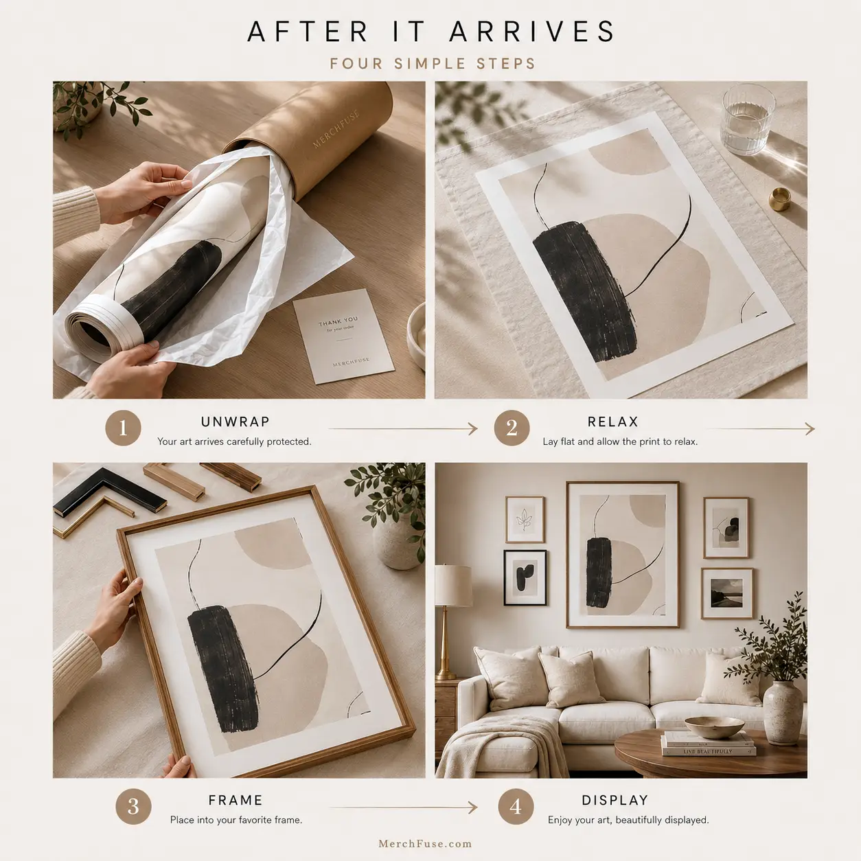
After It Arrives
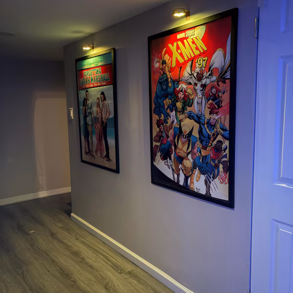
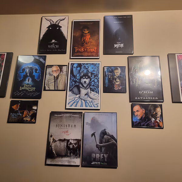
How to Frame & Display Your Print
A clean tube-to-wall setup: let the print relax, choose a standard frame, then style it as a hero piece or part of a gallery wall.
- Unroll & relaxLay the print face-down on a clean flat surface for 20–30 minutes before framing.
- Pick a standard frameUse a matching off-the-shelf frame; no trimming or custom framing is needed for standard sizes.
- Hang away from moistureAvoid bathrooms, direct sunlight and damp areas for the longest-lasting display.


Reviews
Purchased this artwork? Share how it looks in your space and help the next collector choose with confidence.