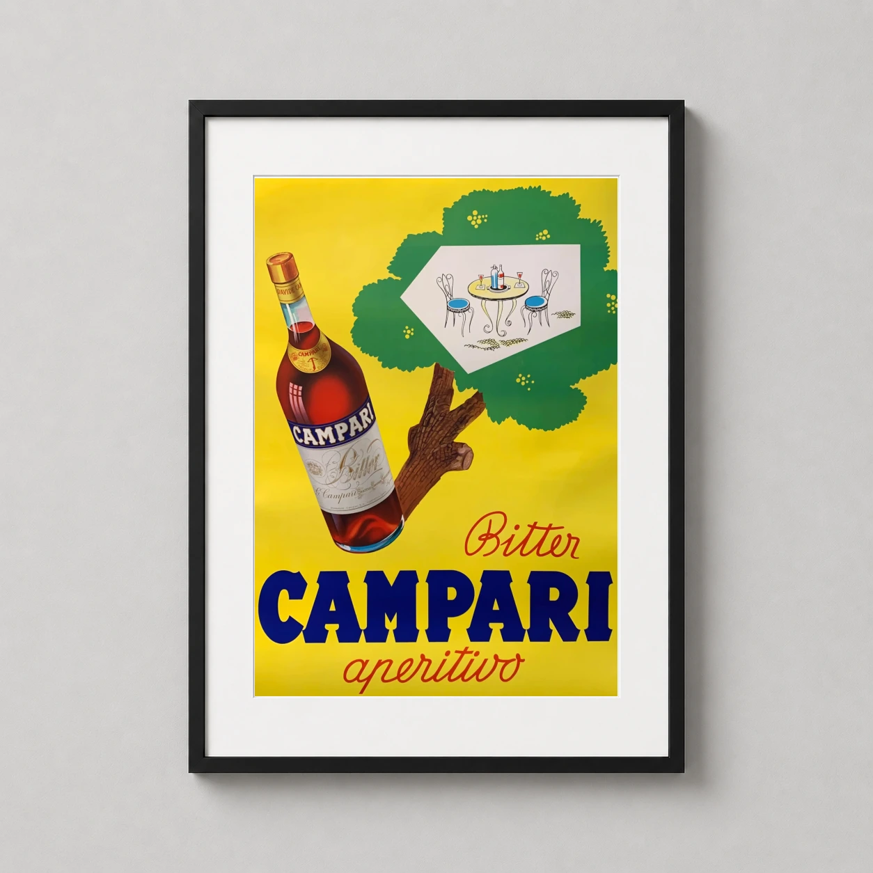
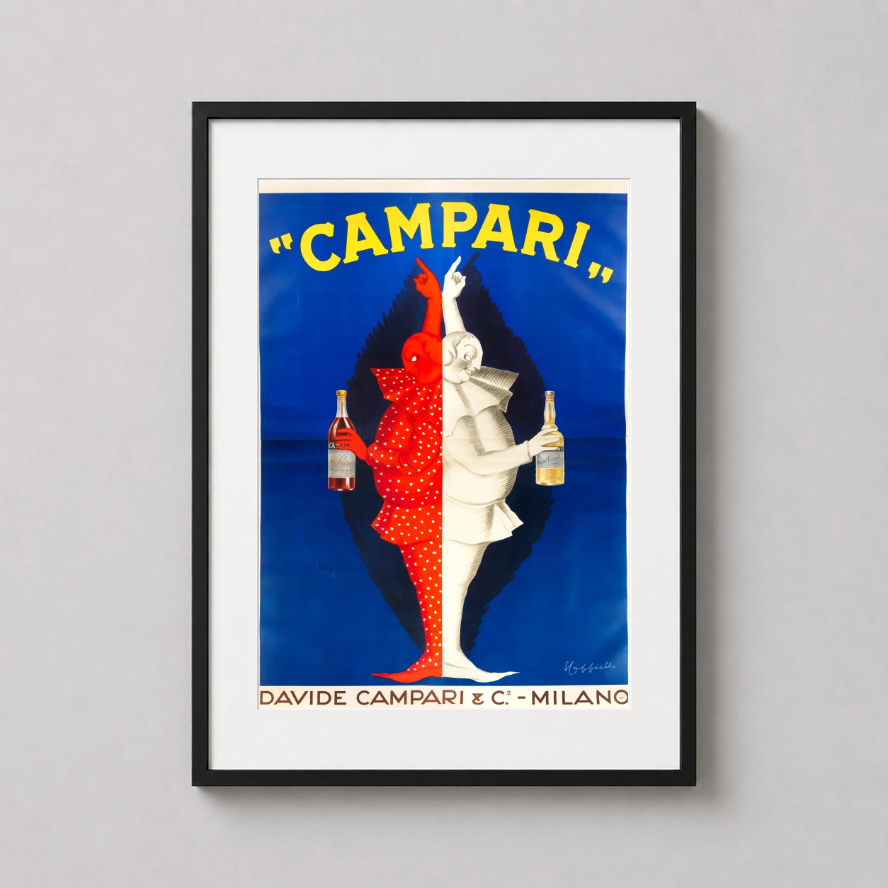
Product description
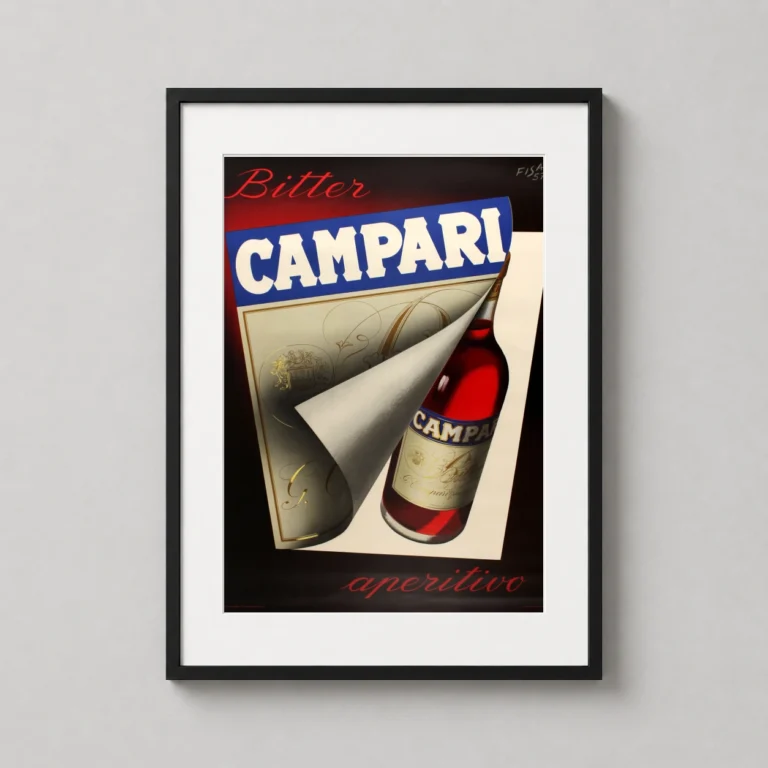
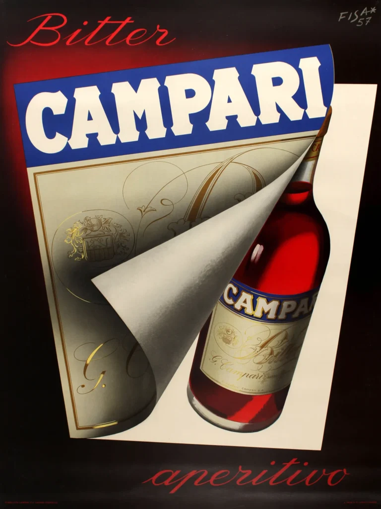
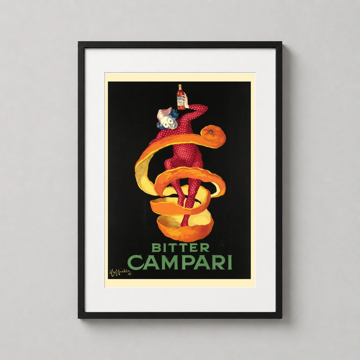
Originally designed in 1957 by the FISA agency, this graphic represents a departure from earlier surrealist beverage ads toward clean, modern minimalism. The composition utilizes a clever peeling effect where a white and gold label pulls away to reveal a vibrant red bottle against a moody, shadowed backdrop. This print features bold blue and white typography that commands attention from the upper third of the frame. The contrast between the saturated scarlet of the liquor and the dark surrounding tones creates a three-dimensional depth rarely seen in mid-century prints.
There is a sense of mystery and sophistication in the way the bottle is only partially unveiled, inviting the viewer to partake in a classic Italian ritual. This artwork captures the cosmopolitan energy of post-war Milan, where the bitter-sweet aperitif became synonymous with urban social life. It evokes memories of twilight hours spent at a marble-topped bar, the clinking of ice, and the sharp citrus aroma of a freshly prepared drink. The design feels both high-fashion and accessible, embodying the effortless style that Italian exports are known for worldwide.
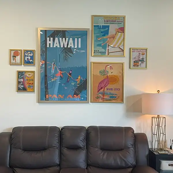
It belongs with the retro bar wall art, and looks deliberate hung near french advertising posters.
Product details
- Product: Campari Bitter Aperitivo 1957, Italian Bar Vintage Poster
- Formats: Unframed physical print or high-resolution digital file
- Print material: 200 GSM matte paper
- Physical sizes: 8×10, 11×14, 12×18, 16×20, 18×24, 20×30, and 24×36 inches
- Orientation: Portrait
- Dominant palette: Blue, Red, Black
- Suggested placement: Kitchen
- Frame: Not included
Product transparency: This listing is offered by MerchFuse. Physical orders contain an unframed print. Selecting Digital File provides a digital artwork file instead of a shipped product. Screen and print colours can vary slightly because displays and printing processes reproduce colour differently.
MerchFuse curator note
For Campari Bitter Aperitivo 1957, Italian Bar Vintage Poster, the portrait vintage and mid-century vintage advertising poster and blue, red, black palette create a clear focal point for kitchen displays. Pair it with period advertising or food-and-drink artwork for a characterful collection.
What You’re Getting
Premium Quality, Every Print
MerchFuse prints are designed for collectors and home styling: crisp artwork, archival-feel paper, careful quality checks and secure packaging.
Paper Quality
200 GSM matte stock
Heavyweight fine-art-style matte paper with a smooth, low-glare finish that feels substantial and displays beautifully under frames.
Ink & Longevity
Archival print clarity
Produced with professional print processes for rich color, clean edges and long-lasting indoor display quality.
Packaging
Protected for transit
Each order is packed flat or rolled depending on size, using protective mailers or tubes so the print arrives safely.
Before You Order
Find Your Perfect Print Size
The sizes below are read directly from this product’s live physical variations. Check local frame availability before ordering.
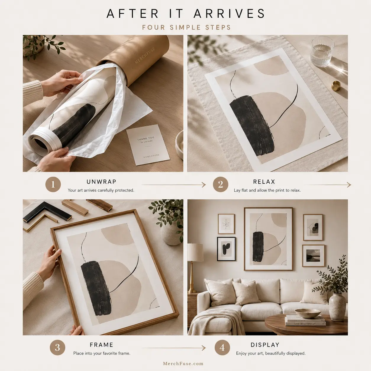
After It Arrives
How to Frame & Display Your Print
A clean tube-to-wall setup: let the print relax, choose a standard frame, then style it as a hero piece or part of a gallery wall.
- Unroll & relaxLay the print face-down on a clean flat surface for 20–30 minutes before framing.
- Pick a standard frameMatch the selected print dimensions to a frame sold in your region; use a mat or custom frame when local standards differ.
- Hang away from moistureAvoid bathrooms, direct sunlight and damp areas for the longest-lasting display.


This print is covered by the same materials, shipping and returns information shown on the product page. Verified buyers can share their experience below.