Product description
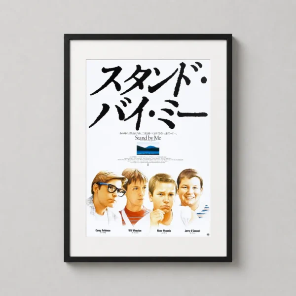
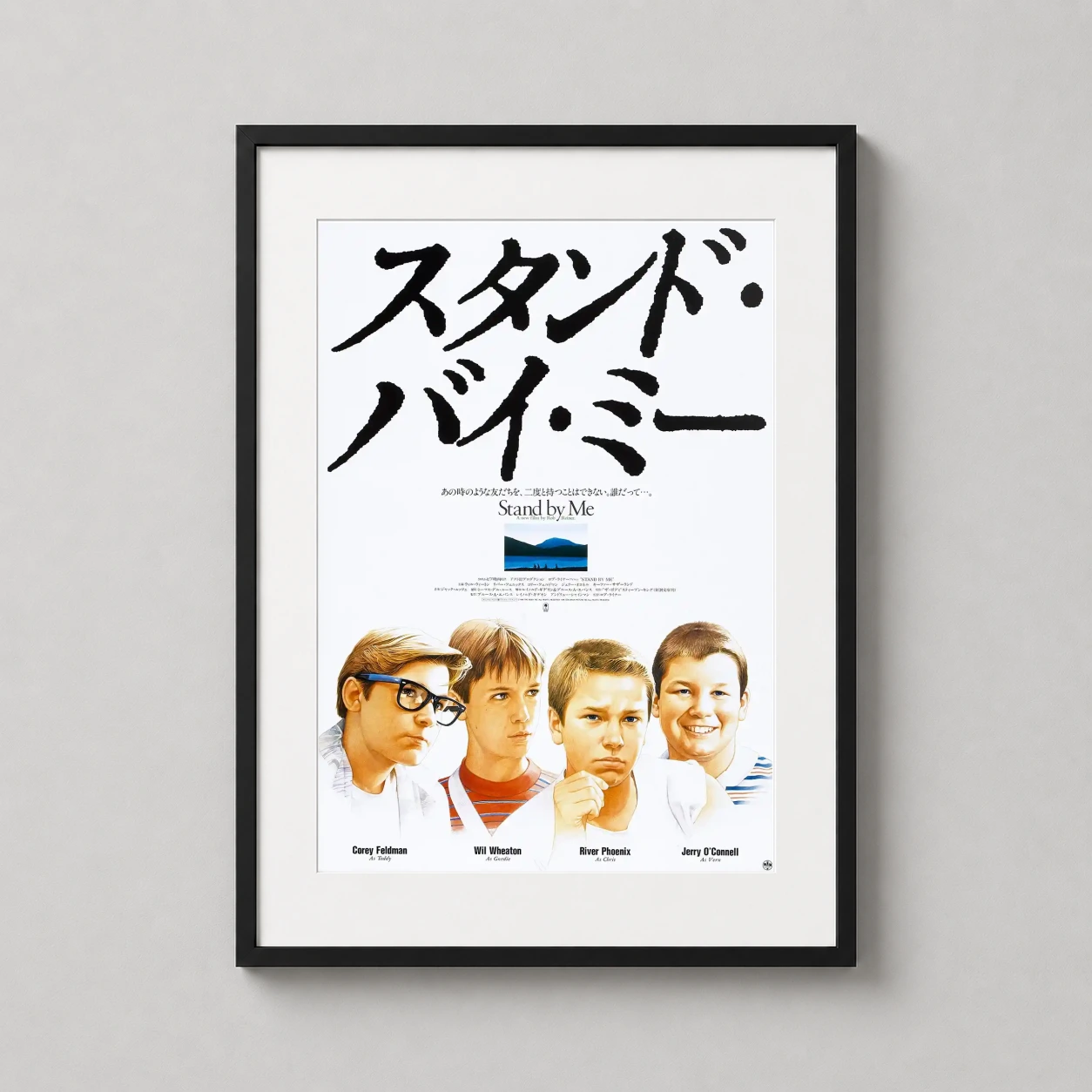
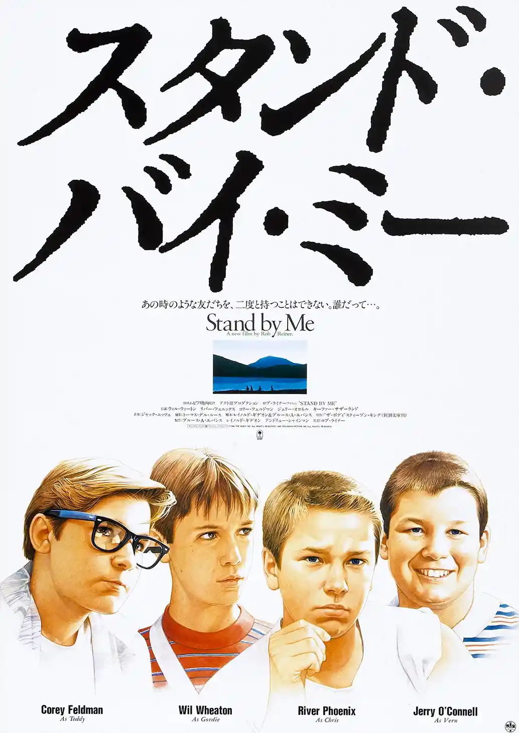
Released in Japan under its phonetic title, the marketing for this 1986 classic utilized this stand by me wall art to emphasize the stark contrast of childhood innocence against a vast world. The composition is dominated by massive, hand-inked black Katakana calligraphy that sweeps across the upper half of the frame. Below these bold brushstrokes, the four young protagonists—Gordie, Chris, Teddy, and Vern—are rendered in clear, close-up portraits against a clean white background. A central horizontal sliver of color depicts the famous railway bridge crossing, providing a vivid anchor to the film’s definitive Oregon landscape.
There is a profound sense of nostalgia woven into this composition that transcends language barriers. By utilizing the Japanese aesthetic of negative space, the design emphasizes the emotional weight of the characters’ expressions rather than distracting with cluttered details. It evokes the bittersweet realization that the friendships of youth are unique and irreproducible, mirroring the sentimental tone that made the Rob Reiner film a foundational piece of coming-of-age cinema.
In a home office or a dedicated media room, this print serves as a sophisticated nod to cinematic history. The high-contrast black and white palette, punctuated by the vibrant blue of the central landscape and the red and blue accents on the boys’ shirts, allows it to integrate seamlessly into a modern gallery wall. Its large-scale typography makes it a focal point in a minimalist entryway, where the bold Japanese characters act as a conversation piece for visiting cinephiles.
This piece is particularly suited for a collector of international film memorabilia or a fan of the 1980s aesthetic. It makes a thoughtful gift for a lifelong friend or a brother, serving as a visual tribute to shared childhood adventures. Whether for a dedicated fan of River Phoenix or someone who finds beauty in foreign language typography, this print honors the enduring legacy of a story that defined a generation.
What You’re Getting
Premium Quality, Every Print
MerchFuse prints are designed for collectors and home styling: crisp artwork, archival-feel paper, careful quality checks and secure packaging.
Paper Quality
200 GSM matte stock
Heavyweight fine-art-style matte paper with a smooth, low-glare finish that feels substantial and displays beautifully under frames.
Ink & Longevity
Archival print clarity
Produced with professional print processes for rich color, clean edges and long-lasting indoor display quality.
Packaging
Protected for transit
Each order is packed flat or rolled depending on size, using protective mailers or tubes so the print arrives safely.
Before You Order
Find Your Perfect Print Size
Choose from frame-ready poster sizes that work with standard off-the-shelf frames and modern gallery-wall layouts.
After It Arrives
How to Frame & Display Your Print
A clean tube-to-wall setup: let the print relax, choose a standard frame, then style it as a hero piece or part of a gallery wall.
- Unroll & relaxLay the print face-down on a clean flat surface for 20–30 minutes before framing.
- Pick a standard frameUse a matching off-the-shelf frame; no trimming or custom framing is needed for standard sizes.
- Hang away from moistureAvoid bathrooms, direct sunlight and damp areas for the longest-lasting display.

Reviews
Purchased this artwork? Share how it looks in your space and help the next collector choose with confidence.