
Product description
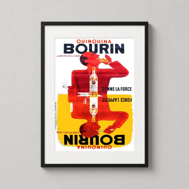
The mirrored silhouette of a red figure dominates this 1936 French advertisement, cleverly representing the dual benefits of the spirit for drinking and dining. This poster utilizes the geometric precision of the Art Deco era, contrasting a vivid crimson character against a split background of stark white and saturated golden yellow. The top half depicts a man enjoying a glass of the aperitif, while his inverted reflection below focuses on a meal, perfectly capturing the brand’s ‘Donne la force’ slogan through minimalist graphic design and bold typography.
Stepping into the visual world of pre-war Paris, this artwork evokes the bustling atmosphere of a French bistro where the clink of glasses and the aroma of fresh bread filled the air. It represents a time when advertising was elevated to fine art, relying on visual wit and high-contrast palettes to grab the attention of passersby. The symmetry suggests a sense of balance and tradition, making it more than just a liquor advertisement—it is a piece of cultural history that celebrates the sophisticated ritual of the European aperitif.
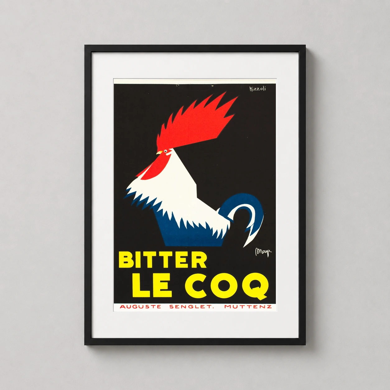
The subject sits squarely within art deco advertising posters, close in spirit to retro bar wall art.
Product details
- Product: Quinquina Bourin Aperitif 1936 French Art Deco Vintage Poster
- Formats: Unframed physical print or high-resolution digital file
- Print material: 200 GSM matte paper
- Physical sizes: 8×10, 11×14, 12×18, 16×20, 18×24, 20×30, and 24×36 inches
- Orientation: Portrait
- Dominant palette: Yellow, Red, White
- Suggested placement: Kitchen
- Frame: Not included
Product transparency: This listing is offered by MerchFuse. Physical orders contain an unframed print. Selecting Digital File provides a digital artwork file instead of a shipped product. Screen and print colours can vary slightly because displays and printing processes reproduce colour differently.
MerchFuse curator note
For Quinquina Bourin Aperitif 1936 French Art Deco Vintage Poster, the portrait minimalist and vintage vintage advertising poster and yellow, red, white palette create a clear focal point for kitchen displays. Pair it with period advertising or food-and-drink artwork for a characterful collection.
Formats and sizes
Choose what works for your wall
Available formats and sizes are listed below. Product-specific material details appear only when MerchFuse has reviewed their source.
Physical print
Printed and delivered
Available physical sizes: 8×10″, 11×14″, 12×18″, 16×20″, 18×24″, 20×30″, 24×36″
Digital Download
File delivery; nothing ships
Download access is provided according to the selected digital product and its licence terms.


Rating summary: approved reviews submitted on this product page. Store and marketplace reviews are labelled separately in the Trust Center and are not included here.
Product reviews submitted here are shown separately from store or imported marketplace reviews. Current product, delivery and return information remains on the product page and published policy pages.