Product description
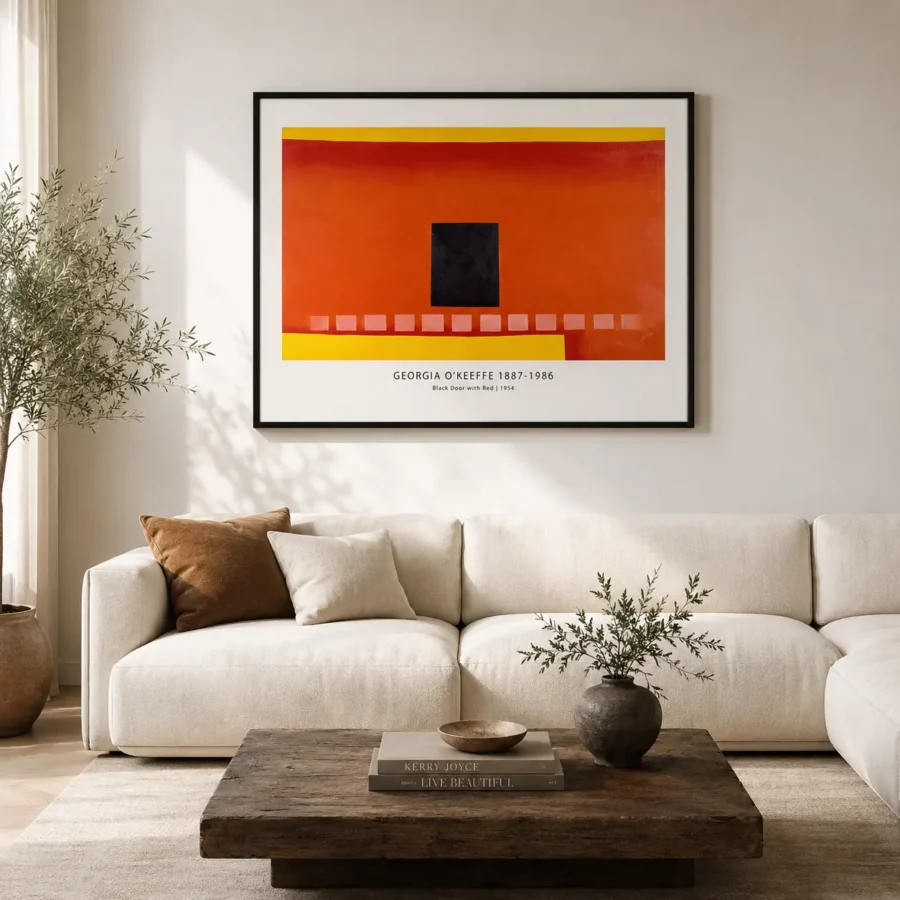
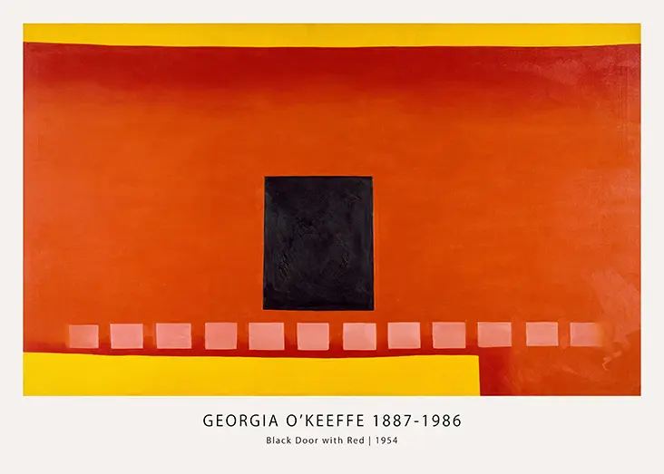
Black Door Print reduces an adobe wall into red-orange bands, yellow edges, a tiled path, and one centered dark square. The image is architectural, but it reads almost like a hard-edged abstract because every part has been simplified. That makes it a strong O’Keeffe choice for buyers who want structure, warmth, and a clear graphic center.
The black square does most of the anchoring. Around it, the red and orange field feels sun-warmed, while thin yellow strips sharpen the horizontal rhythm. This is not a quiet pastel or soft flower. It is clean, warm, and geometric, making it useful for rooms that need color with discipline.
Black Door Print with Red Adobe Balance
The composition is based on O’Keeffe’s repeated interest in the black door at her Abiquiú home, but the print does not need biographical context to work on a wall. It gives the buyer a strong rectangle, warm color, and a small sequence of tile-like shapes below. The design feels settled because every edge has a role and nothing drifts.
Why matte paper matters here
This print uses 200 GSM museum-grade matte paper and fade-resistant quality inks. Matte stock keeps the red-orange field rich without glossy glare and helps the black square remain flat and firm. It also preserves the thin yellow bands and small orange rectangles below the door, details that can disappear if the surface reflects too much light. The result is better for framed display in bright rooms.
Frame and wall placement
A slim black frame repeats the door shape and gives the print a crisp boundary. Walnut or dark oak works if the room has terracotta, leather, clay, or warm brass accents. Hang it above a dining sideboard, bar cabinet, hallway console, or low modern bench. For similar color and shape control, pair it with modern art prints or tighter abstract art prints that do not compete with the red.
Standard frame-ready sizes make this print easy to use as either a warm accent or a central wall piece. In a smaller frame, the black square and red field read almost like a color study. In a larger frame, the adobe wall and tile shapes become more architectural, which is useful above dining furniture or a low console.
This product belongs in the catalog because it gives O’Keeffe buyers a red architectural option that feels very different from her flowers and landscapes. The composition is warm but disciplined, simple but not empty. It can connect with terracotta decor, black metal fixtures, and pale plaster walls while still feeling like a piece chosen for the art, not just the color.
The image also works for buyers who prefer art with order. Every band, square, and tile-like shape has a job, so the print feels controlled even though the red is strong. It can warm a room without making the wall feel visually messy.
It can also act as a color bridge between neutral walls and warmer objects already in the room.
The centered black form keeps the red controlled, so the print stays focused at larger sizes.
Questions buyers usually ask
Is the artwork mostly red?.
Yes. Red and orange dominate, with yellow edges and a centered black square for contrast.
Does it suit a dining room?.
Yes. The warm color and clean geometry work well above sideboards and dining furniture.
Is this connected to the artist or museum?.
No. MerchFuse is not affiliated with any artist, estate, museum, publisher, or rights holder.
MerchFuse prepares orders in 3–5 business days. If your print arrives damaged or defective, the 30-day return window gives you a simple review path.
It belongs with the mid century modern art, and looks deliberate hung near abstract art prints.
What You’re Getting
Premium Quality, Every Print
MerchFuse prints are designed for collectors and home styling: crisp artwork, archival-feel paper, careful quality checks and secure packaging.
Paper Quality
200 GSM matte stock
Heavyweight fine-art-style matte paper with a smooth, low-glare finish that feels substantial and displays beautifully under frames.
Ink & Longevity
Archival print clarity
Produced with professional print processes for rich color, clean edges and long-lasting indoor display quality.
Packaging
Protected for transit
Each order is packed flat or rolled depending on size, using protective mailers or tubes so the print arrives safely.
Before You Order
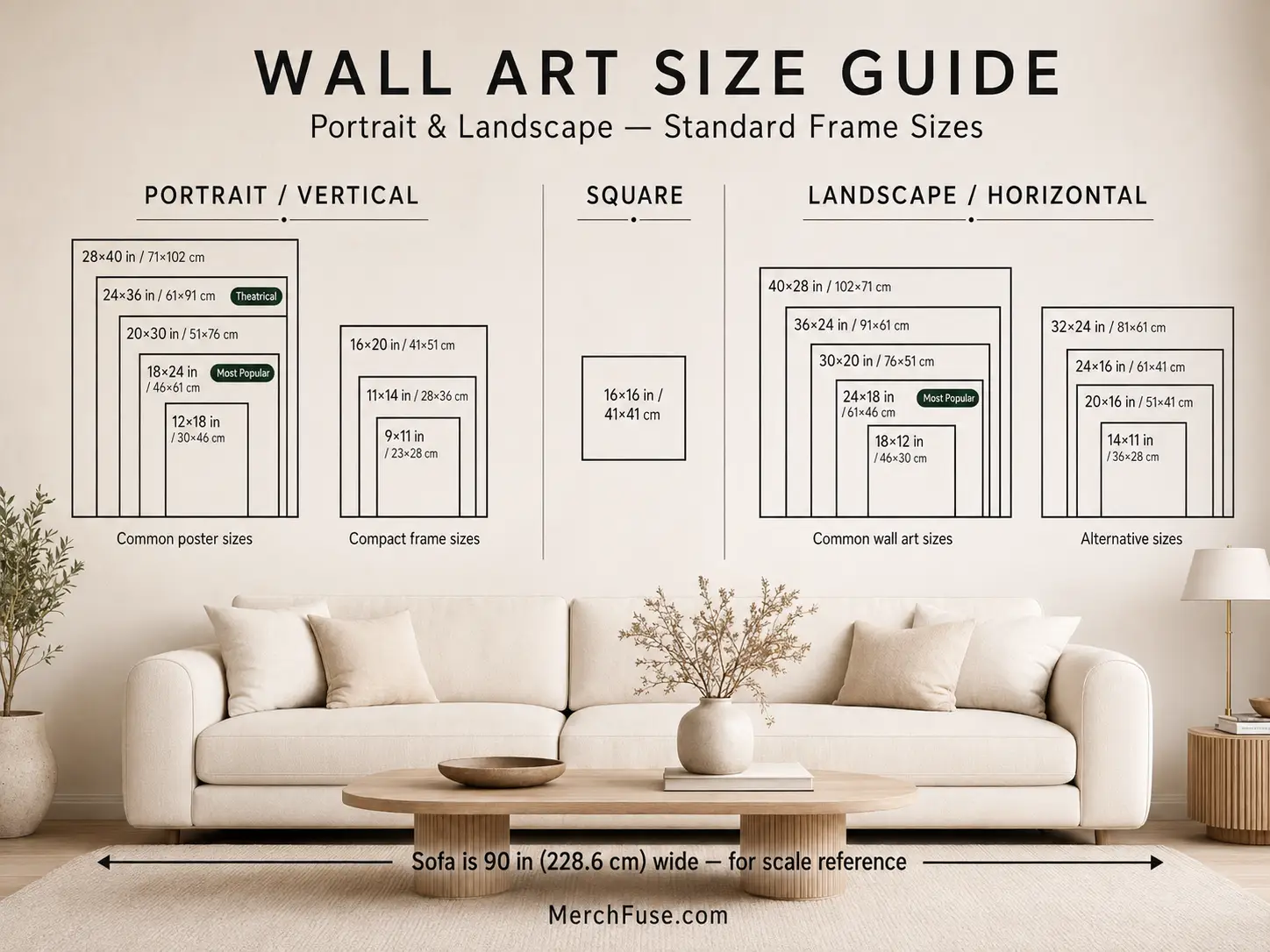
Find Your Perfect Print Size
Choose from frame-ready poster sizes that work with standard off-the-shelf frames and modern gallery-wall layouts.
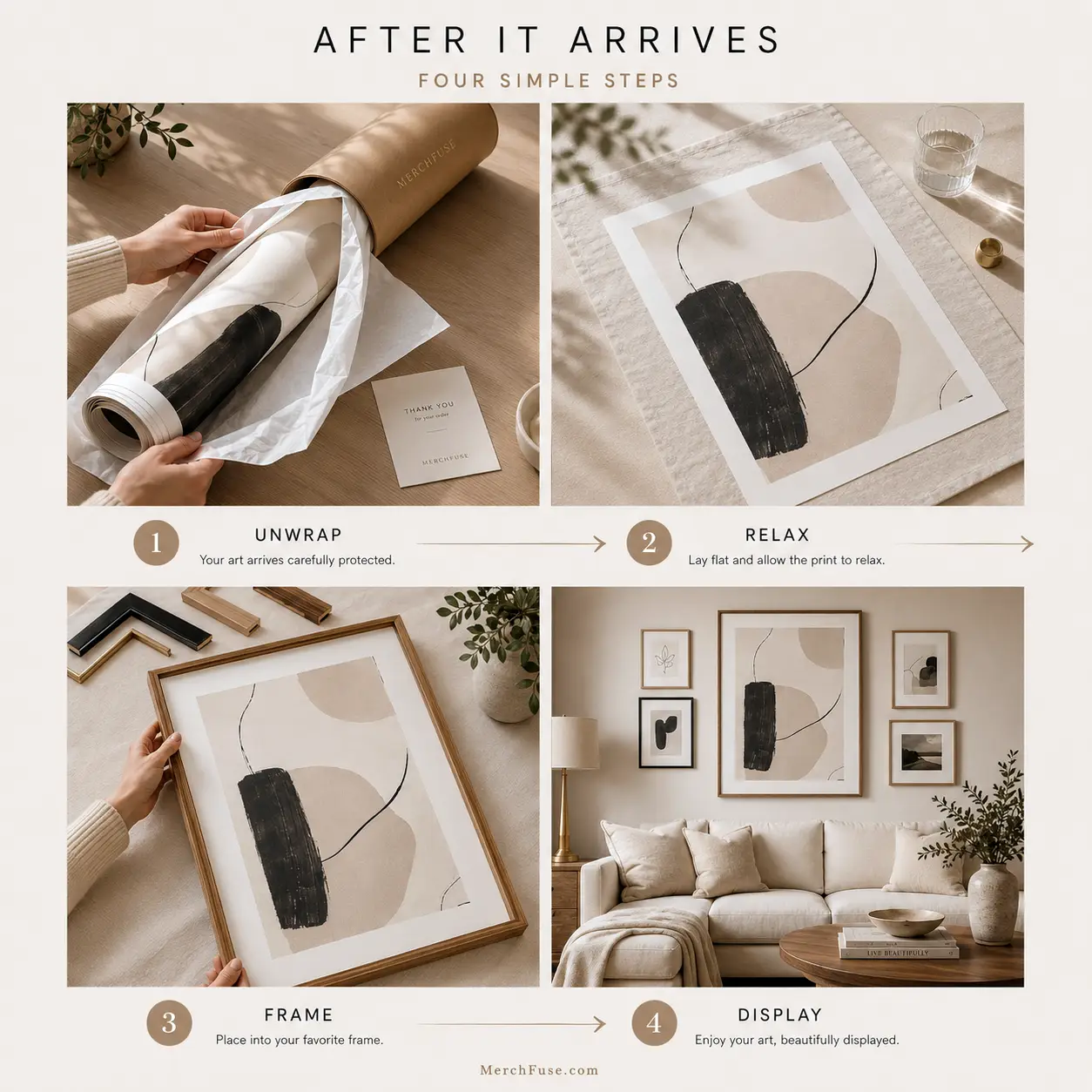
After It Arrives
How to Frame & Display Your Print
A clean tube-to-wall setup: let the print relax, choose a standard frame, then style it as a hero piece or part of a gallery wall.
- Unroll & relaxLay the print face-down on a clean flat surface for 20–30 minutes before framing.
- Pick a standard frameUse a matching off-the-shelf frame; no trimming or custom framing is needed for standard sizes.
- Hang away from moistureAvoid bathrooms, direct sunlight and damp areas for the longest-lasting display.


Reviews
Purchased this artwork? Share how it looks in your space and help the next collector choose with confidence.